Keywords
event-related potential, data visualization, matlab, ERPlab, 3D
This article is included in the Reproducible Research Data and Software collection.
event-related potential, data visualization, matlab, ERPlab, 3D
Visualization is an important tool for the identification and interpretation of patterns in data, particularly for rich and complex multi-dimensional data sets. The event-related potential (ERP) technique presents a good challenge for data visualization. In this technique, an electroencephalogram is created from voltage data that is collected over time at a high sampling rate from multiple locations on the scalp, using (typically) arrays of 32, 64, 128, or even 256 electrodes. The electroencephalogram is time-locked to the presentation of stimuli from one or more conditions and averaged across trials to create event-related potentials. To compare the ERPs to different experimental conditions, difference waves are created by computing the voltage difference at each sample point. Either the ERPs from the individual conditions or from the difference waves could be visualized. Data sets therefore include the spatial coordinates for the position of each electrode on the scalp (typically in 3-D Cartesian coordinates), and the magnitude of voltage over time (“waveforms”), for individual stimulus conditions or their difference waves. Thus, there could be as many as five dimensions to plot: the x, y, z coordinates, voltage, and time.
There are several commonly used methods to visualize these data sets, which each simplify this multidimensional space in different ways. In one method, plots of voltage (y-axis) over time (x-axis) are created for the ERPs at each electrode. These separate plots are often arranged following the topographic arrangement of the electrodes on the scalp, to provide a sense of the spatial distribution of effects. While such plots allow for the spatial and temporal extent of effects to be seen, it can still be difficult to see the extent of any effects or where they are at their maximum. Topographic scalp map plots represent voltage on a color scale, interpolated across electrodes to create a continuous heat map on a 2D projection of the scalp. In such plots, voltage from each ERP is plotted from a single time point or is the average across all the samples within a particular time window. Thus while the spatial location of an effect and the location of its maximum value are easy to see, the temporal extent of an effect can only be seen across successive images (in more or less detail, depending on how or if the successive images are averaged across time windows). Here we describe a novel 3D visualization tool (ERPin3D) to allow for visualization of the spatial extent, temporal extent, and maximum values of ERP effects. The code is offered to illustrate proof of concept but is not intended to be a fully featured implementation.
ERPin3D creates a virtual standardized space to contain a 3D plot, with 2 dimensions for the spatial distribution of the electrodes, and a third dimension for time. In this space, the x-axis captures the left/right direction, the y-axis the anterior/posterior direction, and the z-axis captures time. Positive x-values correspond to the right side of the scalp, negative values to the left. Positive y-values correspond to anterior scalp locations, negative value to posterior locations. We defined the extent of this standard space to be +/- 500 in each dimension in the xy-plane, and to run from -200 to 1200 along the z-axis. Any values in the data set with times outside of this range are not plotted. While the size of this space could be adjusted for visualization of different ERP effects, the creation of a standard space may facilitate comparisons of different ERP effects or of the same ERP effect from different paradigms. We include two features to help orient the viewer in the 3D space. First, we include an opaque outline of a head (with nose and ears) in the xy-plane at the specified minimum time value (by default, this is set to -200 in the code). Second, we include lines that project in the z-direction through the center of the column of voxels for each electrode. The endpoints of these lines contain the electrode label (Cz, F3, etc.).
Each data point in this 3D space is represented as a voxel within the space. Each voxel is assigned a color based on its voltage amplitude (positive or negative), taking advantage of MATLAB’s built-in color maps (which can be dynamically assigned). Each voxel is further assigned a transparency value ranging from 0 (fully transparent) to 1 (fully opaque). Voxel transparency is set by default in the code to 0.3.
Each voxel is centered vertically in the z-direction at a position corresponding to the sample time. The height of the voxel is based on the difference between successive time points. This computation assumes regular sampling throughout the epoch and leaves no gaps between voxels in the z-direction. Each voxel is centered in the xy-plane on the spatial coordinates of the data point’s electrode. The spatial extent of each voxel in the xy-plane was determined visually to give the appearance of contiguity across a standard set of 28 scalp electrodes, without overlap. This is essentially an arbitrary setting and could be adjusted in future versions of the code. For example, the voxel area could be set to a smaller fixed value, allowing for the data from smaller electrode arrays to appear sparse, and more “filled in” with larger numbers of electrodes. Alternatively, the voxel area could be set to vary based on the number of electrodes in the array, allowing for the appearance of contiguity with any electrode configuration. Note that while we opted not to interpolate the data to create a continuous representation, that might also be done, as for the standard topographic plots (see Figure 2 below).
The code starts with a block of constants that define the size of the standard space for plotting. We defined the extent of this standard space to be +/- 500 in each dimension in the xy-plane (electrode_xyplane_extent), and to run from -200 to 1200 along the z-axis (time_range). Any values in the data set with times outside of this range are not plotted. Here we also set the voxel extent in the x- and y-dimensions. For a convenient size, this is set to 75, but could be adjusted by the user as discussed above. We also set the voxel transparency here to .3.
The code then asks for user input to grab the electrode_coordinate file and the data file (described in detail below). The data file is read into a cell array, which specifies the electrode labels and the data values. At this point, the extent of each voxel in the z-dimension is also determined: The height of each voxel is set as the difference of the time values for the first two data points (thus while the voxels may not appear to be continuous in the xy plane, they do appear continuous in the z-dimension).
Next, the user is prompted to select a colormap from a set of choices (e.g, ‘jet’, ‘hot’, ‘cold’), and is prompted to enter voltage values to exclude. The user determines a range of voltage values that will not be plotted (e.g. -2 to 5), and any values within that range in the data will be left out of the resulting plot. Thus if the user selects a lower bound of -2 and an upper bound of 5, the code will plot all values smaller than -2 and all values larger than 5 (i.e., values relatively close to 0 will be skipped).
Next the empty plot is created, and the blank head image is inserted into the space. A color scale is created using the user-selected colormap. An array for the voxel faces and the positions of the vertices of the voxels are defined. The code then loops through the data file assigning each voltage value to a voxel and assigning a color to each face of the voxel, skipping voxels that are within the range of voltage values to exclude. Once the loop is completed, the voxels are plotted and assigned their colors at the correct transparency. Finally, the colormap scale is created and added to the image.
ERPin3D was created with MATLAB R2024b (version: 24.2.0.2806996; R2024b; https://www.mathworks.com) but runs on earlier versions of MATLAB (verified on R2022a, R2021a), and the same code is fully compatible with GNU Octave (version 9.4.0; http://octave.org). Our code is freely available with the MIT no attribution license (see software availability statement below).
To create a new plot with our code, the user needs the default head image (blank_head_ERPin3D.jpg; supplied with the code), a text file that specifies the coordinates of each electrode to be plotted (a default version of this file is supplied with the code), and a (text) data file.
The default head image (blank_head_ERPin3D.jpg) is a 500x500 pixel RGB image file with the outline of a head (including nose and ears) in black on a white background. It is inserted by default into the image space at z=-200 (time -200ms). The purpose of this image is to help orient the viewer in the space by making it clearer how the electrodes are positioned relative to the front and back and left and right sides of the head.
The electrode coordinate file is a tab delimited text file that contains one column for the labels of the electrodes to be plotted (“label”), one column each for the 2D projected x and y coordinates (“x” and “y”), and two additional columns that scale the projected coordinates into the 3D space for the figure (“x-scaled” and “y-scaled”). The first row is a header row. The included projections are pre-computed based on the 3D coordinates of the standard position for each electrode in the International 10-5 system of electrode placement.1 For the default coordinates for the 2D projection, we used the coordinates in the standard_1005_2D.tsv file from Appelhoff and Brunner (v1.2.0).2 The scaled coordinates were created by multiplying each standard projected coordinate by 500. This is an arbitrary factor based on the (hard-coded) size of the image space. Electrode labels should match the labels in the data file. Any electrode in the data file that is not included in this file will not be plotted. Additional electrodes in the electrode coordinate file that are not in the data file are ignored when the code runs.
The data file should be a tab delimited text file. The first column contains the electrode labels to be plotted, and the first row contains the time stamps for each data point. The total number of rows should equal the number of electrodes (plus one for the header row). The code cycles through the rows and columns in the data file and plots all data points.
When the code is executed, the user is prompted to select the electrode coordinate file and the data file. A second dialog box appears after that to allow the user to select the color space (drop down menu) and to input the upper and lower bound of the voltage values to be excluded. Once those are set, the code runs without interruption until the image is created. Note that the electrode coordinate file and data files are text files that can be created by any means as long as they meet the structure described above.
As a test case, we created a plot for data eliciting an N400 effect in a standard priming task from the ERP core3 (https://osf.io/thsqg/). In this task, the N400 effect is seen as the voltage for primed targets (bin4) is less negative than the voltage for unprimed targets (bin3) over centro-parietal electrode positions, with the difference peaking about 400ms post-stimulus onset. This data set included 28 scalp electrodes sampled every 5ms in a 795ms epoch with a 200ms baseline (plotted from -200 to 795). Here we describe in detail how we extracted the data for plotting, as an illustrative example. To create our test image, we created a grand-averaged data file, then applied a bin operation in ERPLAB (version 12.00; https://erpinfo.org/erplab)4 in EEGLAB (v2024.2; https://sccn.ucsd.edu/eeglab/)5 to compute the difference wave (bin4 – bin3) for the N400 effect. Standard ERP plots of this effect are seen in Figure 1 (primed and unprimed conditions) and Figure 2 (difference wave).
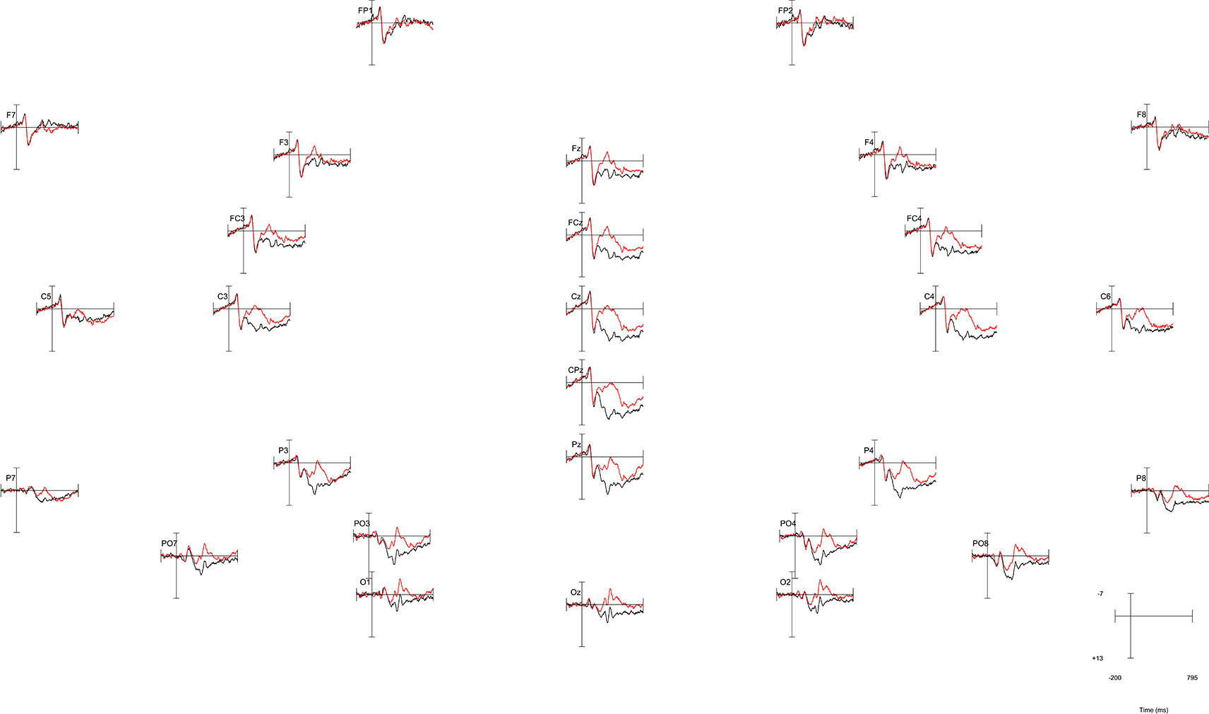
Negative is plotted up. The plotted data shows a centroparietal N400 effect from roughly 300-500ms, with a more negative voltage for words that were unprimed (red line) vs. primed (black line). However, the location of the effect’s maximum and its spatial extent are not too easy to discern from the image.

The spatial extent of the N400 effect and the location of its maximum difference can be clearly seen as the blue blob in the center image. However, the temporal extent of the effect is not precisely discernable from the image, as the data have been averaged across 200ms time windows.
For our ERPin3D plot, we exported the ERP for the difference wave (bin5). To export the data, we used the “Export ERP to text (universal)” option in the “Export and Import ERP” section of the ERPLAB menu. We chose our newly created bin5 to export, named the file, selected the option to include time values (in milliseconds), the option to include electrode labels, and in the Transpose data section, we chose the option to have the electrodes in rows and points in columns. We kept the default numeric precision value of 4 (changing this value might make small differences in the color values but otherwise has no impact on the plot).
Figure 3a and 3b illustrate the initial plot for the N400 effect from 2 different angles (created by taking screenshots of the generated plot after rotating it by mouse in matlab). We chose the ‘jet’ color map, corresponding to the magnitude of the voltage at that voxel. Though this plot shows all of the data, it is difficult to see the N400 effect – it’s buried in the middle of the figure, surrounded by other voxels. To improve visibility, we include a feature to allow the user to select a range of voltage values to exclude. The exclusion settings can be guesstimated based on other plots or by rerunning the code with different values until the desired visualization is achieved, but could be determined more objectively in future versions based on data quality measures, effect size measures, or other statistical information about the effect. In Figure 3c and 3d we show the same effect from the same 2 angles, removing voltages from -4 (lower range of data values to exclude) to 500 (arbitrarily large value for the upper range of data values to exclude), avoiding all positive voltage values in the data, and removing relatively small negative values close to zero. With these changes, the time course and spatial extent of the N400 effect can be more clearly seen.
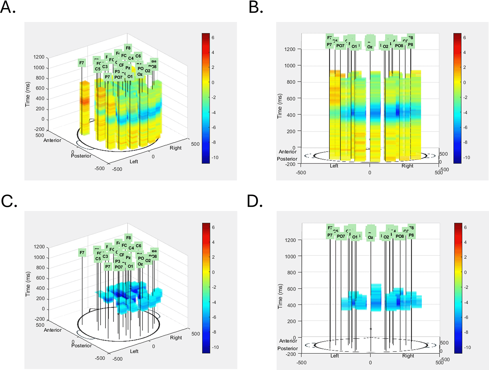
The N400 data is shown first from the default left posterior vantage point (A) and a rotated central posterior vantage point (B). Transparency of each voxel was set at 0.3, but no voxels were excluded from this initial view. In the images in the bottom row, voxels with voltage values between -4μV and 500μV were excluded, leaving only the blue voxels corresponding to the effect, seen from the same default vantage point (C) and rotated vantage point (D) of the images in the top row. With the extraneous voxels removed the spatial extent, temporal extent, and voltage intensity of the N400 effect can all be seen clearly, and particularly so when the image is live in MATLAB and can be rotated by clicking and dragging within the image.
This novel method to visualize ERP components in a standardized three dimensional space is adaptable across different systems, electrode configurations and elicitation paradigms, and flexibly allows the user to visualize aspects of the data that may not be as readily apparent with standard visualization techniques.
Source code for the ERPin3D tool is available from: https://github.com/walenskim21/ERPin3D.
Archived source code at time of publication: https://doi.org/10.5281/zenodo.15397552.6
Licenses: MIT no attribution.
| Views | Downloads | |
|---|---|---|
| F1000Research | - | - |
|
PubMed Central
Data from PMC are received and updated monthly.
|
- | - |
Provide sufficient details of any financial or non-financial competing interests to enable users to assess whether your comments might lead a reasonable person to question your impartiality. Consider the following examples, but note that this is not an exhaustive list:
Sign up for content alerts and receive a weekly or monthly email with all newly published articles
Already registered? Sign in
The email address should be the one you originally registered with F1000.
You registered with F1000 via Google, so we cannot reset your password.
To sign in, please click here.
If you still need help with your Google account password, please click here.
You registered with F1000 via Facebook, so we cannot reset your password.
To sign in, please click here.
If you still need help with your Facebook account password, please click here.
If your email address is registered with us, we will email you instructions to reset your password.
If you think you should have received this email but it has not arrived, please check your spam filters and/or contact for further assistance.
Comments on this article Comments (0)