Keywords
Anatograms, Anatomy, Tissues, Organs, ggplot2, R, Expression Atlas, Shiny
This article is included in the RPackage gateway.
This article is included in the Neuroconductor collection.
Anatograms, Anatomy, Tissues, Organs, ggplot2, R, Expression Atlas, Shiny
This revision addresses the reviewer's comments. I have added an interactive online shiny app version of gganatogram, which will let people without any skills in R to be able to use gganatogram. I have added a cell diagram from the Protein Atlas showing different cellular sub-compartments. I have added a figure showing how changing the order of the organs in the data frame affects the plot. Furthermore, I have also added 24 more organisms from the Expression Atlas along with a table showing all the organisms, how to get the included organism data frame, and how many tissues can be plotted per organism. To incorporate these changes in the manuscript, I have added a figure with the cell to show how this diagram can be used to compare between conditions. I have also included a plot with all the 24 other organisms and their tissues.
To read any peer review reports and author responses for this article, follow the "read" links in the Open Peer Review table.
Efficiently displaying tissue information in multicellular organisms can be a laborious and time consuming process. Often researchers want to showcase differences in values, such as gene expression or pharmacokinetics between tissues in one organism, or between similar tissues in different groups.
Whereas bar charts and heatmaps provide an informative view of the differences between groups, it can be difficult to immediately observe the biological significance (Figure 1a–b). As compared to an anatogram, where it is easy to quickly spot the differences between tissues or groups, and immediately provide biological context to these observations (Figure 1c). This also has the added benefit that the audience, whether reading a paper or attending a lecture, will have to spend less time and effort to grasp the results.
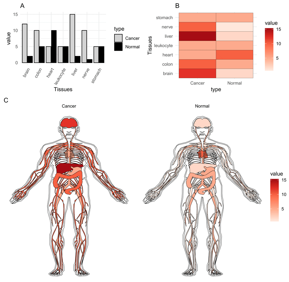
The values in the graphs are the same.
Several online tools to display gene expression in different tissues already exist1–4. Although these tools provide important information regarding gene expression in various tissues and organisms, other disciplines besides genetics are unable to utilise these applications due to the focus on genes. Moreover, these tools often only include a predefined set of experiments that can be visualised, leading to difficulties in presenting your own data. Other caveats with these tools are that it can be laborious to recreate the plot or automatically create plots from results.
Here I present gganatogram, an open source R package based on ggplot25 utilising 28 publicly available anatograms from the Expression Atlas1,2, and a cellular anatogram from The Protein Atlas6. With this package it is easy for any R user to quickly visualise anatograms with specified colours, groups, and values. Using the familiar grammar from ggplot25, this program allows for modular anatograms to be generated.
gganatogram is stored on neuroconductor7, an open-source platform for rapid testing and dissemination of reproducible computational imaging software. A development version can be found on github/jespermaag/gganatogram, which allows for the community to post issues with the package, submit requests, or add anatograms by creating coordinate files.
source("https://neuroconductor.org/neurocLite.R")
neuro_install("gganatogram")
The development version can be installed from github:
devtools::install_github("jespermaag/gganatogram")
Briefly, to generate the main list objects that contain all tissue coordinates, I downloaded SVG files from the Expression Atlas (SVG files present here2. (and processed them using a custom python script (available from GitHub). The script scraped through the SVG files to extract the name, coordinates, and SVG transformations. These were then post-processed in R to create the rda files that make up the tissue coordinates. For the cell, the SVG was downloaded from The Protein Atlas6. Here, I converted the relative coordinates in the SVG to absolute using Inkscape. I then processed the absolute coordinate SVG using python.
gganatogram requires an installation of R≥3.0.0, ggplot25 v.3.0.0 and ggpolypath8 v.0.1.0. The program should be able to run on any computer with the system requirements for R. The online shiny version does not require an installation of R since it is run on the server side.
Plots can be generated using a basic data.frame containing organ name, colour, type, or value, with the specified column names below. Organs are plotted one at a time based on the order of the data.frame. The tissue of each consecutive row will be layered on top of the previous. The gganatogram package provides 29 such data.frames containing all tissues available to plot, one for each human and mouse, divided by sex, one cell, and 24 other organisms (Table 1).
hgMale_key, hgFemale_key, mmMale_key, mmFemale_key, cell_key[["cell"]]
These data frames have already specified colour, type, and an assigned random number to facilitate the start of plotting.
head(hgFemale_key)
            organ  colour      type     value
1        pancreas  orange digestion 10.373146
2           liver  orange digestion 19.723172
3           colon  orange digestion 14.853335
4     bone_marrow #41ab5d     other 19.681587
5 urinary_bladder  orange digestion 14.914273
6         stomach  orange digestion  2.667599
The main function is called gganatogram(). By default, and without any arguments, it plots the outline of a male human with standard ggplot2 parameters. By adding just a few options, it is possible to quickly change to female, fill specified organs by selected colour, or fill the organs based on a value (Figure 2).
library(gganatogram)
library(gridExtra)
organPlot <- data.frame(organ = c("heart", "leukocyte", "nerve", "brain",
"liver", "stomach", "colon"),
type = c("circulation", "circulation",  "nervous␣system", "nervous␣system",
"digestion", "digestion", "digestion"),
colour = c("red", "red", "purple", "purple", "orange", "orange", "orange"),
value = c(10, 5, 15, 8, 10, 0, 10),
stringsAsFactors=F)

A <- gganatogram() + ggtitle("A")
B <- gganatogram(fillOutline="#a6bddb", sex = "female") + theme_void() +
ggtitle("B")
C <- gganatogram(data=organPlot, fillOutline="#a6bddb", organism="human",
sex="female", fill="colour")+ theme_void() + ggtitle("C")
D <- gganatogram(data=organPlot, fillOutline="#a6bddb", organism="human",
sex="female", fill="value") + theme_void() +
scale_fill_distiller(palette = "Reds", direction=1) + ggtitle("D")

grid.arrange(A, B, C, D, ncol=4)
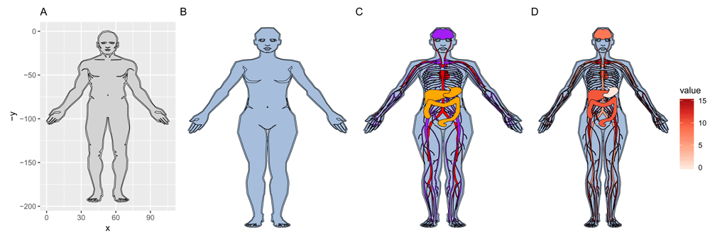
(A) Default plot generated by calling gganatogram(), (B) adding female, plotting specified organs by (C) colour, (D) value.
This section provides additional plotting examples.
To plot all tissues per organism, use the provided key files that exist per organism and sex. This displays all tissues in the order of each data frame. To change the order in which organs are layered on top of each other, reorder the data frame to have those tissues at the bottom (Figure 3).
library(gganatogram)
library(gridExtra)
hgMale <- gganatogram(data=hgMale_key, fillOutline="#a6bddb", organism="human",
 sex="male", fill="colour") + theme_void()+ coord_fixed()
hgFemale <- gganatogram(data=hgFemale_key, fillOutline="#a6bddb",
 organism="human", sex="female", fill="colour") + theme_void()+ coord_fixed()
mmMale <- gganatogram(data=mmMale_key, fillOutline="#a6bddb", organism="mouse",
 sex="male", fill="colour") + theme_void()+ coord_fixed()
mmFemale <- gganatogram(data=mmFemale_key, outline = T, fillOutline="#a6bddb",
 organism="mouse", sex="female", fill="colour") + theme_void()+ coord_fixed()
cell <- gganatogram(data=cell_key[["cell"]], outline = T, fillOutline="#a6bddb",
 organism="cell", fill="colour") + theme_void()+ coord_fixed()

lay <- rbind(c(1,2,3), c(4,5, 5))
grid.arrange(hgMale, hgFemale, mmMale, mmFemale, cell, layout_matrix=lay)

The colours are specified in the provided key data frames.
To compare anatograms, e.g. draw one specific anatogram side by side and compare values, a long table has to be created with the type column changed to the variables to compare. The following code recreates (Figure 1c).
normal <- data.frame(organ = c("heart", "leukocyte", "nerve", "brain", "liver",
"stomach", "colon"),
value = c(10, 5, 1, 2, 2, 5, 5),
type = rep(’Normal’, 7),
stringsAsFactors=F)

cancer <- data.frame(organ = c("heart", "leukocyte", "nerve", "brain", "liver",
"stomach", "colon"),
value = c(5, 5, 10, 12, 15, 5, 10),  type = rep("Cancer", 7),
stringsAsFactors=F)

compareGroups <- rbind(normal, cancer)

gganatogram(data=compareGroups, fillOutline="white", organism="human",
sex="male", fill="value") +
              theme_void() +
              facet_wrap(~type) +
              scale_fill_distiller(palette = "Reds", direction=1)
To change the order of how organs are layered on top of each other, change the order of the data frame. The organs to plot on the top layer should be on the end of the data frame (Figure 4).
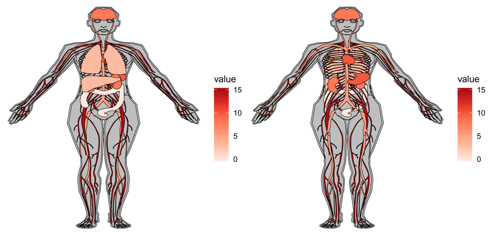
organPlot <- data.frame(organ = c("heart", "leukocyte", "nerve", "brain",
"stomach", "colon", "lung", "kidney", "liver"),
value = c(10, 5, 15, 8, 10, 0, 3, 8, 3),
stringsAsFactors=F)

A <- gganatogram(data=organPlot, fillOutline="grey", organism="human",
sex="female", fill="value") + theme_void() +
scale_fill_distiller(palette = "Reds", direction=1)

organReorder <- c("lung", "liver", "colon", "nerve", "leukocyte",
"kidney",  "stomach", "brain", "heart")
organPlotReorder <- organPlot[match(organReorder, organPlot$organ),]
B <- gganatogram(data=organPlotReorder, fillOutline="grey",
organism="human", sex="female", fill="value") + theme_void() +
scale_fill_distiller(palette = "Reds", direction=1)

grid.arrange(A, B, ncol=2)
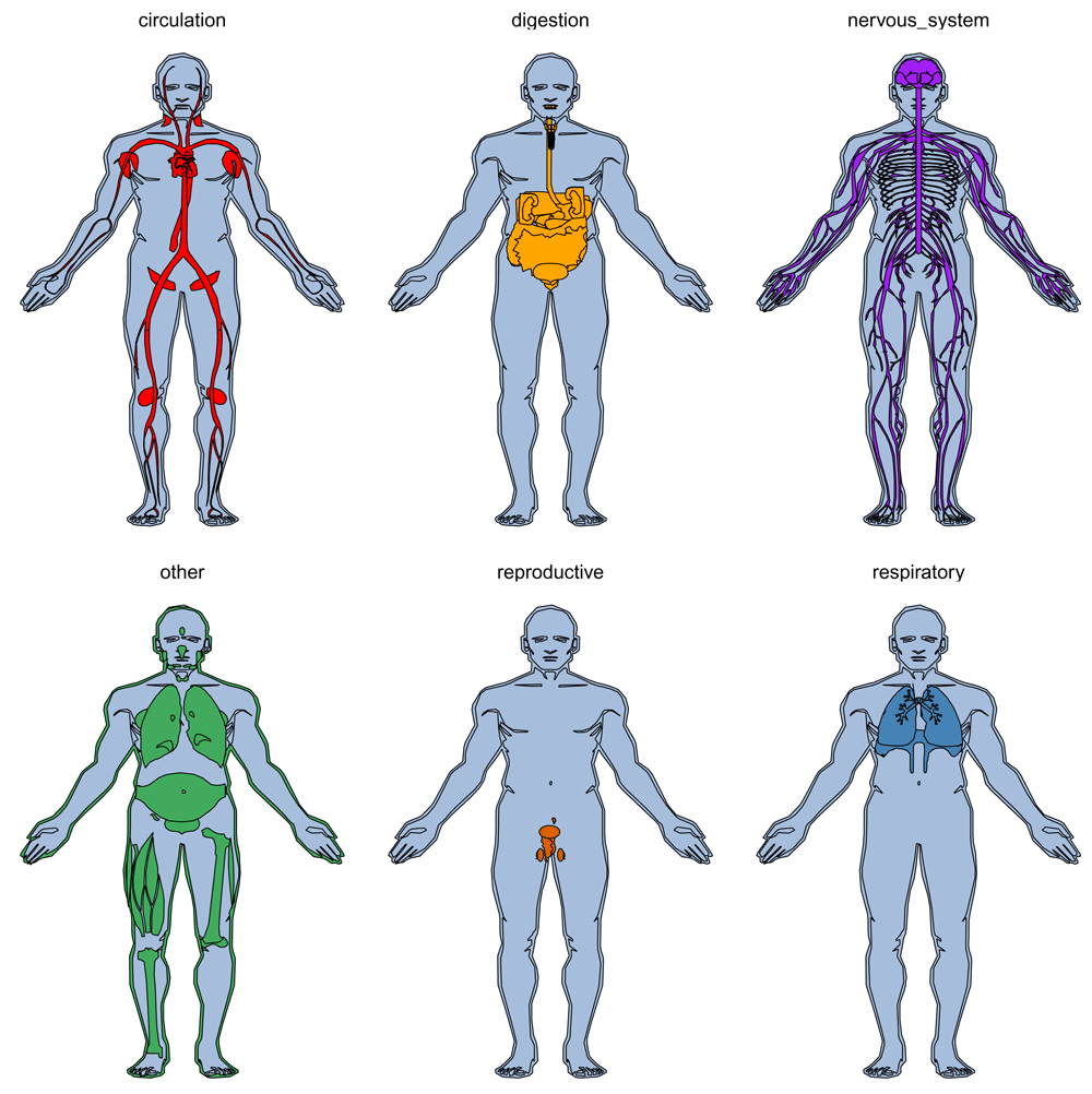
Organs can also be separated by faceting, as per standard ggplot2 using facet_wrap (Figure 5). This can help to display organs that are nested on top of each other. On the left, lungs and liver hides other plotted organs. This is corrected to the right in order to show the organs of interest.
library(gganatogram)

gganatogram(hgMale_key, fillOutline="#a6bddb", organism="human",
sex="male", fill="colour") +
theme_void() +
facet_wrap(~type)
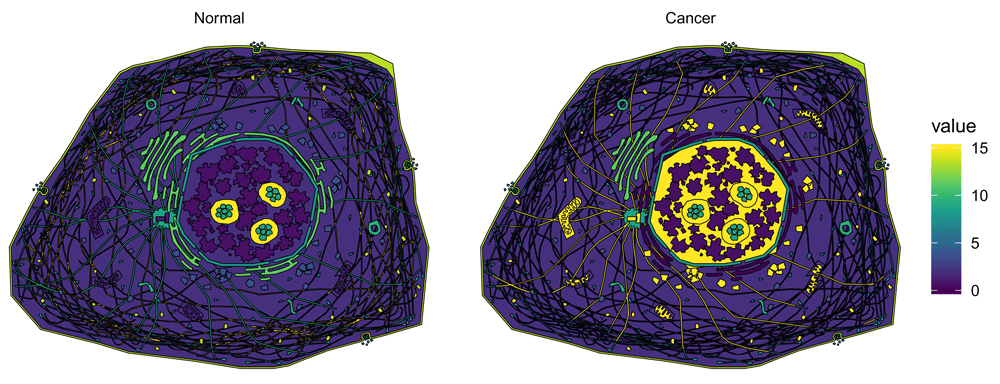
The cell diagram will be useful for users to plot cellular sub-locations of proteins, mRNAs, or other molecules(Figure 6).
library(viridis)
library(dplyr)
normal <- cell_key[["cell"]]
normal$type <- "Normal"
cancer <- cell_key[["cell"]]
cellCompartments <- c("intermediate_filaments", "endoplasmic_reticulum",
"centrosome", "microtubules", "nucleoplasm", "mitochondria", "endosomes",
"lipid_droplets")
cancer[match(cellCompartments, cancer$organ),]$value <- c(2,0, rep(15, 6))
cancer$type <- "Cancer"
plotCell <- rbind(normal,cancer)
plotCell %>%
mutate(type = factor(type, levels=c("Normal", "Cancer")))%>%
gganatogram( outline = F, organism="cell", fill="value") + theme_void() +
coord_fixed() +  scale_fill_viridis() +facet_wrap(~type)
Because I elected to use ggplot25 for the package, the user can add additional layers from standard plots. This can be useful to show highlight features, such as metastasis, location of tissue biopsies, or gene expression of specific biopsies (Figure 7).
library(gganatogram)
library(dplyr)
library(gridExtra)

biopsies <- data.frame(biopsy = c("liver", "heart", "prostate", "stomach", "brain"),
 x = c(50, 55, 53, 60, 57),
 y = c(60, 48, 95, 68, 10),
 value = c(10, 15, 5, 2, 15))
p <- hgMale_key %>%
 dplyr::filter(organ %in% c("liver", "heart", "prostate", "stomach",
 "brain")) %>%
 gganatogram(fillOutline="lightgray", organism="human", sex="male",
 fill="colour") + theme_void() +
 ggtitle("Position␣of␣biopsies")

p <- p + geom_point(data = biopsies, pch=21, size=2, aes(x =x, y = -y,
 fill = biopsy, colour= biopsy))
p2 <- ggplot(biopsies, aes(x = biopsy, y = value, fill = biopsy)) +
 geom_bar(stat= "identity", col="black") +
 theme_minimal() +
 theme(legend.position= "none")+
 theme(axis.text.x = element_text(angle = 60, hjust = 1))+
 ggtitle("Gene1␣expression")

p3 <- hgMale_key%>%
 dplyr::filter(organ %in% c("liver", "heart", "prostate", "stomach",
 "brain"))%>%
 gganatogram(fillOutline="lightgray", organism="human", sex="male",
 fill="value") + theme_void() +
 ggtitle("Value␣of␣biopsies")+
 geom_point(data = biopsies, pch=21, size=3, aes(x =x, y = -y,
 fill = value), colour="red")

lay <- rbind(c(1,2), c(1,2), c(3, NULL))
grid.arrange(p, p3, p2, layout_matrix = lay)
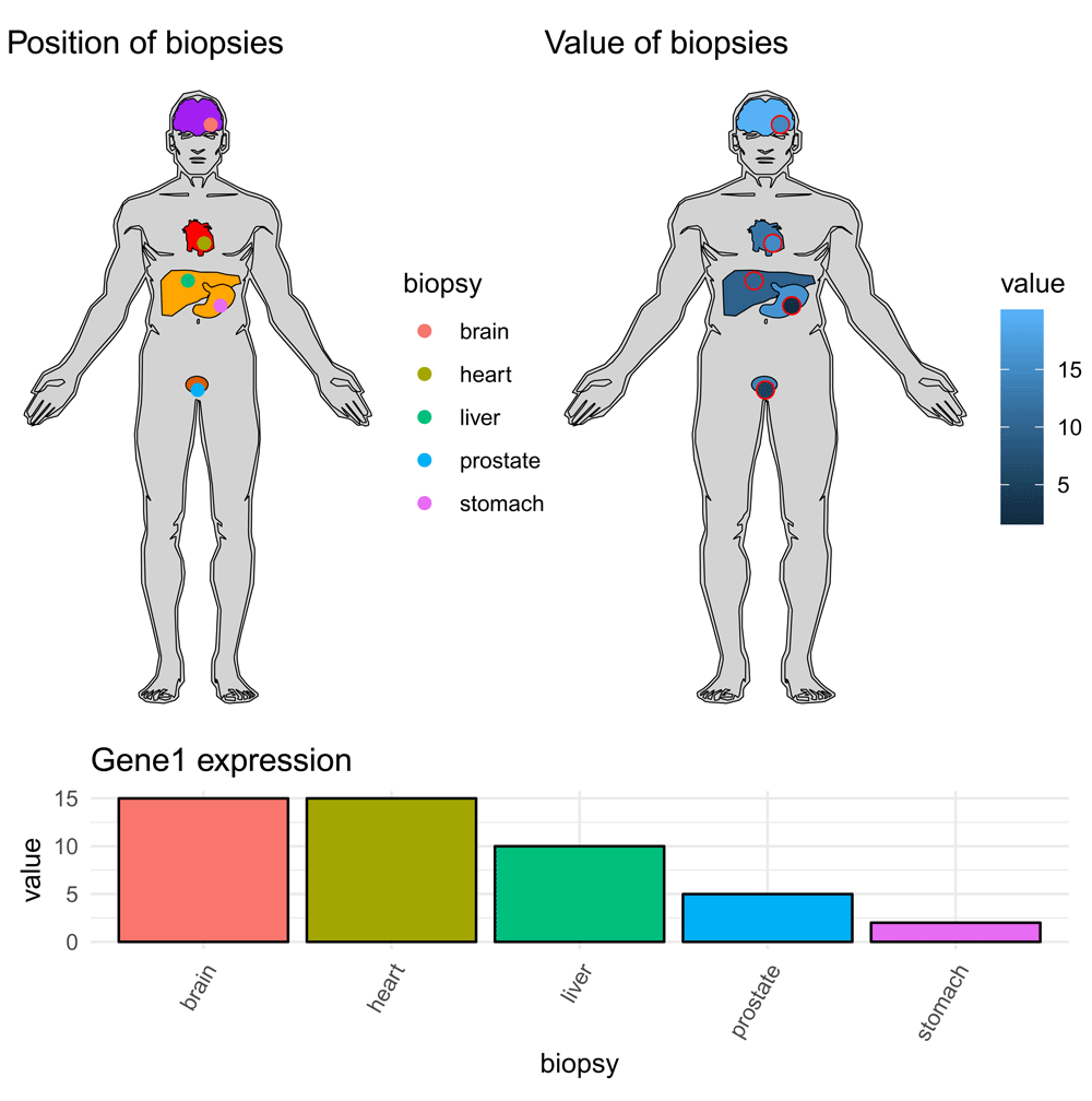
Another option is to fill both tissues and points by value (top right). Red colour around plot added for emphasis.
Other than human, mouse, and the cell diagram, gganatogram consists of 24 other organisms which can be called with the other_key (Table 1). These consists of a mix of animals and plants. Unfortunately, these organisms are not as detailed which is apparent from the lower number of features to plot (Table 1, Figure 8).
library(gridExtra)
plotList <- list()
for (organism in names(other_key)) {
    plotList[[organism]] <- gganatogram(data=other_key[[organism]], outline = T,
fillOutline="white", organism=organism, fill="colour")  +
               theme_void() +
               ggtitle(organism)+
               theme(plot.title = element_text(hjust=0.5, size=9)) +
               coord_fixed()
}

do.call(grid.arrange,  c(plotList, ncol=6))

Furthermore, gganantogram has an online shiny app which can be used without any R installation. This app let people can select organisms, colour palette, select tissues and adjust values for the tissues. This should allow for researchers without any experience in R to be able to use gganatogram. The online shiny app is located at https://jespermaag.shinyapps.io/gganatogram/.
For R users, the app can easily be run locally with the following command:
library(shiny)
runGitHub("gganatogram", "jespermaag", subdir = "shiny")
This command checks for all required packages and installs them if needed.
In summary, I have designed and implemented an R package to easily visualise anatograms based on ggplot25 and the anatograms from Expression Atlas2, which when combined create a powerful tool to plot and display tissue information.
The one line command to generate these plots should allow for users with even limited R knowledge to create informative anatograms for publications or presentations.
1. Link to version control repository containing the source code:
2. Link to development version:
3. Link to archived source code as at time of revision:
https://zenodo.org/record/14774749
Software license: GPL-2
| Views | Downloads | |
|---|---|---|
| F1000Research | - | - |
|
PubMed Central
Data from PMC are received and updated monthly.
|
- | - |
Provide sufficient details of any financial or non-financial competing interests to enable users to assess whether your comments might lead a reasonable person to question your impartiality. Consider the following examples, but note that this is not an exhaustive list:
Sign up for content alerts and receive a weekly or monthly email with all newly published articles
Already registered? Sign in
The email address should be the one you originally registered with F1000.
You registered with F1000 via Google, so we cannot reset your password.
To sign in, please click here.
If you still need help with your Google account password, please click here.
You registered with F1000 via Facebook, so we cannot reset your password.
To sign in, please click here.
If you still need help with your Facebook account password, please click here.
If your email address is registered with us, we will email you instructions to reset your password.
If you think you should have received this email but it has not arrived, please check your spam filters and/or contact for further assistance.
Comments on this article Comments (0)