Keywords
shiny, alpha diversity, beta diversity, interactive web application, R, microbiome
This article is included in the RPackage gateway.
shiny, alpha diversity, beta diversity, interactive web application, R, microbiome
Microbial survey studies (i.e. microbiome survey analysis) use alpha and beta diversity indices to estimate within and between sample diversity. Alpha diversity is the diversity in a single sample site (e.g. human gut) and beta diversity describes the difference in diversity between those sites1 (e.g. different regions of the body). With a variety of alpha and beta diversity indices available, it can be difficult to determine which index to choose.
Previously developed user-friendly HTML web applications such as Microbiome Analyst2 and Dynamic Assessment of Microbial Ecology (DAME)3 allow users to visualize alpha and beta diversity. However, these tools do not address and explore how the different alpha and beta diversity indices impact their results. In this regard, we’ve developed an interactive user-friendly application that utilizes real data to dynamically visualize different alpha or beta diversity indices (Figure 1). The user is able to see how the distribution, normalization, and datasets alter the resulting diversity indices. Ultimately, this leads to an intuitive understanding of how these different diversity indices affect the data. The majority of the tool’s development was undertaken as part of the hackseq genomics hackathon in Vancouver, BC.
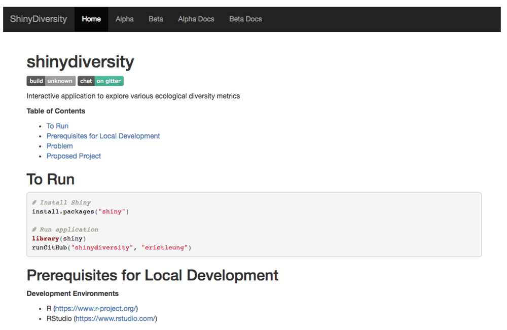
The homepage includes a brief description of the project, how to run the application locally, and the motivation behind the project.
ShinyDiversity is an interactive HTML web application that utilizes the shiny (version 1.5.5.872) R package4. The application allows users to interactively visualize both alpha and beta diversity of multiple datasets. All diversity plots are generated using the phyloseq (version 1.16.2) R package which conveniently allows for phylogenetic analysis and visualization of microbial communities and provides 44 supported distance methods5. The underlying data used for calculations is an operational taxonomic unit (OTU) abundance table. An OTU abundance table is a matrix where the rows represent the various taxa and the columns are different samples. The table values are the counts of how often those taxa are observed.
System requirements are computers that can successfully install Bioconductor (Release 3.6) and R (≥ 3.4.0).
Our application utilizes two built-in datasets from phyloseq (version 1.16.2): GlobalPatterns and esophagus. GlobalPatterns is a dataset composed of nine different sample types obtained from areas ranging from freshwater to the human gut6. The esophagus dataset is a small example dataset of three samples of a human esophageal community, with one sample from each of the three subjects7. In addition to these two datasets, we created a third dataset GP3, which is a subset of the GlobalPatterns dataset. The following R code generates this dataset.
library(phyloseq)
data("GlobalPatterns")
GP3 <- subset_samples(GlobalPatterns,  SampleType  %in%  c("Skin",  "Tongue",  "Feces"))
GP3 only includes human feces, skin, and tongue samples and was created for easier visualization of multiple sample groups.
The alpha diversity page (Figure 2) currently gives users the option to visualize up to five different alpha diversity indices: Abundance Coverage-based Estimator (ACE), Shannon, Simpson, Inverse Simpson, and Fisher. The application dynamically produces side by side comparisons of the original data and any indices selected by the user. The side by side comparison allows the user to compare and contrast their selected indices.
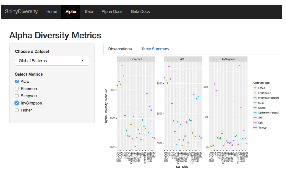
Here is an example with the GlobalPatterns dataset and three plots for alpha diversity indices: observed taxa (i.e. number of different taxa), ACE, and Inverse Simpson. The dropdown box allows the user to choose different datasets.
It was also important for users to have a top level and individual sample view of their data in order to quickly identify interesting features (Figure 3). The alpha diversity page features a heat map displaying the frequency count of each sample in the dataset. A barplot right beside the heat map shows the intensity pattern for a single sample, which provides a quick way to identify and focus on interesting samples.
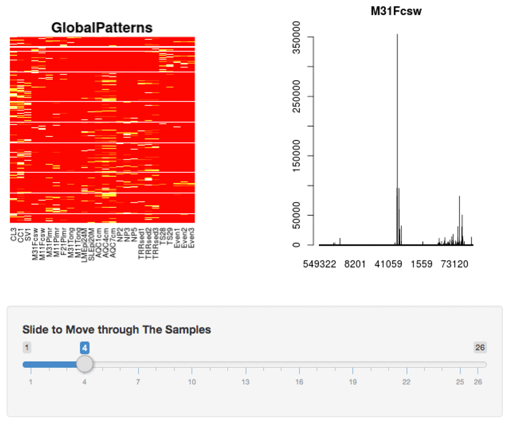
The heat map gives a cursory view of the similarities and differences between samples. The bar graph shows an individual sample where the x-axis are the taxa and the y-axis are the taxa counts. The slider allows the user to move through the different samples to change the bar plot. These plots are shown at the bottom of the alpha diversity page.
Lastly, the alpha diversity page also shows the singleton and doubleton count for each sample (Figure 4). Some of the alpha diversity indices are sensitive to singletons and doubletons, which are OTUs that appear in the data only once or twice, respectively. These rare OTUs may suggest undersampling and hence a higher, true abundance in the population8. If a OTU is found more than two times then we can be more confident that it is not a false positive.
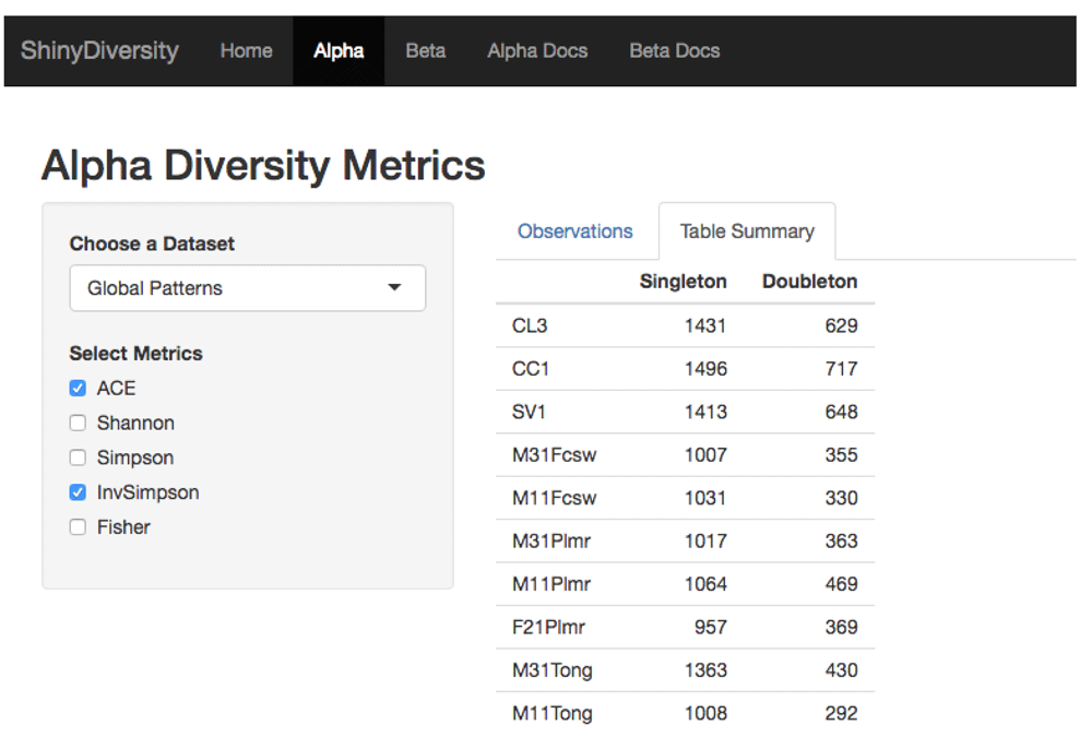
The table shows the different samples and the number of single and double taxa.
Currently, the beta diversity page (Figure 5 and Figure 6) allows users to dynamically visualize and compare two groups of the most common beta diversity indices: 1) non-phylogenetic distance indices - Euclidean, Bray-Curtis, Jaccard and 2) phylogenetic distance indices - unweighted UniFrac and weighted UniFrac. All distance indices were visualized with principal coordinate analysis (PCoA) plots, which have two principal coordinates that explain the greatest distance between samples. The dataset used to visualize beta diversity is the GP3 normalized dataset. The dataset is normalized by rarefying, a resampling method9, to the sample with the smallest library size (N = 100,187). Users have the option to rarefy the samples to any library size below 100,187. This option allows users to visualize how rarefying affects beta diversity.
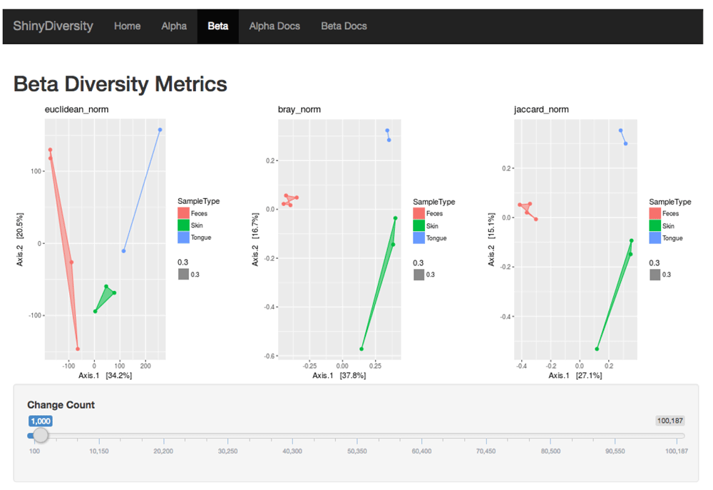
The Euclidean, Bray-Curtis, and Jaccard distances are plotted. The slider will rarefy the GP3 dataset to the specified library size.
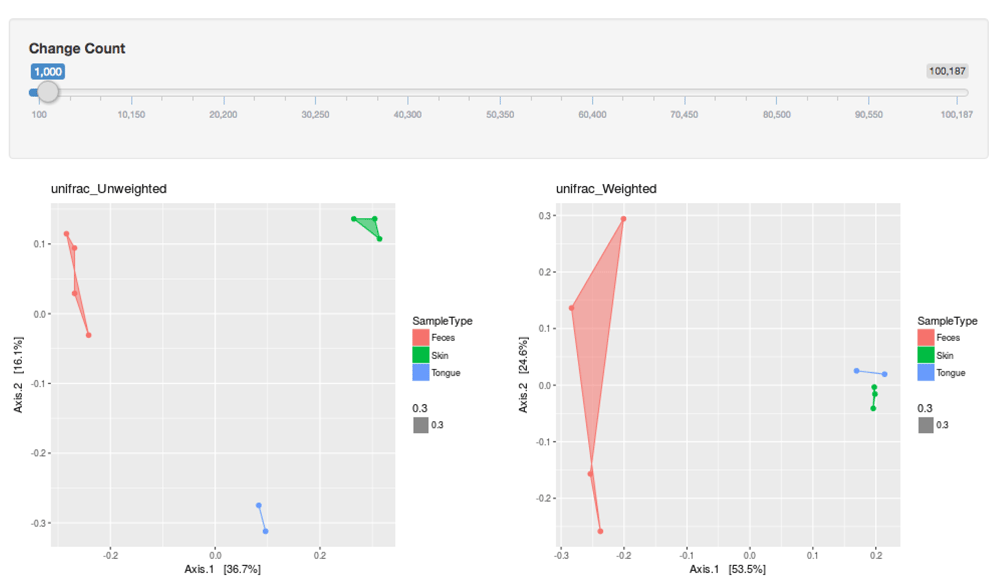
The indices plotted are the unweighted UniFrac and weighted UniFrac.
Ecologists have spent decades developing these diversity indices, each having their own assumptions and use cases. Current software tools make it easy to calculate many of these indices without making the strengths and weaknesses of each clear. ShinyDiversity facilitates an exploration and understanding of alpha and beta diversity indices on microbiome data. This understanding is developed by enabling users to compare and contrast the visual differences in the plotted indices on their data.
Our software is the first step in making these indices more understandable. Future work includes allowing users to input an abundance table for both the genus and OTU taxa level, use other normalization techniques (i.e. scaling), and select the degree of sparsity and dispersion. Additionally, we plan to include more diversity indices and options for users to change the distribution of selected samples. This will enable users to observe how each diversity index is influenced by sample distribution, providing a deeper understanding of diversity indices.
ShinyDiversity website https://erictleung.shinyapps.io/shinydiversity
Latest source code: https://github.com/erictleung/shinydiversity
Archived source code as at time of publication: http://dx.doi.org/10.5281/zenodo.1188304 (Leung et al., 2018)
Software license: GNU General Public License (GPL) Version 3.0
| Views | Downloads | |
|---|---|---|
| F1000Research | - | - |
|
PubMed Central
Data from PMC are received and updated monthly.
|
- | - |
Provide sufficient details of any financial or non-financial competing interests to enable users to assess whether your comments might lead a reasonable person to question your impartiality. Consider the following examples, but note that this is not an exhaustive list:
Sign up for content alerts and receive a weekly or monthly email with all newly published articles
Already registered? Sign in
The email address should be the one you originally registered with F1000.
You registered with F1000 via Google, so we cannot reset your password.
To sign in, please click here.
If you still need help with your Google account password, please click here.
You registered with F1000 via Facebook, so we cannot reset your password.
To sign in, please click here.
If you still need help with your Facebook account password, please click here.
If your email address is registered with us, we will email you instructions to reset your password.
If you think you should have received this email but it has not arrived, please check your spam filters and/or contact for further assistance.
and that entering phyloseq and shiny in google brings you to the ... Continue reading It might be worth noting that this version is very close to Shiny-phyloseq which was published in Bioinformatics https://www.ncbi.nlm.nih.gov/pmc/articles/PMC4287943/
and that entering phyloseq and shiny in google brings you to the page:
http://joey711.github.io/shiny-phyloseq/
In the academic setting it is often useful to reference previous work and compare new tools to existing ones.
and that entering phyloseq and shiny in google brings you to the page:
http://joey711.github.io/shiny-phyloseq/
In the academic setting it is often useful to reference previous work and compare new tools to existing ones.