Keywords
time-course gene expression data, clustering, differential expression, workflow
This article is included in the RPackage gateway.
This article is included in the Bioconductor gateway.
time-course gene expression data, clustering, differential expression, workflow
Gene expression studies provide simultaneous quantification of the level of mRNA from all genes in a sample. High-throughput studies of gene expression have a long history, starting with microarray technologies in the 1990s through to single-cell technologies. While many expression studies are designed to compare the gene expression between distinct groups, there is also a long history of time-course expression studies. Such studies compare gene expression across time by measuring mRNA levels from samples collected at different timepoints1. Such time-course studies can vary from measuring a few distinct timepoints, to sampling ten to 20 time points. These longer time series are particularly interesting for investigating development over time. More recently, a new variety of time course studies have come from single-cell sequencing experiments (Habib et al., 2016; Shalek et al., 2014; Trapnell et al., 2014) which can sequence single cells at different stages of development; in this case, the time point is the stage of the cell in the process of development -- a value that is not know but estimated from the data as its "pseudo-time."
While there are many methods that have been proposed for discrete aspects of time course data, the entire workflow for analysis of such data remains difficult, particularly for long, developmental time series. Most methods proposed for time course data are concerned with detecting genes that are changing over time (differential expression analysis), examples being edge (Storey et al., 2005), functional component analysis based models (Wu & Wu, 2013), time-course permutation tests (Park et al., 2003a), and multiple testing strategies to combine single time point differential expression analysis (Wenguang & Zhi, 2011). However, with long time course datasets, particularly in developmental systems, a massive number of genes will show some change (Varoquaux et al., 2019). For example, in a study of mice lung tissues infected with influenza that we consider in this workflow, we show that over 50% of genes are changing over time. The task in these settings is often not to detect changes in genes, but to categorize them into biologically interpretable patterns.
We present here a workflow for such an analysis that consists of 4 main parts (Figure 1):
Quality control and normalization;
Identification of genes that are differentially expressed;
Clustering of genes into distinct temporal patterns;
Biological interpretation of the clusters.

This workflow represents an integration of both novel implementations of previously established methods and new methodologies for the settings of developmental time series. It relies on several standard packages for analysing gene expression data, some specific for time-course data, others broadly used by the community. We provide the various steps of the workflow as functions in a R package called moanin.
moanin and timecoursedata are available from bioconductor, and can be installed using the install function in the package BiocManager, along with the corresponding package that contains time course datasets we will use:
library (BiocManager)
# Need to use the development version for now.
BiocManager::install(version="devel")
BiocManager::valid()

BiocManager::install("timecoursedata")
BiocManager::install("moanin")
The following additional packages are needed for this workflow:
# From Github
library(moanin)
library(timecoursedata)

# From CRAN
library(NMF)
library(ggfortify)

# From Bioconductor
library(topGO)
library(biomaRt)
library(KEGGprofile)
library(BiocWorkflowTools) #Needed for compiling the .Rmd script
If Bioconductor is installed, the CRAN and Bioconductor packages above can be installed via
BiocManager::install(
     c("NMF", "ggfortify", "topGO", "biomaRt",
       "KEGGprofile", "BiocWorkflowTools", "timecoursedata", ))
This workflow is illustrated using data from a micro-array time-course experiment, exposing mice to three different strains of influenza, and collecting lung tissue during 14 time-points after infection (0, 3, 6, 9, 12, 18, 24, 30, 36, 48, 60 hours, then 3, 5, and 7 days later) (Shoemaker et al., 2015). The three strains of influenza used in the study are (1) a low pathogenicity seasonal H1N1 influenza virus (A/Kawasaki/UTK4/2009 [H1N1]), a mildly pathogenic virus from the 2009 pandemic season (A/California/04/2009 [H1N1]), and a highly pathogenic H5N1 avian influenza virus (A/Vietnam/1203/2004 [H5N1]. Mice were injected with 105 PFU of each virus. An additional 42 mice were injected with a lower dose of the Vietnam avian influenza virus (103 PFU).
By combining gene expression time-course data with virus growth data, the authors show that the inflammatory response of lung tissue is gated until a threshold of the virus concentration is exceeded in the lung. Once this threshold is exceeded, a strong inflammatory and cytokine production occurs. These results provide evidence that the pathology response is non-linearly regulated by virus concentration.
While we showcase this pipeline on micro-array data, Varoquaux et al. (2019) leverages a similar set of steps to analyse RNA-seq data of the lifetime transcriptomic response of the crop S. bicolor to drought.
First let's load the data. The package moanin contains the normalized data and metadata of (Shoemaker et al., 2015).
# Now load in the metadata
data(shoemaker2015)
meta = shoemaker2015$meta
data = shoemaker2015$data
The meta data contains information about the treatment group, the replicate, and the timepoint for each observation (see Table 1).
| Group | Replicate | Timepoint | ||
|---|---|---|---|---|
| GSM1557140 | 0 | K | 1 | 0 |
| GSM1557141 | 1 | K | 2 | 0 |
| GSM1557142 | 2 | K | 3 | 0 |
| GSM1557143 | 3 | K | 1 | 12 |
| GSM1557144 | 4 | K | 2 | 12 |
| GSM1557145 | 5 | K | 3 | 12 |
Before we dive into the exploratory analysis and quality control, let us define color schemes for our data that we will use across the whole analysis. We define color schemes for groups and time points as named vectors. We also define a series of markers (or plotting symbols) to distinguish replicate samples in scatter plots. We also reorder the factor Group which describes the treatments so that the treatments are ordered from low to high pathogeny (with Control being first).
group_colors = c(
     "M"="dodgerblue4",
     "K"="gold",
     "C"="orange",
     "VH"="red4",
     "VL"="red2")
time_colors = grDevices::rainbow(15) [1:14]
names(time_colors) = c(0, 3, 6, 9,12, 18, 24, 30, 36, 48, 60, 72, 120, 168)

# Combine all color schemes into one named lists.
ann_colors = list(
     Timepoint=time_colors,
     Group=group_colors
     )

replicate_markers = c(15, 17, 19)
names(replicate_markers) = c(1, 2, 3)
ann_markers = list(
     Replicate=replicate_markers)


# Reorder the conditions such that:
#   - Control is before any influenza treatment
#   - Each treatment is ordered from low to high pathogeny
meta$Group = factor(meta$Group, levels(meta$Group)[c(3, 2, 1, 5, 4)])
The first steps of analysis of gene expression data is always to do normalization and quality control checks of the data. However, in what follows, we do not show the steps for normalization, as these are specific to the platform (microarray); the code for the normalization is available from GitHub (Abrams et al., 2019; Park et al., 2003b).
Instead, we focus on common steps for exploratory analysis of the data, including for the purpose of quality control. These steps are not specific to time course data, but could be applied for any gene expression analysis. For this reason, we will not print the detailed code that is needed for this part of the analysis; interested readers can examine the rmarkdown code that accompanies this workflow.
Typically, two quality control and exploratory analysis steps are performed before and after normalization: (1) low dimensionality embedding of the samples; (2) correlation plots between each sample. In both cases, we expect a strong biological signal, while replicate samples should be strongly clustered or correlated with one another.
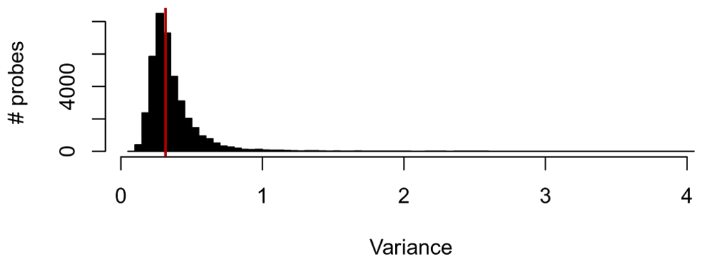
Before performing any additional exploratory analysis, let us only keep highly variable genes: for this step, we keep only the top 50% most variable genes. In Figure 2, we plot the distribution of variance across all genes.
variance_cutoff = 0.5
# Filter genes by median absolute deviation (mad)
variance_per_genes = apply(data, 1, mad)
min_variance = quantile(variance_per_genes, c(variance_cutoff))
variance_filtered_data = data[variance_per_genes > min_variance,]
Let us first perform the Principal Component Analysis (PCA) analysis. Here, we perform a PCA of rank 3 of the centered and scaled gene expression data.
In Figure 3, we visualize the data by plotting the Principal Components (PC), with samples colored by either its condition (top row) or its sampling time (bottom row) and each replicate a different symbol. We can see a large difference in later time points.
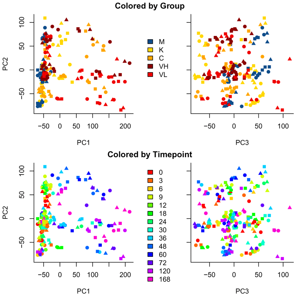
Samples are colored by condition (top row) and sampling time (bottom row).
We also plot in Figure 4 the Pearson correlation between each sample as a heatmap diagram (using the function aheatmap in NMF). We order the samples by their group (treatment) and timepoint (the time of sampling).
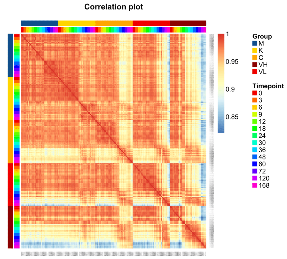
We can already see interesting patterns emerging from the correlation plot. First, the cross-correlation amongst samples taken from the control mice is higher than the cross correlation amongst the rest of the treatments. Second, the influenza-infected mice mildly react until time point 36. Third, the less pathogenic the strain is, the closer the samples are to the control condition. Fourth, the Vietnam samples at time point 120 and 168 are the one that are the most different from control samples.
The next step in a gene expression analysis is typically to run a differential expression analysis, generally to find genes different between different conditions. For time-course data, there are two different approaches for determining differentially expressed genes,
1) Per-time point analysis, where we consider each time point a different condition and determine what genes are changing between specific time points, or between conditions at a single time-point.
2) Global analysis, where we consider the expression pattern globally over time, and consider what genes have either different patterns between conditions or a changing pattern (i.e. non-constant) over time. A common approach first step is to fit a spline model to each gene (Storey et al., 2005), and then use that spline model to test for different kinds of differential expression across time.
The per-time point analysis uses classical differential expression approaches and is often the approach advocated when dealing with small time-course datasets, where there are only a few time points (Love et al., 2014; Ritchie et al., 2015; Robinson et al., 2010). For long time-course datasets, however, a separate test for each time point results in creating many different tests, for example one for every time point, the results of which are difficult to integrate. We find in practice that the global analysis simplifies analysis and interpretation of longer time courses data, with per-time point analysis reserved for particularly interesting comparisons of individual time-points.
Time course data can either be on a single condition (to identify genes changing over time) or on multiple conditions (such as the influenza dataset we are considering), which will alter slightly the types of questions we are interested in.
DE analysis in moanin. Our package moanin provides functionality for performing both of these types of approaches, though our focus is on the global approach, specifically by fitting spline models to the genes.
In both situations, we first need to set up an object (a moanin object) to hold the meta data, as well as information for fitting the spline model (formula, number of degrees of freedom of the splines, ...). The moanin object will contain information used throughout this analysis, in particular the condition and timepoints of each sample and the basis matrix for fitting splines models.
We start by creating the moanin object using the create_moanin_model function. We need to provide two things to the function: a data.frame with the metadata, and the number of degrees of freedom of the splines to be used in the functional modeling. The metadata data.frame object should contain at least two columns: one named Group, containing the treatment effect, and a second one named Timepoint containing the timepoint information (see Table 1).
We create a moanin object for our data:
moanin_model = create_moanin_model(data=data, meta=meta,
    degrees_of_freedom=6)
The main operation of the create_moanin_model function, in addition to holding the necessary meta data of the samples, is to create a basis matrix for the splines fit. This matrix gives the evaluation of all of the spline basis functions for each sample (as such, replicate samples will have the same values). By default, create_moanin_model will create the spline basis functions which will lead to a different spline fit for every group (as defined by the Group variable in the meta data.frame). This is done by the following R formula syntax:
formula = ~Group:ns(Timepoint, df=degrees_of_fredoom) + Group + 0.
Alternatively, the user can provide a formula of their own, or simply provide the basis matrix themselves.
We can see this information when we print the object:
show(moanin_model)
## Moanin object on 209 samples containing the following information:
## Group variable given by 'Group' with the following levels:
##  M  K  C VL VH
## 42 42 42 42 41
## Time variable given by 'Timepoint'
## Basis matrix with 35 basis_matrix functions
## Basis matrix was constructed with the following spline_formula
## ~Group + Group:splines::ns(Timepoint, df = 6) + 0
##
## Information about the data (a SummarizedExperiment object):
## class: SummarizedExperiment
## dim: 39544 209
## metadata(0):
## assays(1): ''
## rownames(39544): NM_009912 NM_008725 ... NM_010201.1 AK078781
## rowData names(0):
## colnames(209): GSM1557140 GSM1557141 ... GSM1557347 GSM1557348
## colData names(5): '' Group Replicate Timepoint WeeklyGroup
The moanin class extends the SummarizedExperiment class of Bioconductor, so that the data as well as the meta data and our spline information are all held in one object. This means that the object can be subsetted just like the data matrix, and the corresponding meta data and basis function evaluations will be similarly subsetted:
dim(moanin_model)
## [1] 39544 209moanin_model[1:10,1:3]
## Moanin object on 3 samples containing the following information:
## Group variable given by 'Group' with the following levels:
##  M  K  C VL VH
##  0  3  0  0  0
## Time variable given by 'Timepoint'
## Basis matrix with 35 basis_matrix functions
## Basis matrix was constructed with the following spline_formula
## ~Group + Group:splines::ns(Timepoint, df = 6) + 0
##
## Information about the data (a SummarizedExperiment object):
## class: SummarizedExperiment
## dim: 10 3
## metadata(0):
## assays(1): ''
## rownames(10): NM_009912 NM_008725 ... NM_013782 NM_028622
## rowData names(0):
## colnames(3): GSM1557140 GSM1557141 GSM1557142
## colData names(5): '' Group Replicate Timepoint WeeklyGroupmoanin provides a simple interface to perform a timepoint by timepoint differential expression analysis. Comparison between groups is traditionally done by defining the group comparisons (called contrasts in linear models) as a linear combination of the coefficients of the model. Comparing groups within each timepoint can create many contrasts, and thus moanin provides functionality to create these contrasts in an automatic way, and then calls limma (Ritchie et al., 2015) on the set of contrasts provided. By default, moanin expects RNA-Seq gene counts, and will estimate voom weights, so for microarray data we will set use_voom_weights=FALSE.
Here, we show an example where we create contrasts that will be the difference between the control mouse ("M") and the mouse infected with the high dose of the influenza strain A/Vietnam/1203/04 (H5N1) ("VL") for each time point (but the function works with any form contrasts (Ritchie et al., 2015)).
First, create the contrasts for all timepoints between the two groups of interest:
# Define contrasts
contrasts = create_timepoints_contrasts(moanin_model,"M", "VL")
This creates a character vector of contrasts to be tested, one for each timepoint, in the format required by limma:
## [1] "M.0-VL.0" "M.3-VL.3" "M.6-VL.6" "M.9-VL.9" "M.12-VL.12"
Then moanin will run the differential expression analysis on all of those timepoints jointly using the function DE_timepoints.
weekly_de_analysis = DE_timepoints(moanin_model, contrasts,
     use_voom_weights=FALSE)
The output is a table of results, where each row corresponds to a gene and the columns correspond to the p-value (pval), log-fold change (lfc) and adjusted p-value (qval) of the sets of contrasts; the order of the genes in the table is the same as the input data. Table 2 contains the results for the first timepoint (i.e. first three columns of the output) and the first ten genes.
Shown are the three columns giving results corresponding to timepoint 0 (the first time point).
Additional timepoints are in the additional columns of the output.
We will repeat this, comparing each of the remaining three treatments to the control ("M") (code not printed here, as it is a replicate of the above, see accompanying rmarkdown document).
In Figure 5, we show the distribution of genes found differentially expressed per week between control and each of the influenza strains. Such an analysis can demonstrate some general trends, with clearly more genes being differentially expressed at later time points, and the Vietnam high-dose showing perhaps an earlier onset than the low-dose.
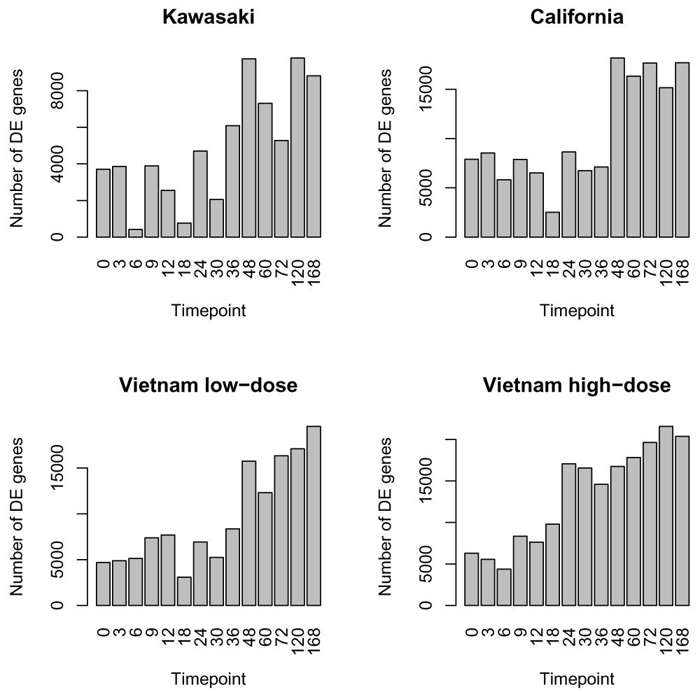
However, the distribution of the number of genes found differentially expressed by considering each time-point independently highlights the challenges of such approach. We can see that some timepoints have many less genes found significantly differentially expressed (e.g. timepoint 6H and 18H of the Kawasaki strain). While there may be biological differences at those time points for some genes, it seems unlikely that the large majority of genes differentially expressed at timepoint 3H stop being differentially expressed at 6H and then jump back to being differentially expressed at 9H. A more likely explanation is that there are some technical or biological artifacts about the samples for 6H that are creating higher variation and thus less ability to detect significance.
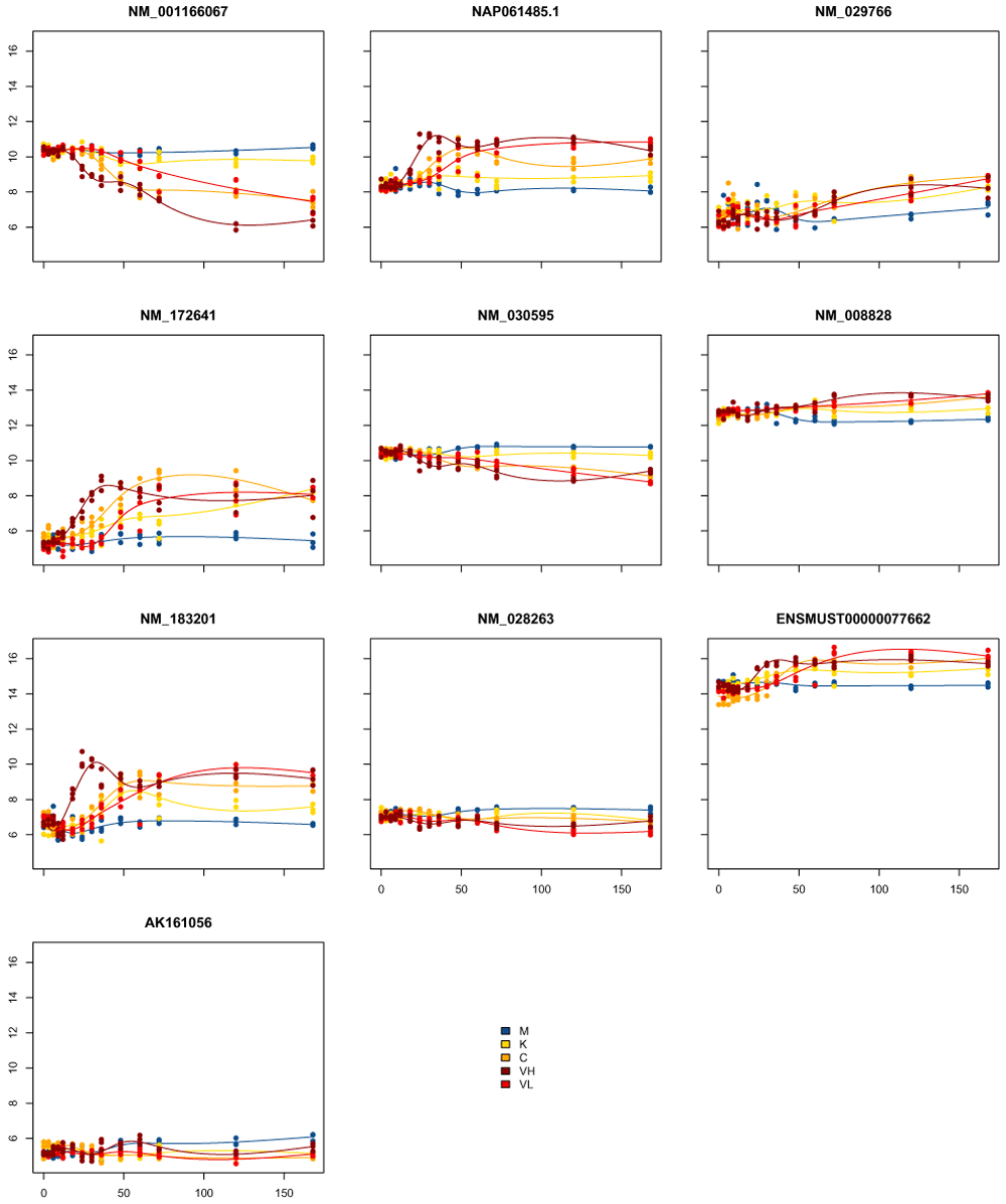
Another difficulty with such an approach is making sense of the general temporal structure for any particular gene, as different genes will have different combinations of timepoints DE. For the comparison of the Kawasaki strain to the control, for example, there are 26534 genes found DE in some timepoints, and there are 1590 different combinations of timepoints for which they are DE. Some of these make sense, such as DE in timepoints 48H–168H (509 genes), but many are very fragmentary. For example there are 330 genes which are DE in timepoints 48, 60, 120, 168H, but not in the 72H. Many of these genes are likely to have not made the cutoff for significance in 72H, but don't show real differences in the overall trend between 48H-168H. In Figure 6, we show the plots of the first 10 such genes. We can see that most genes show overall changes across the timecourse, but have either overall increased variability at 72H often due to one single replicate behaving as an outlier: This increased variability results at 72H in a lack of significance for this timepoint despite showing an overall different expression pattern.
As a summary, classic differential expression methods are appropriate for unordered treatments, but fail to make use of the temporal structure of the data.
To leverage this temporal structure, Storey et al. (2005) proposed to model each gene in a time-course micro-array with a splines function, and to use a log-ratio likelihood test to detect differentially expressed genes.
moanin extends this idea by not only fitting a splines function for each gene, but also providing functionality to compare time course data between different treatment conditions, using a similar mechanism of contrasts -- only now the contrasts are differences between the estimated mean functions. This is done with the function DE_timecourse, which takes a similar input that of DE_timepoints, only now it will fit spline functions for each gene and test the entire mean function (and unlike DE_timepoints, therefore does not require the extra step of expanding the contrasts into contrasts for individual timepoints).
# Differential expression analysis
timecourse_contrasts = c("M-K", "M-C", "M-VL", "M-VH")

# The function takes the data (data.frame or named matrix), the meta data
# (data.frame containing a timepoint and group column, the first corresponding
# to the time-course information, the latter corresponding to the
# treatment).
DE_results = DE_timecourse( moanin_model, timecourse_contrasts,
    use_voom_weights=FALSE)
The output from DE_timecourse is a matrix of (raw) p-values and Benjamini-Hochberg corrected q-values for each comparison.
names(DE_results)

## [1] "M-K_pval"  "M-K_qval"  "M-C_pval"  "M-C_qval"  "M-VL_pval" "M-VL_qval"
## [7] "M-VH_pval" "M-VH_qval"
For convenience we will separate these into two matrices.
pval_columns = colnames(DE_results)[
     grepl("pval", colnames(DE_results))]
qval_columns = colnames(DE_results)[
     grepl("qval", colnames(DE_results))]
pvalues = DE_results[, pval_columns]
qvalues = DE_results[, qval_columns]
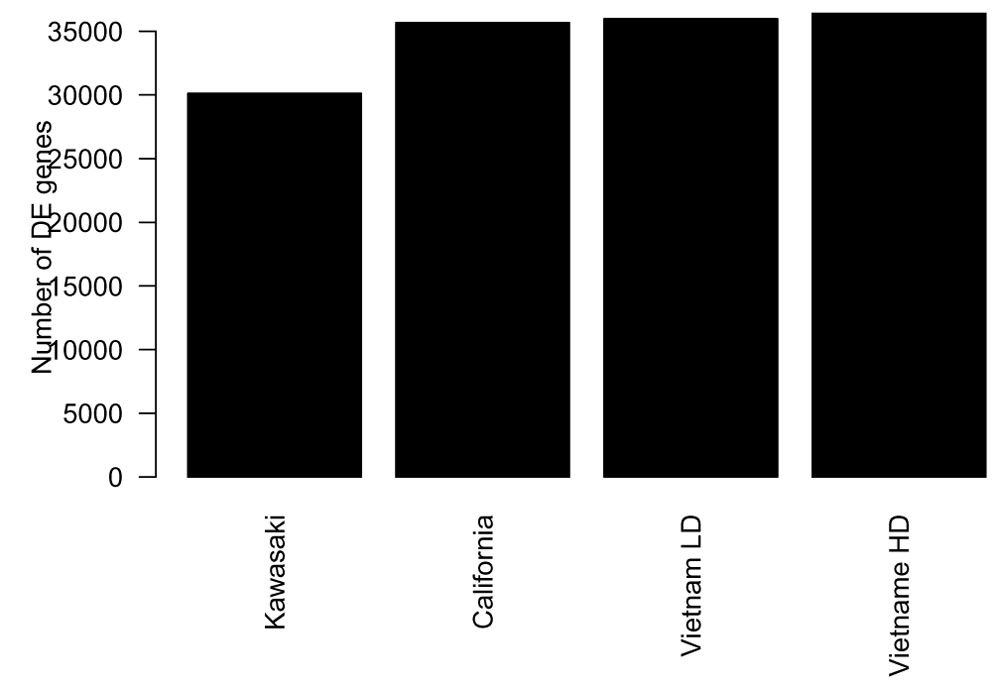
The number of genes found differentially expressed ranges from around 12000 to 29000 depending on the strain and dosage of influenza virus given to the mice (Figure 7). This corresponds to between 30% to 70% of the genes found differentially expressed in this time-course experiment.
The next step in a classical differential expression analysis is typically to assess the effect of the treatment by calculating for each gene the log fold change in the gene expression between the treatment and control.
Computing the log fold change on a time-course experiment is not trivial: one can be interested in the average log-fold change across time, or the cumulative log-fold change. Sometimes a gene can be over-expressed at the beginning of the time-course data, and then under-expressed at the end of the experiment. As a result, moanin provides a number of possible ways to compute the log fold change across the whole time-course. This is done via the function estimate_log_fold_change which takes as arguments the data, the moanin object, the contrasts to evaluate, and the method to use to estimate the log-fold change.
Individual timepoints. The first method ("timely") gives a simple interface to compute the log-fold change for each individual timepoints (see Table 3 for a sample output).
log_fold_change_timepoints = estimate_log_fold_change(
moanin_model, timecourse_contrasts,  method="timely")
This matrix can then be used to visualize the log-fold change for each contrast per timepoint.
Cumulative Effect. Sometimes, a single value per gene for each contrast is more useful, and estimate_log_fold_change used above provides several options for this as well. See Table 4 for all the possible ways to compute log-fold change values with estimate_log_fold_change (including timely discussed above).
The method "timecourse" tries to capture the overall strength and direction of the response in the following way: we leverage the timepoint by timepoint log-fold change lfc(t), and apply the following formula:
Note, however, that when a gene is not consistently up- or down-regulated the estimation of the direction will not accurately represent the changes observed.
We demonstrate several of these methods on our data.
log_fold_change_timecourse = estimate_log_fold_change(
     moanin_model, timecourse_contrasts,  method="timecourse")

log_fold_change_sum = estimate_log_fold_change(
     moanin_model, timecourse_contrasts,  method="sum")

log_fold_change_max = estimate_log_fold_change(
     moanin_model, timecourse_contrasts, method="max")

log_fold_change_min = estimate_log_fold_change(
     moanin_model, timecourse_contrasts, method="min")
The returning object is a matrix, where each row corresponds to a gene, each column to a contrast, and each entry to the log-fold change for this pair of contrast and gene (see Table 5).
| M-K | M-C | M-VL | M-VH | |
|---|---|---|---|---|
| NM_009912 | -0.4091 | -0.7525 | -1.025 | -1.42 |
| NM_008725 | 1.575 | 2.008 | 2.543 | 2.618 |
| NM_007473 | -0.4158 | -0.3346 | -0.2127 | 0.3643 |
| ENSMUST00000094955 | -0.1126 | -0.3763 | -0.1558 | -0.3091 |
| NM_001042489 | -0.2341 | -0.4104 | 0.3085 | 0.4301 |
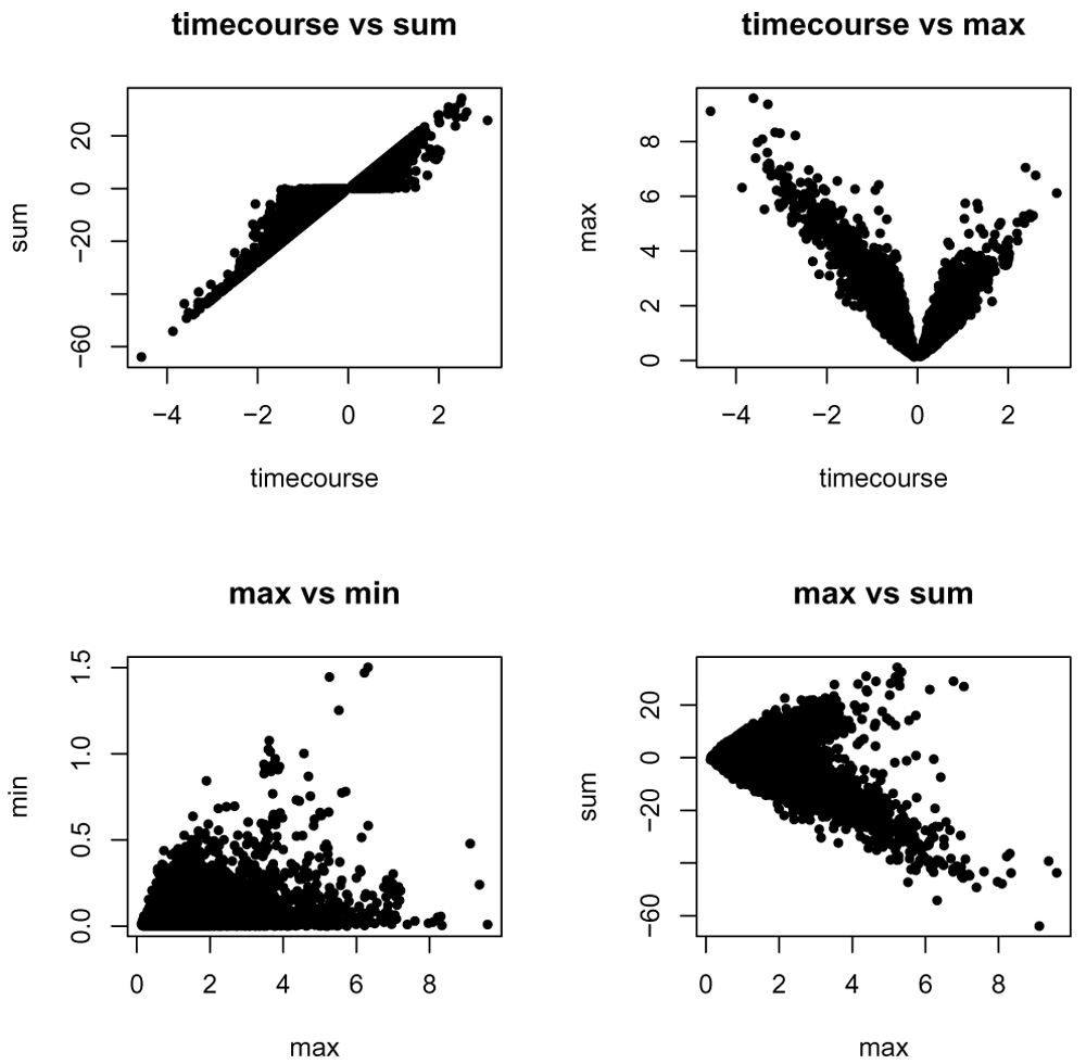
In Figure 8, we plot the log-fold change summary of each of these methods against each other. We see that each method captures different elements of the time-course data, for example, overall change versus the largest change.
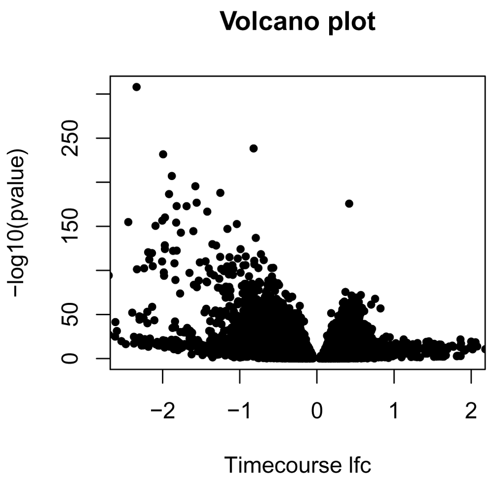
With a single measure of log-fold change and the p-value, we can now look at the traditional volcano plot. In Figure 9, we show the example of a volcano plot for the comparison of the control to the Kawasaki strain, using the "timecourse" method of calculating log fold change.
pvalue = DE_results[, "M-K_pval"]
names(pvalue) = row.names(DE_results)
lfc_timecourse = log_fold_change_timecourse[, "M-K"]
names(lfc_timecourse) = row.names(log_fold_change_timecourse)

plot(lfc_timecourse, -log10(pvalue), pch=20, main="Volcano plot",
      xlim=c(-2.5, 2), xlab="Timecourse lfc")
The package moanin also provides a simple utility function (plot_splines_data) to visualize gene time-course data from different conditions. In Figure 10, we plot the 10 genes with the smallest p-values.
top_DE_genes_pval = names(sort(pvalue)[1:10])
plot_splines_data(moanin_model,subset_data=top_DE_genes_pval,
    colors=ann_colors$Group, smooth=TRUE,
    mar=c(1.5,2.5,2,0.1))
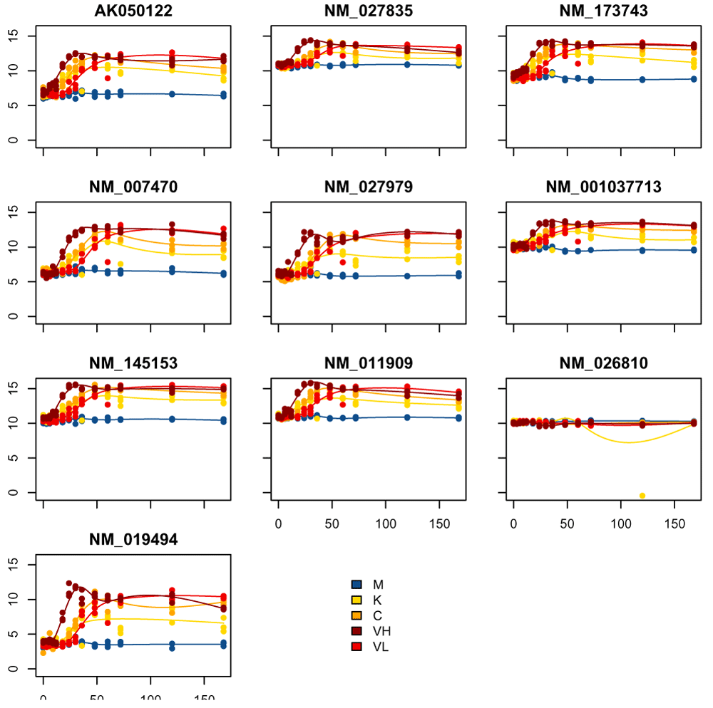
For each gene, the individual data points are plotted against time and color coded by their condition. Further, a fitted spline function for each group is plotted to aid in comparing global trends across conditions.
Figure 11, we visualize the genes with the largest absolute timecourse log-fold change.
top_DE_genes_lfc = names(
    sort(abs(lfc_timecourse),
     decreasing=TRUE)[1:10])
plot_splines_data(moanin_model, subset_data=top_DE_genes_lfc,
    colors=ann_colors$Group, smooth=TRUE,
    mar=c(1.5,2.5,2,0.1))
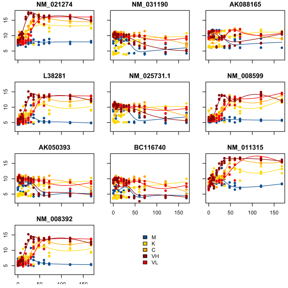
In examining these visualizations, we can see that genes often follow similar patterns of expression, although on a different scale for each gene. We can leverage this observation to cluster the genes into groups of similar patterns of transcriptomic response.
The very large number of genes found differentially expressed impairs any interpretation one would attempt: with 70% of the genome found differentially expressed, all pathways are affected by the treatment. Hence the next step of the workflow to cluster gene expression according to their dynamical response to the treatment.
Before clustering the genes, we first reduce the set of genes of interest to genes that (1) are found to be significantly differentially expressed; (2) have a large-fold change between conditions. Reducing the set of genes on which to perform the clustering allows the estimation of the centroids of the clusters with more stability.
To do this, we first aggregate all p-values obtained during the time-course differential expression step in a single p-value using Fisher's method (Fisher, 1925) (pvalues_fisher_method). Next we select all the genes which have a Fisher-adjusted p-value below 0.05 and a log-fold change of at least two for at least one condition and one time-point.
# Then rank by fisher's p-value and take max the number of genes of interest
# Filter out q-values for the pvalues table
fishers_pval = pvalues_fisher_method(pvalues)
qvalues = apply(pvalues, 2, p.adjust)
fishers_qval = p.adjust(fishers_pval)

genes_to_keep = row.names(
    log_fold_change_max[
    (rowSums(log_fold_change_max > 2) > 0) &
    (fishers_qval < 0.05), ])
# Keep the data corresponding to the genes of interest in another variable.
# by subsetting the `moanin_model`, which contains the data.
de_moanin_model = moanin_model[genes_to_keep,]
After filtering, we are left with 5521 genes. We can then apply a clustering routine. As observed by looking at genes found differentially expressed, many genes share a similar gene expression pattern, but on different scales.
We thus propose the following adaptation of k-means:
1. Splines estimation: for each gene, fit the splines function with the basis of your choice (as contained in the moanin object).
2. Rescaling splines: for each gene, rescale the estimated splines function such that the values are bounded between 0 and 1 and thus comparable between genes.
3. K-means: apply k-means on the rescaled fitted values of the splines to estimate the cluster centroids.
The rescaling of the splines aims at bringing each gene onto a comparable scale, akin to the centering and scaling performed on gene expression typically done on gene expression studies without a time component.
These clustering steps are performed by the splines_kmeans function in moanin. For now, we will set the number of clusters to be 8, though we will return to the question of picking the best number of clusters below.
# First fit the kmeans clusters
kmeans_clusters = splines_kmeans(de_moanin_model, n_clusters=8,
     random_seed=42,
     n_init=20)
The splines_kmeans function returns a named list with:
centroids: a matrix containing the cluster centroids. The matrix is of shape (n_centroid, n_samples).
clusters: a vector of size n_genes, containing the cluster assignments given by the kmeans step of each gene
We then use the plot_splines_data function, only now applied to the centroids, to visualize the centroids of each cluster obtained with the splines k-means model (Figure 12).
plot_splines_data(de_moanin_model,
    data=kmeans_clusters$centroids,
    colors=ann_colors$Group,
    smooth=TRUE)
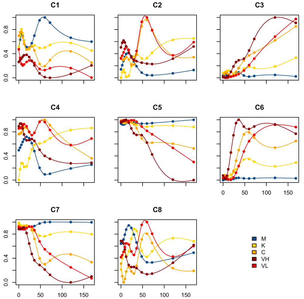
These centroids are on a 0-1 scale, because of our rescaling of the spline fits, and do not represent the actual gene expression level. In Figure 13, we plot a few of the actual genes assigned to cluster 2 with the estimated centroid overlaid:
cluster_of_interest = 2
cluster2Genes = names(
     kmeans_clusters$clusters[kmeans_clusters$clusters==cluster_of_interest])
plot_splines_data(de_moanin_model,
    centroid=kmeans_clusters$centroids[cluster_of_interest,],
    colors=ann_colors$Group, smooth=TRUE,simpleY =FALSE,
    subset_data=cluster2Genes[3:6],
    mar=c(1.5,2.5,2,0.1))
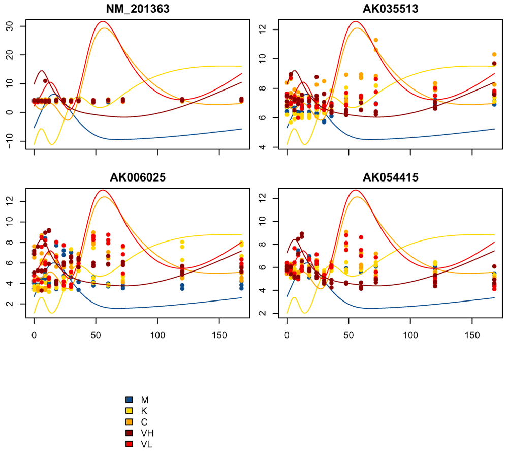
As we can see, while these genes have some similarity with the pattern of the cluster centroids, these particular genes are not the best examples of the cluster, in the sense of matching the centroid estimates. Because of this variability in how well the genes fit a cluster, we would like to be able to score how well a gene fits a cluster.
Furthermore, we arbitrarily chose a subset of genes based on our filter, and we would like to have a mechanism to assign all genes to a cluster.
Thus, the next step in the clustering portion of the workflow is a scoring and label step. Each gene is given a score that corresponds to a goodness-of-fit between each gene and each cluster, computed as follows:
where μk is the centroid of cluster k and yi the gene of interest. The scoring function thus returns a value between 0 and 1, 0 being the best score possible and 1 the worst score possible (no correlation between the gene and the cluster centroid).
The score then allows us to assign all genes to a cluster (i.e. a label) based on the cluster for which they have the best score, regardless of whether the gene was used in the clustering procedure.
The scoring and labeling is done via the splines_kmeans_score_and_label function. This function calculates the goodness of fit of the gene to the cluster centroid and gives a cluster label to the gene if they have a sufficiently high score, as we explain above.
# Then assign scores and labels to *all* the data, using a goodness-of-fit
# scoring function.
scores_and_labels = splines_kmeans_score_and_label(
     moanin_model, kmeans_clusters)
The scores_and_labels list contains three elements:
scores: the matrix of shape n_cluster x n_genes, containing for each gene and each cluster, the goodness of fit as described above.
labels: the labels for all of the genes with a sufficiently good goodness-of-fit score.
score_cutoff: the cutoff used on scores to determine whether to assign a label
Assigning cluster labels: We could just assign each gene to a cluster based on which cluster gave the minimum score. By default, splines_kmeans_score_and_label does not do that, but rather requires a sufficiently low enough goodness-of-fit score. The criteria for being "sufficiently low" is based on looking at the distribution of the scores of all genes on all clusters (i.e. the entire scores matrix returned by splines_kmeans_score_and_label). A gene is then assigned to a cluster only if their best score is above the 50% percentile of that distribution, with the remaining genes getting NA as their assignment (this choice can be changed by proportion_genes_to_label). Note that because the distribution of scores of genes across all clusters is used -- this is not equivalent to assigning 50% of genes to a cluster -- it is possible that all genes are assigned to a cluster.
labels = scores_and_labels$labels

# Let's keep only the list of genes that have a label.
labels = unlist(labels[!is.na(labels)])

# And also keep track of all the genes in cluster 2.
genes_in_cluster2 = names(labels[labels==cluster_of_interest])
After running scores_and_labels on our data, we now have 19772 genes that are assigned to a cluster.
We can visualize the impact of this filtering process by considering the distribution of goodness-of-fit scores for each cluster if we did not have the filtering cutoff of splines_kmeans_score_and_label, i.e. if we simply assign every gene to a cluster based on which gives them their minimum score. We display for each cluster, the scores of the genes assigned to that cluster (Figure 14), as compared to the cutoff value for what that score must be under our filtering procedure. We can do this by rerunning splines_kmeans_score_and_label and setting the filter percentage_genes_to_label=1 (and we can speed up the calculation by giving our previously calculated score via the argument previous_scores)
# Get the best score and best label for all of the genes
# This time without filtering labels
# We can give the previous calculated scores to `previous_scores` to save time
unfiltered_scores = splines_kmeans_score_and_label(
     moanin_model, kmeans_clusters,
     proportion_genes_to_label=1,
     previous_scores=scores_and_labels$scores)
best_score = rowMin(scores_and_labels$scores)
best_label = unfiltered_scores$labels

par(mfrow=c(3, 3))
n_clusters = dim(kmeans_clusters$centroids)[1]
for(cluster_id in 1:n_clusters){
    hist(best_score[best_label==cluster_id],
     breaks=(1:50/50), xlim=c(0, 1),
     col="black", main=paste("C", cluster_id, sep=""),
     xlab="score", ylab="Num. genes")
    abline(v=scores_and_labels$score_cutoff, col="red", lwd=3, lty=2)
}
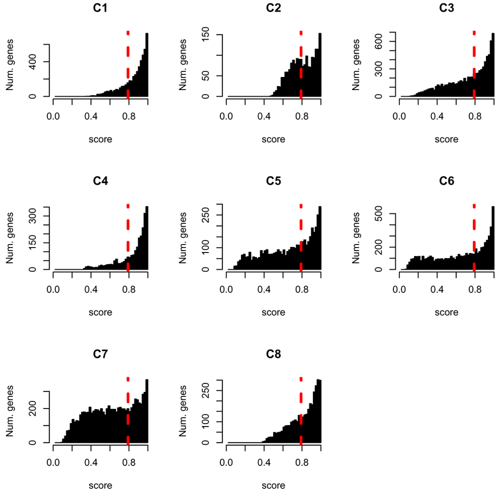
The dashed red line indicates the scoring threshold: all genes with a score above this threshold will not be labeled.
Note that for some of the genes, their scores in all clusters is 1. Such genes fit poorly to all clusters and the assignment of genes to a single cluster that we did above to one cluster is done arbitrarily to the first matching cluster for such genes. This underlines the importance of filtering genes that fit poorly to clusters.
We can also investigate the differences between the labels provided by the splines k-means model and our scoring and labeling step, in terms of the number of genes assigned to each cluster (Figure 15).
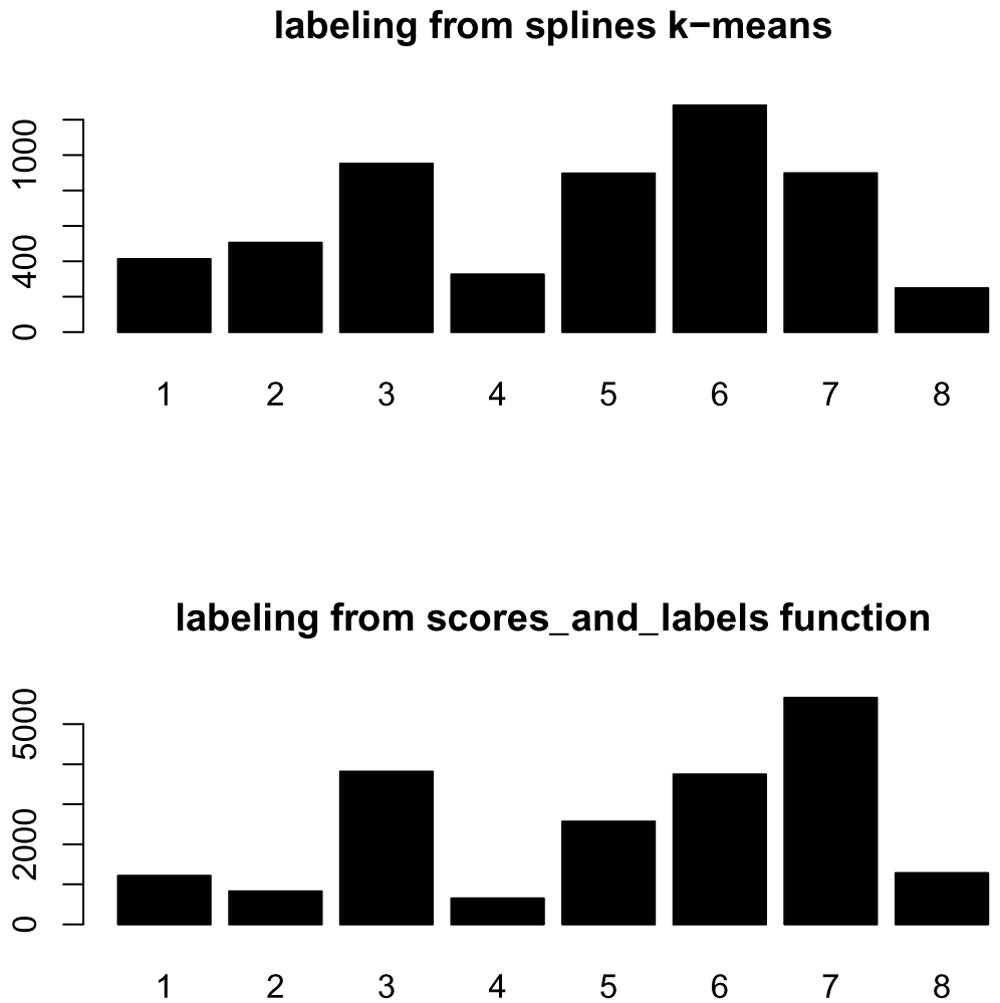
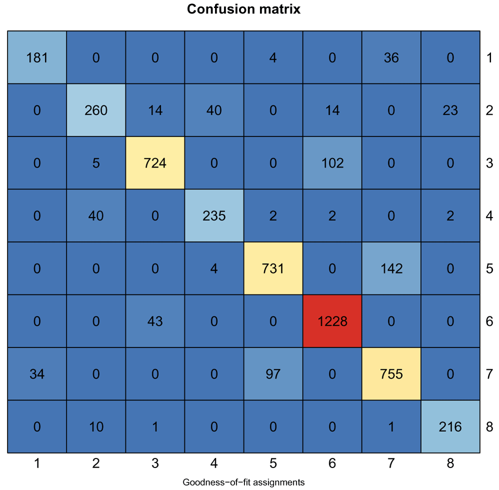
Of the original 5521 genes used in the clustering, 4946 are still assigned to a cluster based on their goodness of fit score. We can compare whether they are still assigned to the same clusters based on a confusion matrix shown below (Figure 16). The k-means cluster assignments are shown on the rows, and the goodness-of-fit assignments in the columns, with the number in each cell indicating the number of genes in the intersection of the two clusters.
Of the four genes we plotted before, two of them remained assigned to cluster 2 after our scoring. We can again look at a few genes in cluster 2, only now pick the best scoring genes (Figure 17)
# order them by their score in cluster
ord = order(scores_and_labels$scores[genes_in_cluster2,
                       cluster_of_interest])
cluster2Score = genes_in_cluster2[ord]
plot_splines_data(
    moanin_model, subset_data=cluster2Score[1:4],
    centroid=kmeans_clusters$centroids[cluster_of_interest,],
    colors=ann_colors$Group, smooth= TRUE, simpleY= FALSE,
    mar=c(1.5,2.5,2,0.1))
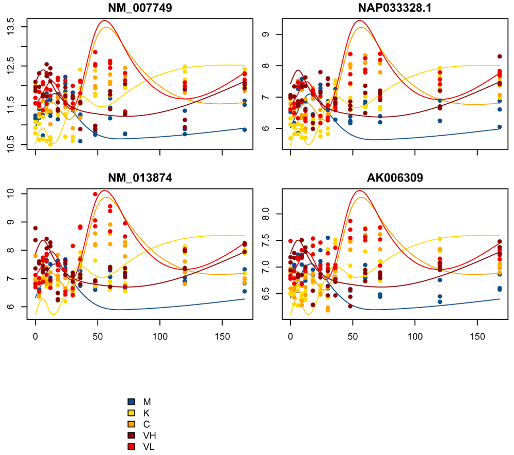
We see that, as expected, these genes are a much better match to the cluster centroids.
Now, let us look more in detail at some specific clusters. Cluster 6 seems particularly interesting: it captures genes with strong differences between the different influenza treatments and the control, while the control remains relatively flat.
We've already shown how we can plot a few example genes, however, it can be hard to make sense of individual genes given the amount of noise, as well as being hard to draw conclusions based on a few genes.
Heatmaps are useful to investigate the range of expression patterns for specific genes. Here, we are going to plot heatmaps of the normalized gene expression patterns and the rescaled gene expression patterns side by side.
First, we select the genes of interest, namely those in cluster 6, based on our goodness-of-fit assignment.
cluster_to_plot = 6
genes_to_plot = names(labels[labels == cluster_to_plot])
Now we will create the heatmaps of these genes (3746 genes, Figure 18).
layout(matrix(c(1,2),nrow=1), widths=c(1.5,2))

# order the observations by Group, then time, then replicate
orderedMeta<-data.frame(colData(moanin_model))
ord = order(
  orderedMeta$Group,
  orderedMeta$Timepoint,
  orderedMeta$Replicate)
orderedMeta$Timepoint = as.factor(orderedMeta$Timepoint)

orderedMeta = orderedMeta[ord, ]

res = aheatmap(
     as.matrix(assay(moanin_model[genes_to_plot,ord])),
     Colv=NA,
     color="YlGnBu",
     annCol=orderedMeta[,c("Group", "Timepoint")],
     annLegend=FALSE,
     annColors=ann_colors,
     main=paste("Cluster", cluster_to_plot, "(raw)"),
     treeheight=0, legend=FALSE)
# Now use the results of the previous call to aheatmap to reorder the genes.
aheatmap(
     rescale_values(moanin_model[genes_to_plot,ord])[res$rowInd,],
     Colv=NA,
     Rowv=NA,
     annCol=orderedMeta[, c("Group", "Timepoint")],
     annLegend=TRUE,
     annColors=ann_colors,
     main=paste("Cluster", cluster_to_plot, "(rescaled)"),
     treeheight=0)
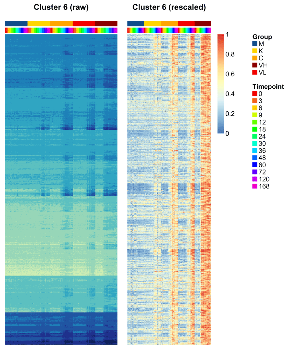
Those two heatmaps demonstrate that the clustering method successfully clusters genes that are on different scales, and yet share the same dynamical response to the treatments.
A common question that arises when performing clustering is how to choose the number of clusters. A choice for the number of clusters K depends on the goal. In this particular case, the end goal is not the clustering, but to facilitate interpretation of the differential expression analysis step. As a result, the number of clusters should not exceed the number of gene sets the user wants to interpret. This allows to set a maximum number of clusters. Let us assume here that this number is 20 clusters.
Once the maximum number of clusters is set, several strategies allow the identification of the number of clusters:
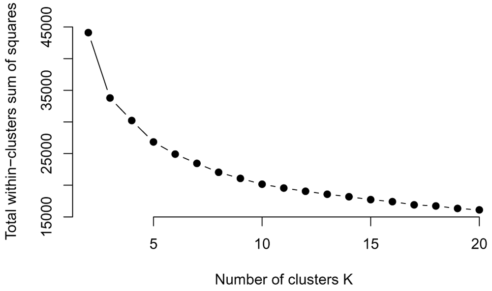
• Elbow method. First introduced in 1953 by Thorndike (Thorndike, 1953), the elbow method looks at the total within cluster sum of squares as a function of the number of clusters (WCSS). When adding clusters doesn't decrease the WCSS by a sufficient amount, one can consider stopping. This method thus provides visual aid to the user to choose the number of clusters, but often the "elbow" is hard to see on real data, where the number of clusters is not clearly defined.
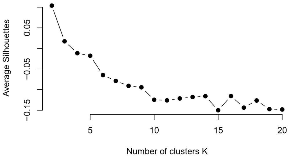
• Silhouette method. Similarly to the Elbow method, the Silhouette method refers to a method of validation of consistency within clusters, and provides visual aid to choose the number of clusters.
• Stability methods Stability methods are more computationally intensive than any other method, as they rely on assessing the stability of the clustering for every k to a small randomization of the data. The user is then invited to choose the number of clusters based on a number of similarity measures.
First, let us run the clustering for all values of k of interest. We will, for each clustering, conserve (1) with within cluster sum of squares; (2) the clustering assignment (or label) for each gene.
Below we run the clustering for k equal to 2 – 20. The splines_kmeans function returns the WCSS for each cluster, which we sum to get the total WCSS.
all_possible_n_clusters = c(2:20)
all_clustering = list()
wss_values = list()

i = 1
for(n_cluster in all_possible_n_clusters){
    clustering_results = splines_kmeans(de_moanin_model,
    n_clusters=n_cluster, random_seed=42,
    n_init=10)
    wss_values[i] = sum(clustering_results$WCSS_per_cluster)
    all_clustering[[i]] = clustering_results$clusters
    i = i + 1
}
Elbow method. The Elbow method to choose the number of clusters relies on visualization aid to choose the number of clusters. The method relies on plotting the within cluster sum of squares (WCSS) as a function of the number of clusters. At some point, the WCSS will start decreasing more slowly, giving an angle or "elbow" in the graph. The number of clusters is chosen at this "Elbow point."
We plot the WCSS for k = 2 – 20 here (Figure 19). We see that as expected the WCSS continues to drop, but there is no clear drop in the decrease, except for very small values of k (3-4 clusters). However, 3-4 seems a very small number of gene clusters to find, given the complexity
plot(all_possible_n_clusters, wss_values,
      type="b", pch=19, frame=FALSE,
      xlab="Number of clusters K",
      ylab="Total within-clusters sum of squares")
Average silhouette method. The silhouette value is a measure of how similar a data point is to its own cluster (cohesion) compared to other clusters (separation), shown in Figure 20.
# function to compute average silhouette for k clusters
average_silhouette = function(labels, y) {
     silhouette_results = silhouette(unlist(labels[1]),dist(y))
     return(mean(silhouette_results[, 3]))
}
# extract the average silhouette
average_silhouette_values = list()
i = 1
for(i in 1:length(all_clustering)){
    clustering_results = all_clustering[i]
    average_silhouette_values[i] = average_silhouette(clustering_results,
         assay(de_moanin_model))
    i = i + 1
}
plot(all_possible_n_clusters, average_silhouette_values,
     type="b", pch=19, frame=FALSE,
     xlab="Number of clusters K",
     ylab="Average Silhouettes")
Looking at the stability of the clustering. On real data, the number of clusters is not only unknown but also ambiguous: it will depend on the desired clustering resolution of the user. Yet, in the case of biological data, stability and reproducibility of the results is necessary to ensure that the biological interpretation of the results hold when the data or the model is exposed to reasonable perturbations.
Methods that rely on the stability of the clustering results to choose k thus ensure that the biological interpretation of the clusters holds after perturbations to the data. In addition, simulation where the data is generated with a well defined k show that the clustering is more stable for the correct number of the clusters.
Most methods to find the number of clusters with stability measures only provide visual aids to guide the user. The first element often visualized is the consensus matrix: the consensus matrix is an n × n matrix that stores the proportion of clustering in which two items are clustered together. A perfect consensus matrix ordered such that all elements that belong to the same cluster are adjacent to one another which show blocks along the diagonal close to 1.
To perform such analysis, the first step is run the clustering several times on a resampled dataset--either using bootstrap or subsampling.
Using the bootstrapping strategy, we sample with replacement a sample of the same size as our original clustering (i.e. 5521 genes):
n_genes = dim(de_moanin_model)[1]
indices = sample(1:dim(de_moanin_model)[1], n_genes, replace=TRUE)

bootstrapped_y = de_moanin_model[indices, ]
Using the subsampling strategy, we take a unique subset of the genes, keeping 80% of the genes:
subsample_proportion = 0.8
indices = sample(1:dim(de_moanin_model)[1],
          n_genes * subsample_proportion,
          replace=FALSE)

subsampled_y = de_moanin_model[indices, ]
We run the bootstrap method on all genes differentially expressed and with a log-fold-change higher than 2 (computed with the lfc_max method), and do it B = 20 times for each of k = 2 – 10. We show the code below, but because of the time the computations take, we have evaluated these values separately and provided the results in separate files (one per k) for users to explore more quickly.
# You may want to set the random seed of the experiment so that the results
# don't vary if you rerun the experiment.
# set.seed(random_seed)
n_genes = dim(de_moanin_model)[1] * subsample_proportion
indices = sample(1:dim(de_moanin_model)[1], n_genes, replace=TRUE)

kmeans_clusters = splines_kmeans(de_moanin_model[indices,],
     n_clusters=n_clusters,
     random_seed=42,
     n_init=20)

# Perform prediction on the whole set of data.
kmeans_clusters = splines_kmeans_predict(de_moanin_model, kmeans_clusters,
     method="distance")
For now, we bring in the results for k = 5 and k = 20.
stability_5 = read.table("results/stability_5.tsv", sep="\t")
stability_20 = read.table("results/stability_20.tsv", sep="\t")
Each column corresponds to a bootstrap sample, each row to a gene, and each entry to the label found for that particular clustering. Thus, for each gene, we have an assignment to a cluster over the 25 resampling runs. See Table 6 for a sample of the results of the clustering for 10 bootstrap and k = 5.
| B1 | B2 | B3 | B4 | B5 | B6 | B7 | B8 | B9 | B10 | |
|---|---|---|---|---|---|---|---|---|---|---|
| AA204140 | 5 | 5 | 5 | 5 | 5 | 1 | 3 | 2 | 1 | 3 |
| AB008911 | 5 | 5 | 1 | 4 | 1 | 2 | 3 | 3 | 2 | 3 |
| AB010313 | 3 | 3 | 1 | 4 | 1 | 2 | 4 | 3 | 2 | 5 |
| AB010342 | 5 | 3 | 1 | 5 | 1 | 1 | 3 | 3 | 1 | 3 |
| AB011473 | 2 | 1 | 2 | 1 | 3 | 3 | 2 | 5 | 5 | 2 |
| AB099518 | 2 | 1 | 2 | 1 | 3 | 3 | 2 | 5 | 5 | 2 |
Now we will use the function consensus_matrix in the moanin package to calculate proportion of times each pair of samples was clustered together across the 25 resampling runs, and plot the heatmap of those consensus matrices for k = 5 and k = 20.
par(mfrow=c(1, 2))
consensus_matrix_stability_5 = consensus_matrix(stability_5,
                           scale=FALSE)
aheatmap(consensus_matrix_stability_5[1:1000, 1:1000], Rowv=FALSE,
      Colv=FALSE,
      treeheight=0, main="K=5")

consensus_matrix_stability_20 = consensus_matrix(stability_20,
                            scale=FALSE)
aheatmap(consensus_matrix_stability_20[1:1000, 1:1000], Rowv=FALSE,
      Colv=FALSE,
      treeheight=0, main="K=20")
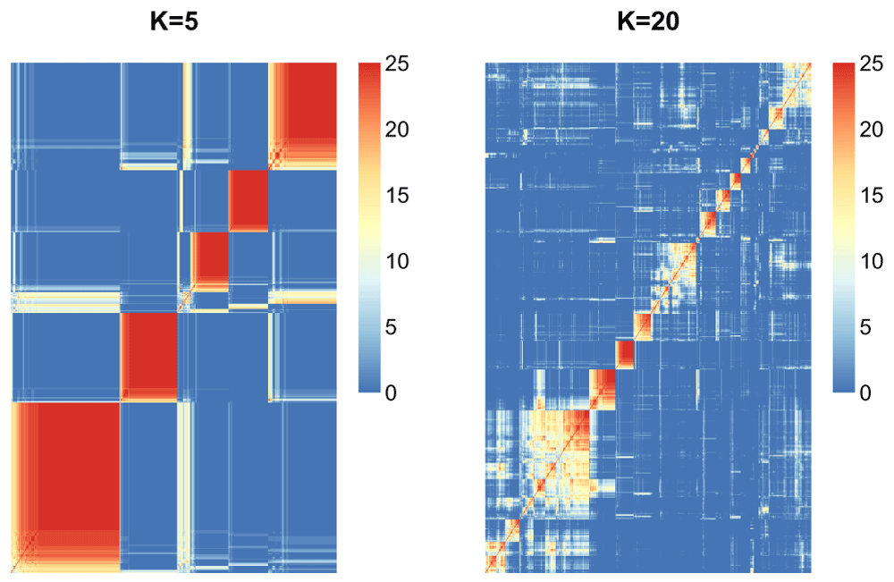
We can see (Figure 21) that the choice of K = 5 seems much more stable across resampling runs than that of K = 20.
The model explorer strategy. The model explorer algorithm (Ben-Hur et al., 2001) proposes to estimate the number of clusters exploiting the observation that if the number of clusters is correct, the clustering results are stable to bootstrap resampling, as described above. The distribution of similarities between bootstrapped results for each k can thus be compared for different values of k and guide the user in the choice of number of clusters.
The model explorer strategy works as follows. For a single choice of k, first perform n bootstrap experiments to estimate the cluster centroids, followed by a step of assigning a label to all data points. Then, choose a similarity measure between two partitions or clusters S(B1, B2). Examples are the normalized mutual information or Fowlkes-Mallows. Finally, compute the pairwise similarity measure between all bootstrapped partitions (i.e. B choose 2 pairs). Repeat this procedure for different k and plot per k the cumulative density of the obtained scores.
We have already run the bootstrap resampling for values k = 2 – 20 and saved the results. We will read in that data in, and use it to calculate the pairwise similarity scores.
The function plot_model_explorer takes in input a list of the bootstrapped results for all labels.
plot_model_explorer(all_labels)
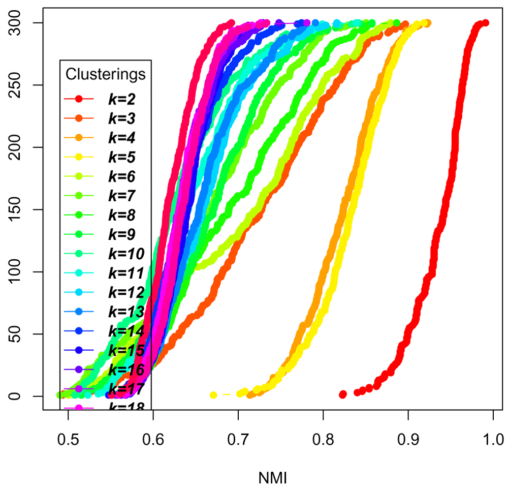
From this plot (Figure 22), we can deduce that k = 5 is more stable than k = 3 and k =4, but not as stable as k = 2. The model explorer strategy, in addition to visualizing the diversity of the centroids, can thus help assess an adequate number of clusters.
Now, replot the same model explorer, but only for the clustering experiments k = 6, k = 7, k = 8, k = 9, and k = 10 so that we can see more clearly the stability measures in that range (Figure 23).
clusters = c("k=6", "k=7", "k=8", "k=9", "k=10")
selected_labels = all_labels[clusters]
plot_model_explorer(selected_labels)
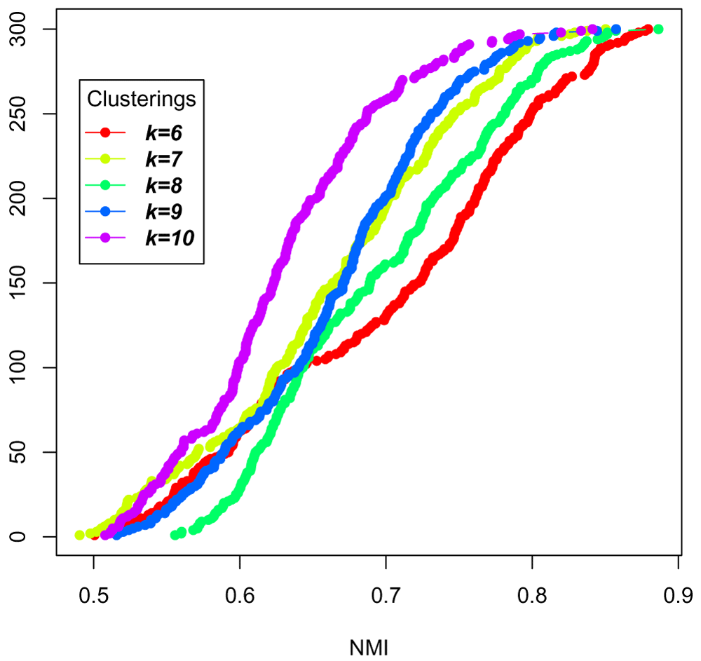
This analysis doesn't necessarily pick a particular k, but can help decide between k within a desired range, for example, or to avoid k that degrade the stability.
Consensus clustering as a way to find k. The consensus clustering (Monti et al., 2003) relies on a similar idea but instead of looking at the cumulative density of similarity measures of bootstrapped clustering, the authors suggest plotting the cumulative density of elements of the consensus matrix. We provide a function plot_cdf_consensus in moanin to do this (Figure 24):
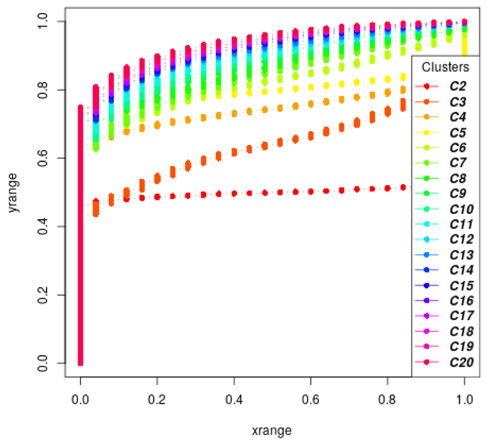
plot_cdf_consensus(all_labels)
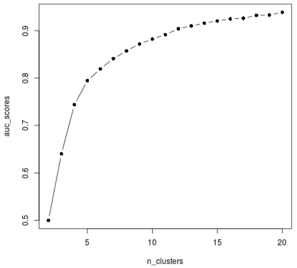
The stability of the clustering based on the consensus matrix can then be measured via a single number by looking at the area under the curve (AUC). Indeed, the more stable the clustering, the closer to 0 or 1 will be the entries of the consensus matrix, and thus, the higher the area under the curve (AUC). To choose a good balance between the model complexity (the number of clusters) and the stability of the clustering, the consensus clustering strategy thus suggests looking at the AUC as the function of the number of clusters, or at the "improvement" in AUC as a function of the number of clusters to identify the highest increase.
Here we calculate the AUC (Figure 25).
auc_scores = moanin:::get_auc_similarity_scores(all_labels)
plot(n_clusters, auc_scores, col="black", type="b", pch=16)
While here we calculate the improvement in the AUC (Figure 26).
delta_auc = diff(auc_scores)/auc_scores[1:(length(auc_scores)-1)]
plot(3:20, delta_auc, col="black", type="b")
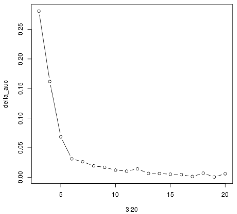
The consensus clustering method suggest that the most stable is k = 2, which separates over-expressed genes from under-expressed genes. While it is indeed a very stable clustering, it does not capture the range of gene expression patterns present in the data. This shows the limitation of such methods on real data, where the number of clusters is not clearly defined.
Once good clusters are obtained, the next step is to leverage the clustering to ease interpretation. Classic enrichment analysis can then be performed on the gene set defined by each cluster. Examples include KEGG pathway enrichment analysis, GO term enrichment analysis, and motif enrichment analysis.
First, let us clean up the genes we work with and only select the genes we are going to use in the enrichment analysis. One can either consider (1) the results of the clustering without any further filtering, (2) only the set of differentially expressed genes in each cluster, or (3) the subset of genes that fit well to a cluster (based on some criterion).
Let us first tackle the case of pathway enrichment analysis. We will leverage the packages biomaRt (Durinck et al., 2005) and KEGGprofile (Zhao et al., 2017) for this step. KEGGprofile is a package that facilitates enrichment analysis on a set of genes labeled with the Ensembl annotation (Yates et al., 2019) based on the set of biological pathways described in the KEGG database (Kanehisa et al., 2015).
We thus need to convert the gene names, which are given in the Refseq annotation, into the corresponding Ensembl name. This is where biomaRt comes in handy: it enables easy conversion from one gene annotation to another. Here, we will use the function getBM in biomaRt to convert the gene names from cluster 8.
## Set up right ensembl database
ensembl = useMart("ensembl")
ensembl = useDataset("mmusculus_gene_ensembl", mart=ensembl)

## Get gene names of genes in Cluster 8
cluster = 6
gene_names = names(labels)
genes = gene_names[labels == cluster]

## Convert gene names
genes = getBM(attributes=c("ensembl_gene_id", "entrezgene_id"),
           filters="refseq_mrna", values=genes,
           mart=ensembl)["entrezgene_id"]
Then we use the function find_enriched_pathway in the KEGGprofile package to determine whether any KEGG pathways are enriched in cluster 6, i.e. whether a higher percentage of genes from a single pathway are found in cluster 6 than we would expect by simply proportional assignment of genes to clusters (see Table 7).
genes = as.vector(unlist(genes))
pathways = find_enriched_pathway(
    genes, species="mmu",
    download_latest=FALSE)$stastic
The Gene Ontology (GO) database (Consortium, 2018), also categorizes genes into meaningful biological ontologies and can be used for enrichment analysis via the package topGO (Alexa & Rahnenfuhrer, 2016). We again use biomaRt to find the mapping between genes and the GO terms to which they match.
genes = getBM(attributes=c("go_id", "refseq_mrna"),
           values=gene_names,
           filters="refseq_mrna",
           mart=ensembl)
The biomaRt query results in a matrix with two columns: gene names and GO term ID. The package topGO (Alexa & Rahnenfuhrer, 2016) expects the GO term to gene mapping to be a list where each item is a mapping between a gene name and a GO term ID vector, for example:
$NM_199153
[1] "GO:0016020" "GO:0016021" "GO:0007186" "GO:0004930" "GO:0007165"
[6] "GO:0050896" "GO:0050909"

$NM_201361
 [1] "GO:0016020" "GO:0016021" "GO:0003674" "GO:0008150" "GO:0005794"
 [6] "GO:0005829" "GO:0005737" "GO:0005856" "GO:0005874" "GO:0005739"
[11] "GO:0005819" "GO:0000922" "GO:0072686"
moanin provides a simple function (create_go_term_mapping) to make this conversion:
# Create gene to GO id mapping
gene_id_go_mapping = create_go_term_mapping(genes)
Once the gene ID to GO mapping list is created, moanin provides an interface to topGO to determine enriched GO terms. In particular, it performs a p-value correction and only returns the significant GO-term enrichment in an easy to use data.frame object. Here, we show an example of running a GO term enrichment on the "Biological process" ontology (BP) (see Table 8 for results).
# Create logical vector of whether in cluster 6
assignments = labels == cluster

go_terms_enriched = find_enriched_go_terms(
    assignments,
    gene_id_go_mapping, ontology="BP")
This workflow provides a tutorial for the analysis of lengthy time-course gene expression data in R using the package moanin, which aids in implementing common timecourse analyses. We illustrate the workflow through the analysis of mice lung tissue exposed to different influenza strains and measured over time. The proposed workflow consists of three common analysis main steps generally performed after quality control and normalization: (1) differential expression analysis; (2) clustering of time-course gene expression data; (3) downstream analysis of clusters. We demonstrate how the use of the package moanin allows for easy implementation of these procedures in the setting of time-course data.
Data used in this workflow are available from NCBI GEO, accession GSE63786. Normalized data can be found in timecoursedata. Normalization information is provided as supplementary information.
Source code is available from GitHub: https://github.com/NelleV/2019timecourse-rnaseq-pipeline.
Archived source code at the time of publication: https://doi.org/10.17605/OSF.IO/U2DQP (Varoquaux & Purdom, 2020)
License: BSD-3
All packages used in the workflow are available on GitHub, CRAN, or Bioconductor.
Finally, we use sessionInfo() to display all packages used in this pipeline and their version numbers.
sessionInfo()

## R version 4.0.2 (2020-06-22)
## Platform: x86_64-pc-linux-gnu (64-bit)
## Running under: Ubuntu 18.04.4 LTS
##
## Matrix products: default
## BLAS:   /usr/lib/x86_64-linux-gnu/blas/libblas.so.3.7.1
## LAPACK: /usr/lib/x86_64-linux-gnu/lapack/liblapack.so.3.7.1
##
## locale:
##  [1] LC_CTYPE=en_US.UTF-8       LC_NUMERIC=C
##  [3] LC_TIME=en_GB.UTF-8        LC_COLLATE=en_US.UTF-8
##  [5] LC_MONETARY=en_US.UTF-8    LC_MESSAGES=en_US.UTF-8
##  [7] LC_PAPER=en_US.UTF-8       LC_NAME=C
##  [9] LC_ADDRESS=C               LC_TELEPHONE=C
## [11] LC_MEASUREMENT=en_US.UTF-8 LC_IDENTIFICATION=C
##
## attached base packages:
##  [1] stats4    parallel  splines   stats     graphics  grDevices utils
##  [8] datasets  methods   base
##
## other attached packages:
##  [1] RColorBrewer_1.1-2          BiocWorkflowTools_1.14.0
##  [3] ggfortify_0.4.10            timecoursedata_0.99.17
##  [5] kableExtra_1.2.1            moanin_0.99.0-902
##  [7] SummarizedExperiment_1.18.2 DelayedArray_0.14.1
##  [9] matrixStats_0.56.0          GenomicRanges_1.40.0
## [11] GenomeInfoDb_1.24.2         topGO_2.40.0
## [13] SparseM_1.78                GO.db_3.11.4
## [15] AnnotationDbi_1.50.3        IRanges_2.22.2
## [17] S4Vectors_0.26.1            graph_1.66.0
## [19] viridis_0.5.1               viridisLite_0.3.0
## [21] KEGGprofile_1.30.0          NMF_0.23.0
## [23] Biobase_2.48.0              BiocGenerics_0.34.0
## [25] cluster_2.1.0               rngtools_1.5
## [27] pkgmaker_0.31.1             registry_0.5-1
## [29] ggplot2_3.3.2               pander_0.6.3
## [31] biomaRt_2.44.1              BiocStyle_2.16.0
## [33] knitr_1.29                  limma_3.44.3
## [35] devtools_2.3.1              usethis_1.6.1
## [37] rmarkdown_2.3
##
## loaded via a namespace (and not attached):
##  [1] colorspace_1.4-1       ellipsis_0.3.1         rprojroot_1.3-2
##  [4] XVector_0.28.0         fs_1.5.0               rstudioapi_0.11
##  [7] remotes_2.2.0          bit64_4.0.5            fansi_0.4.1
## [10] xml2_1.3.2             ClusterR_1.2.2         KEGG.db_3.2.4
## [13] codetools_0.2-16       doParallel_1.0.15      pkgload_1.1.0
## [16] gridBase_0.4-7         dbplyr_1.4.4           png_0.1-7
## [19] BiocManager_1.30.10    compiler_4.0.2         httr_1.4.2
## [22] backports_1.1.9        Matrix_1.2-18          assertthat_0.2.1
## [25] cli_2.0.2              htmltools_0.5.0        prettyunits_1.1.1
## [28] tools_4.0.2            gmp_0.6-0              gtable_0.3.0
## [31] glue_1.4.2             GenomeInfoDbData_1.2.3 reshape2_1.4.4
## [34] dplyr_1.0.2            rappdirs_0.3.1         Rcpp_1.0.5
## [37] vctrs_0.3.4            Biostrings_2.56.0      NMI_2.0
## [40] iterators_1.0.12       xfun_0.16              stringr_1.4.0
## [43] ps_1.3.4               rvest_0.3.6            testthat_2.3.2
## [46] lifecycle_0.2.0        gtools_3.8.2           XML_3.99-0.5
## [49] edgeR_3.30.3           zlibbioc_1.34.0        scales_1.1.1
## [52] hms_0.5.3              yaml_2.2.1             curl_4.3
## [55] memoise_1.1.0          gridExtra_2.3          TeachingDemos_2.12
## [58] stringi_1.4.6          RSQLite_2.2.0          desc_1.2.0
## [61] foreach_1.5.0          pkgbuild_1.1.0         bibtex_0.4.2.2
## [64] rlang_0.4.7            pkgconfig_2.0.3        bitops_1.0-6
## [67] evaluate_0.14          lattice_0.20-41        purrr_0.3.4
## [70] bit_4.0.4              processx_3.4.3         tidyselect_1.1.0
## [73] bookdown_0.20          plyr_1.8.6             magrittr_1.5
## [76] R6_2.4.1               generics_0.0.2         DBI_1.1.0
## [79] pillar_1.4.6           withr_2.2.0            KEGGREST_1.28.0
## [82] RCurl_1.98-1.2         tibble_3.0.3           crayon_1.3.4
## [85] BiocFileCache_1.12.1   progress_1.2.2         locfit_1.5-9.4
## [88] grid_4.0.2             git2r_0.27.1           blob_1.2.1
## [91] callr_3.4.3            webshot_0.5.2          digest_0.6.25
## [94] xtable_1.8-4           tidyr_1.1.2            openssl_1.4.2
## [97] munsell_0.5.0          sessioninfo_1.1.1      askpass_1.1
| Views | Downloads | |
|---|---|---|
| F1000Research | - | - |
|
PubMed Central
Data from PMC are received and updated monthly.
|
- | - |
Provide sufficient details of any financial or non-financial competing interests to enable users to assess whether your comments might lead a reasonable person to question your impartiality. Consider the following examples, but note that this is not an exhaustive list:
Sign up for content alerts and receive a weekly or monthly email with all newly published articles
Already registered? Sign in
The email address should be the one you originally registered with F1000.
You registered with F1000 via Google, so we cannot reset your password.
To sign in, please click here.
If you still need help with your Google account password, please click here.
You registered with F1000 via Facebook, so we cannot reset your password.
To sign in, please click here.
If you still need help with your Facebook account password, please click here.
If your email address is registered with us, we will email you instructions to reset your password.
If you think you should have received this email but it has not arrived, please check your spam filters and/or contact for further assistance.
Comments on this article Comments (0)