Keywords
.NET, F#, C#, data visualization
This article is included in the Software and Hardware Engineering gateway.
.NET, F#, C#, data visualization
Proper visualization of scientific results or data in general is an essential element for teaching, the discussion of analysis results, or the distribution of new insights within the research community. Well structured figures help to improve visibility, explorability, and interpretability of the underlying data, consequently saving tedious searching in order to be able to interpret the presented data. Algorithmic diversity is paramount in exploratory data analysis, but ultimately the goal will always be to produce meaningful figures that represent the obtained information in an optimal way. Even during exploration, figures help to guide the researcher to hidden properties that become apparent when inspected in the form of a figure, especially when the figure is interactive. Therefore, the ability for convenient and streamlined plotting strategies/possibilities is not only important for distributing results, but also helps to get new insights during data analysis, and is an invaluable tool in the data science stacks of any programming language.
plotly.js1 is a popular open source graphing JavaScript library. It provides a well defined grammar for creating visualizations via the figure data structure - a tree with named nodes called attributes. The figure data structure can be represented via JavaScript Object Notation (JSON) - a widespread standard for representation of structured data which can be parsed and created by any modern programming language (see Figure 1 for an example). Due to this interoperability, libraries for creating plotly.js figures are available in many programming languages, most notably in Python2 and R3 which see widespread adoption in the scientific programming landscape.
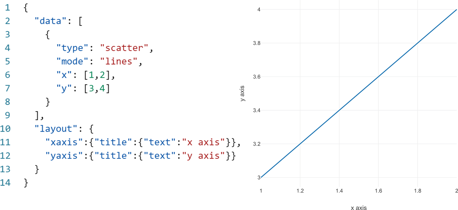
Left: The JSON (JavaScript Object Notation) formatted figure object. Lines 2-9 are the data array, which contains trace objects representing individual data visualizations of the figure. Lines 10-13 are the layout object, which contains data-independent styling options such as the axis objects. Right: The respective rendered graph.
In this paper we present Plotly.NET - a library for creating plotly.js-conform JSON formatted figures for the set of statically typed .NET languages (F#,4,5 C#,6 VB.NET7). Plotly.NET is written in F# and leverages the static type system by providing type-safe domain specific languages (DSLs) for plotly.js attributes and objects, as well as several abstraction layers for ease-of-use. Plotly.NET is feature complete regarding plotly.js API (application programming interface) coverage and is compatible with the .NET kernel for Jupyter, therefore offering a complete suite of data visualization tools for exploratory data analysis unprecedented in the .NET environment.
Plotly.NET is implemented in the open source F# programming language. It creates objects which are serialized into JSON (using the Newtonsoft.Json package8) which can be used by a rendering engine to create the visual equivalent. This is either realized by embedding the generated JSON in a HTML scaffold where plotly.js is used for rendering the plot in a browser (or equivalent environment where JavaScript can be executed), or via an interface for custom rendering engines.
The API is designed to enable different styles of creating charts and contains several abstraction layers. All (as of v2.6.3) plotly.js trace types have type safe equivalents with additional convenience layers to create derivative charts from these base traces.
Plotly.NET provides multiple API layers with increasing abstraction levels: (1) DynamicObject, (2) plotly.js object mappings, and (3) the high-level Chart API.
(1) DynamicObject: The low-level API builds on top of the DynamicObj package9 which provides a way of setting dynamic members in the statically typed .NET environment. Instances of this class, as well as instances of classes inheriting from it, provide the ?-operator which enables member assignment on runtime. This is usually prevented by the static type system of .NET languages, but necessary to support the highly dynamically typed nature of the JSON objects expected by plotly.js. Static classes are not flexible enough for this, especially because almost all attributes are optional and can be of multiple types.
This API layer is closest to plotly.js and can be used to directly translate javascript examples, as attribute names must be mirrored exactly. This also means that extensive knowledge of plotly.js, or at least it’s JSON schema is necessary to effectively use it, but makes it easy to implement new features should the underlying plotly.js version be updated. Figure 2 shows an example on how to use this API layer to generate the same plot shown in Figure 1.
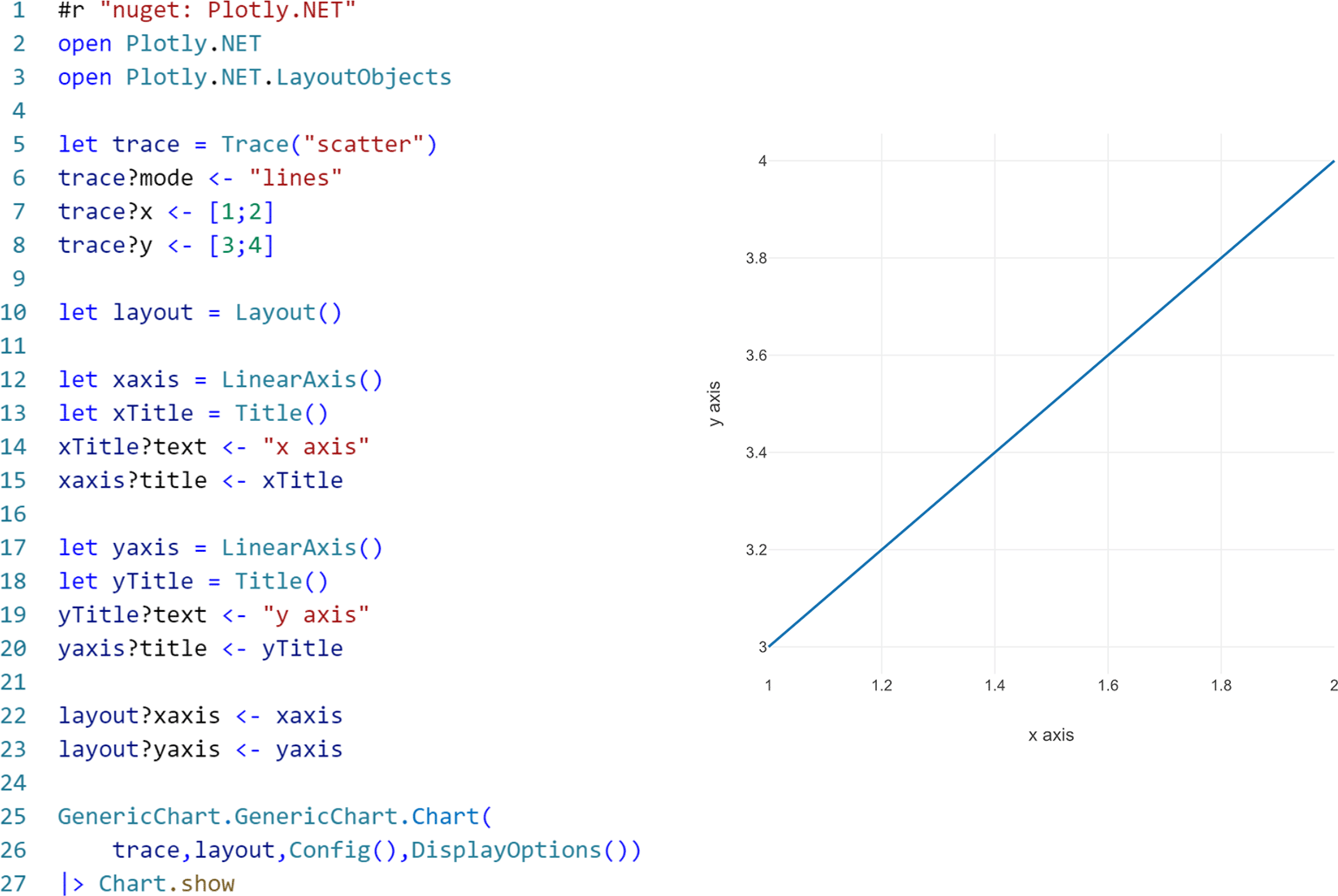
Left: F# code creating the figure data structure. Lines 1-3 are referencing the library, lines 5-8 create the trace object (see equivalent lines 2-9 in Figure 1). Lines 10-23 create the layout object containing the axis objects (see equivalent lines 10-13 in Figure 1). Lines 25-27 create the figure object and render it in a browser. Right: The respective rendered graph.
(2) plotly.js object mappings: plotly.js attributes that are themselves objects are abstracted as classes built on top of (1) and provide static init and style methods, as well as object-specific methods. These methods have a plethora of optional typed arguments which are equivalent to all attributes supported in the respective plotly.js JSON. Additionally, type-safe DSLs for attributes/values used on multiple occasions such as style parameters, color, or enums are provided in the StyleParam namespace. This layer comes with the additional advantage of providing options for auto-completing argument names as well as documentation for them, leading to less plotly.js knowledge being required for its usage. Figure 3 shows an example on how to use this API layer to generate the same plot shown in Figure 1.
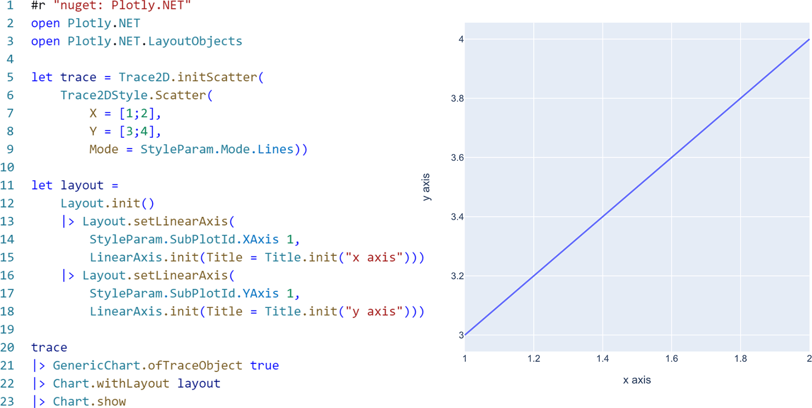
Left: F# code creating the figure data structure. Lines 1-3 are referencing the library. Lines 5-9 create the trace object (see equivalent lines 2-9 in Figure 1). Lines 11-18 create the layout object containing the axis objects (see equivalent lines 10-13 in Figure 1). Lines 20-23 create the figure object with default styling (Line 21) and render it in a browser. Right: The respective rendered graph.
Note that this API layer provides type-safe abstractions, but still needs insights about how plotly.js structures figures: While allowed attribute names and types are abstracted, the user still needs to know that for example axis styles are to be set on a Layout object (see Figure 3 left, lines 11-18). It is also possible to use style presets (see Figure 3 left, line 21) with this API layer.
(3) The high-level Chart API provides type safe abstractions for chart creation and styling without knowledge of the structure of plotly.js JSON. Type-safe methods for creating figure structures for all trace types and derived charts as well as various styling methods are provided.
The plotly.js figure schema is completely abstracted away. The API surface is only concerned with’creating and styling a chart’. Consider the following example: In plotly.js JSON, the axis style has to be set on the layout object. It also must be specified which type of axis (x, y, z, etc.) it is. Styling the x axis usually requires knowledge of this. The Chart API however provides a Chart.withXAxisStyle function, which also provides arguments for the relevant attributes, and can be applied to any Chart object.
Using this API layer also significantly decreases the lines of code necessary to create figures, as proper creation of nested objects and argument naming is implicitly done by the Chart methods. See Figure 4 for an example on how to use this API layer to generate the same plot shown in Figure 1. Note that there is a single flow of the initial Chart object, without the need of creating additional objects for axis styling.
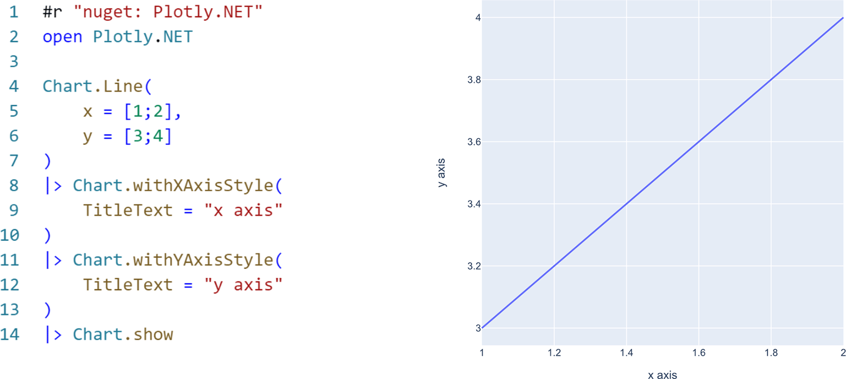
Left: F# code creating the figure data structure. Lines 1 and 2 are referencing the library. In this API layer, there are no clear equivalents to Figure 1: in Lines 4-7, the Chart. Line method creates a figure structure with default styling and the input data. Subsequently, the x and y axes are styled using respective styling methods without the need of creating title objects in contrast to the other API layers. Right: The respective rendered graph.
Plotly.NET however does not enforce the usage of any API layer. The low-level, abstraction-less layer (1) is exposed on purpose as this gradual abstraction via API layers enables users with any kind of knowledge about plotly.js to use it. Additionally, this allows for both imperative and declarative creation of figures. The dynamic assignment of members however might seem not intuitive to .NET users unexposed to dynamically typed languages. The high-level Chart API (3) on the other hand provides type-safe abstractions with the trade-off of reduced customizability. Extending this layer needs a lot of domain knowledge in both plotly.js and the Plotly.NET equivalent DSL. We believe that users are offered the best of both worlds by providing low-code abstractions for common use-cases, while retaining the ability to take full control where needed.
In addition to the core API, three extension packages - Plotly.NET.ImageExport, Plotly.NET.Interactive, and Plotly.NET.CSharp - are provided. Plotly.NET.ImageExport and Plotly.NET.Interactive cover two specific use cases - static image export and usage with the .NET Jupyter Kernel .NET Interactive - while the aim of Plotly.NET.CSharp is providing a native, idiomatic API surface for consuming the core API for the object-oriented C# language (note that the core API can be consumed in any.NET programming language, this package just provides a more idiomatic API).
Plotly.NET.ImageExport provides an interface for rendering engines that can produce PNG, JPG, or SVG files from plotly.js JSON figures. A reference implementation is provided that uses PuppeteerSharp10 to create a headless Chromium browser to render the figure and save it to the disk in the desired format.
Plotly.NET.Interactive is a formatting extension for .NET interactive, the Jupyter kernel for .NET languages. It enables automatic rendering of figures created with Plotly.NET in the notebook output cells without the need to leave the analysis environment by switching to the browser. Having the charts tied to the code producing them is especially helpful in the context of sharing and comprehension of visualizations. Examples of such notebooks are included in the Plotly.NET repository (see the Data availability section).
Plotly.NET targets the netstandard2.0 framework and is therefore supported on a plethora of compatible target frameworks across the .NET ecosystem. At the time of writing this article, this means that Plotly.NET can be used on any modern desktop operating system, as well as multiple mobile operating systems. It can be either referenced as nuget package or be built from source.
Plotly.NET is available as pre-compiled binary package on nuget.org (see here), which is the central package registry in the .NET ecosystem. It can be incorporated into any .NET project, script or notebook via the respective package reference. A target framework compatibility matrix is available on the nuget package page.
Plotly.NET aims to be a general-purpose visualization library for the .NET ecosystem. It targets interactive workflows such as visualization in scripting or in notebook environments, as well as visualizations in any kind of application, be it for desktop, mobile, or the web. Therefore, we demonstrate some of the visualization capabilities in the following section instead of specifying use cases.
Figure 5 shows a few more complex charts that can be generated with Plotly.NET:
• Figure 5A shows various variations of box and violin plots for the purpose of visualizing shapes and properties of distributions.
• Figure 5B is a combination of a temperature time course as line chart and a superimposed heatmap indicating correlation coefficients derived by continuous wavelet transform using FSharp.Stats (see Ref. 11 and Underlying data). High values (reddish) indicate high correlation to the frequency given as row indicators on the right. High negative values (bluish) indicate high anti-correlation.
• Figure 5C shows a scatter plot matrix of the classic iris data set (see Ref. 12 and Underlying data) providing an overview of how the respective features in it correlate with each other.
• Figure 5D shows a surface chart of the three dimensional wave function .
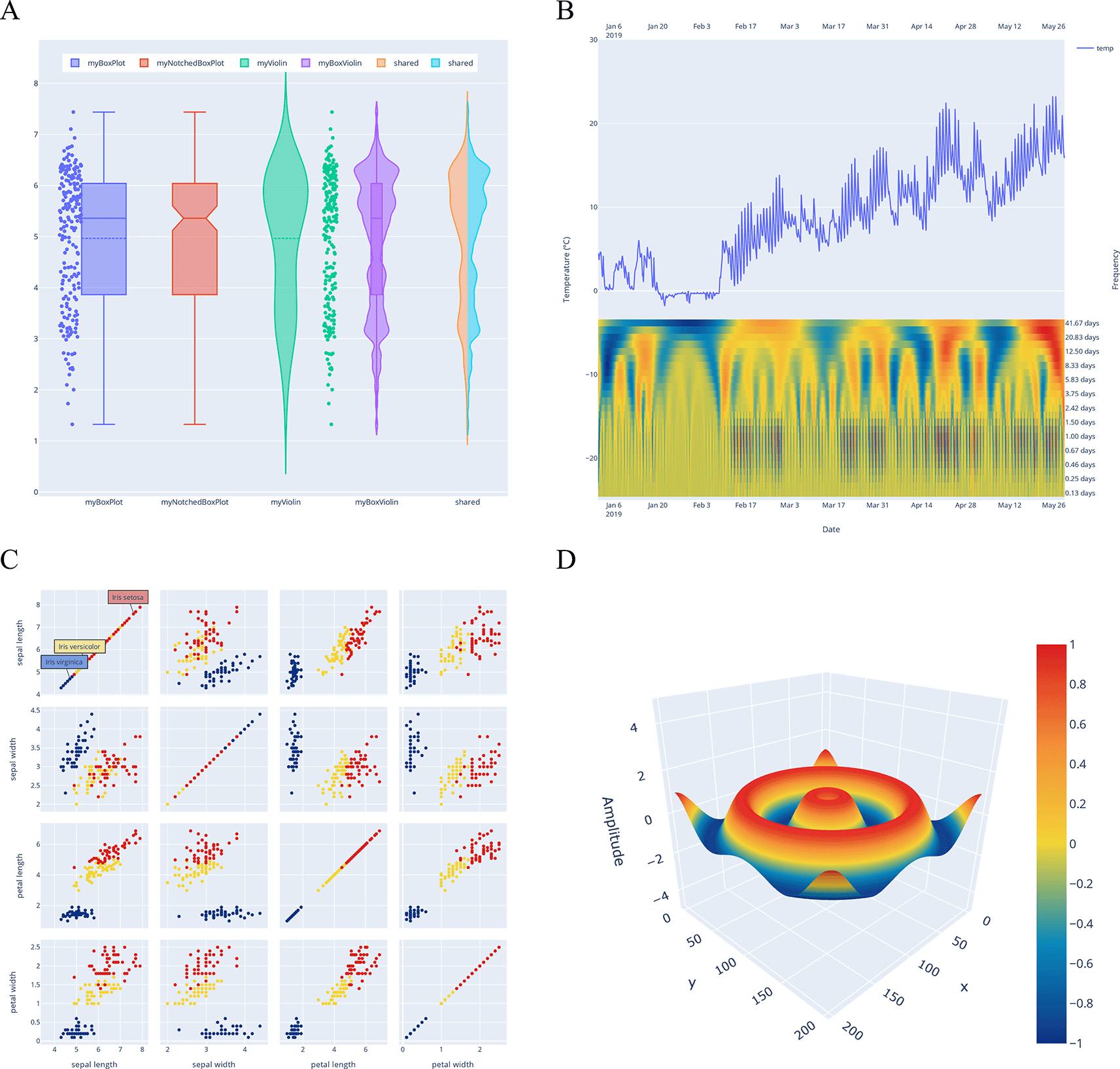
(A) Box and violin plots to describe properties and shapes of distributions. (B) Combined chart of temperature measurements and their frequency representation as heatmap. (C) Splom chart of the iris data set. (D) Surface chart of a three dimensional wave function.
The respective code is provided as interactive notebooks in the repository on GitHub (see Software availability13).
The data underlying Figure 5 are contained in the’publication’ folder in the Plotly.NET GitHub and Zenodo repositories (see Software availability below) as follows:
• iris-data.csv (contains species label, sepal length/width, and petal length/width of observed iris flowers. This data was originally obtained from Ref. 12).
• waveletData.txt (contains water temperature measurements conducted by the authors. Additional correlation coefficients were derived by continuous wavelet transform using Marr wavelets with frequencies specified in the row annotations. This data was made available previously in Ref. 11).
• Software available from: https://nuget.org/packages/Plotly.NET
• Source code and notebooks generating the example figures are available from: https://github.com/plotly/Plotly.NET
• Archived source code at time of publication: https://doi.org/10.5281/zenodo.682258213
• License: MIT
| Views | Downloads | |
|---|---|---|
| F1000Research | - | - |
|
PubMed Central
Data from PMC are received and updated monthly.
|
- | - |
Provide sufficient details of any financial or non-financial competing interests to enable users to assess whether your comments might lead a reasonable person to question your impartiality. Consider the following examples, but note that this is not an exhaustive list:
Sign up for content alerts and receive a weekly or monthly email with all newly published articles
Already registered? Sign in
The email address should be the one you originally registered with F1000.
You registered with F1000 via Google, so we cannot reset your password.
To sign in, please click here.
If you still need help with your Google account password, please click here.
You registered with F1000 via Facebook, so we cannot reset your password.
To sign in, please click here.
If you still need help with your Facebook account password, please click here.
If your email address is registered with us, we will email you instructions to reset your password.
If you think you should have received this email but it has not arrived, please check your spam filters and/or contact for further assistance.
Comments on this article Comments (0)