Keywords
Data visualization, Heatmap, PCA, t-SNE, Reproducibility
This article is included in the RPackage gateway.
This article is included in the Bioinformatics gateway.
Data visualization, Heatmap, PCA, t-SNE, Reproducibility
High-dimensional datasets, such as expression matrices from RNA-seq or proteomics experiments, have become commonplace in biomedical research. Heatmaps are an effective visualization method, efficiently representing thousands of data points in a matrix through variations in color. Several heatmap-centric visualization tools, including Clustergrammer1, Phantasus2, and Morpheus3, have been developed to facilitate the analysis of these expansive datasets. Phantasus and Morpheus operate entirely within the user’s web browser, while Clustergrammer requires server-side processing.
Our goal was to develop a secure, browser-based application capable of generating high-quality and reproducible visualizations. To address this, we developed DataMap, an R/Shiny application deployed via Shinylive, leveraging WebR—a specialized version of R compiled into WebAssembly—to enable execution directly within web browsers. Hosted as static files on GitHub, this serverless design ensures sensitive data remains securely on the user’s device while eliminating the need for server-side computation.
DataMap supports multiple visualization methods, including hierarchical clustering with heatmaps, principal component analysis (PCA), and t-distributed stochastic neighbor embedding (t-SNE)4. These methods enable researchers to uncover biologically significant patterns, clusters, and relationships within complex datasets. To facilitate usability, the application automatically recommends optimal file-parsing methods and data transformation settings by analyzing input files and assessing data distributions. Although optimized for omics datasets, DataMap remains broadly applicable to general high-dimensional data matrices across various research domains.
DataMap is implemented as an R/Shiny application compiled into WebAssembly via Shinylive, enabling entirely client-side execution within web browsers. The application is hosted on GitHub Pages as static files, automatically updated through GitHub Actions from the source code repository, ensuring continuous integration and continuous deployment (CI/CD).
The app consists of several functional modules:
1. File Upload Module: Supports multiple file formats, including Excel, CSV, TSV, TXT, and other plain text files, with automatic delimiter detection for accurate parsing.
2. Data Transformation Module: Offers essential preprocessing features, such as log transformation, normalization, missing value handling, outlier capping, and feature filtering.
3. Visualization Modules: Produces high-quality, publication-ready visualizations, including hierarchical clustering heatmaps generated using the pheatmap package5, as well as PCA and t-SNE plots. The heatmap visualization supports dendrogram cutting, enabling clearer identification of distinct clusters.
4. Code Generation Module: Automatically generates reproducible R code reflecting all analytical steps performed by the user, facilitating transparency and reproducibility.
This modular and serverless design ensures data security by processing exclusively on the user’s device and facilitates easy maintenance and ongoing enhancements through automated deployment.
To use DataMap, simply access the application via the static GitHub page at https://gexijin.github.io/datamap using modern web browsers such as Chrome, Edge, Safari, or Firefox. Additionally, users may install and run DataMap locally as an R package using the following commands in R:
remotes::install_github(“gexijin/datamap”)
datamap::run_app()
This flexibility ensures seamless operation both online and offline, accommodating diverse user needs.
Secure local processing: DataMap securely processes all data directly within the user’s web browser, safeguarding data privacy and removing dependency on external servers. This approach also ensures scalability without being limited by server resources.
Smart data import: It automatically detects file formats, delimiters, and annotations, streamlining the data upload process. The app also examines the data to identify the presence of row and column names. Row annotations can be uploaded separately or included in the data matrix. Column annotations, such as experimental design factors in omics datasets, must be uploaded separately using matching column names.
Comprehensive data transformations: The data transformation workflow employs statistical heuristics to recommend appropriate settings for effective visualization. Missing data can remain unchanged or be imputed using row-wise or column-wise mean or median values. When high skewness (>1) is detected and no negative values are present, the app recommends a log transformation, addressing common challenges associated with visualizing biological datasets. Matrix orientation is inferred by comparing row and column variability using the Median Absolute Deviation, followed by recommendations for centering or scaling. The mapping of data to colors in heatmaps is usually determined by the minimum and maximum values in the data matrix. This makes the mapping susceptible to outliers. Outliers beyond three standard deviations from the mean are capped, optimizing color ranges for visualization. Users can also filter out less variable rows. To optimize heatmap color mapping, outliers exceeding three standard deviations from the mean are capped by default, minimizing their influence. Additionally, users can filter out less-variable rows. These built-in strategies empower users, including non-statisticians, to produce robust visualizations effortlessly.
Publication-quality visualizations: Leveraging R visualization libraries, DataMap generates high-quality graphics suitable for publication, downloadable in PDF or PNG formats.
Reproducible analysis: DataMap promotes transparency, consistency, and collaborative analysis by automatically recording all user-selected settings and analytical steps, generating reproducible R code that replicates visualizations on local systems.
DataMap complements existing visualization tools such as Clustergrammer, Phantasus, and Morpheus. Like Phantasus and Morpheus, DataMap employs client-side processing for enhanced data security. It extends their functionality by offering a broader set of preprocessing options, automatic generation of reproducible R scripts, and publication-quality graphics. However, DataMap is less interactive than native web applications built with Java or other programming languages.
Use cases
We used DataMap to visualize genes upregulated by ionizing radiation in mouse B cells with and without functional p53 gene6. Figure 1A shows the top genes specifically induced in B cells with p53. Experimental conditions (genotype and radiation exposure) are annotated by column annotations, while row color bars indicate genes involved in apoptosis. This heatmap clearly reveals genes strongly responsive to radiation only in wild-type B cells, highlighting the functional importance of p53. In Figure 1B, we visualize a t-SNE projection of 2,700 single-cell RNA-seq samples, color-coded by clusters corresponding to cell types. These examples highlight DataMap’s capability to uncover insights within complex, high-dimensional omics datasets.
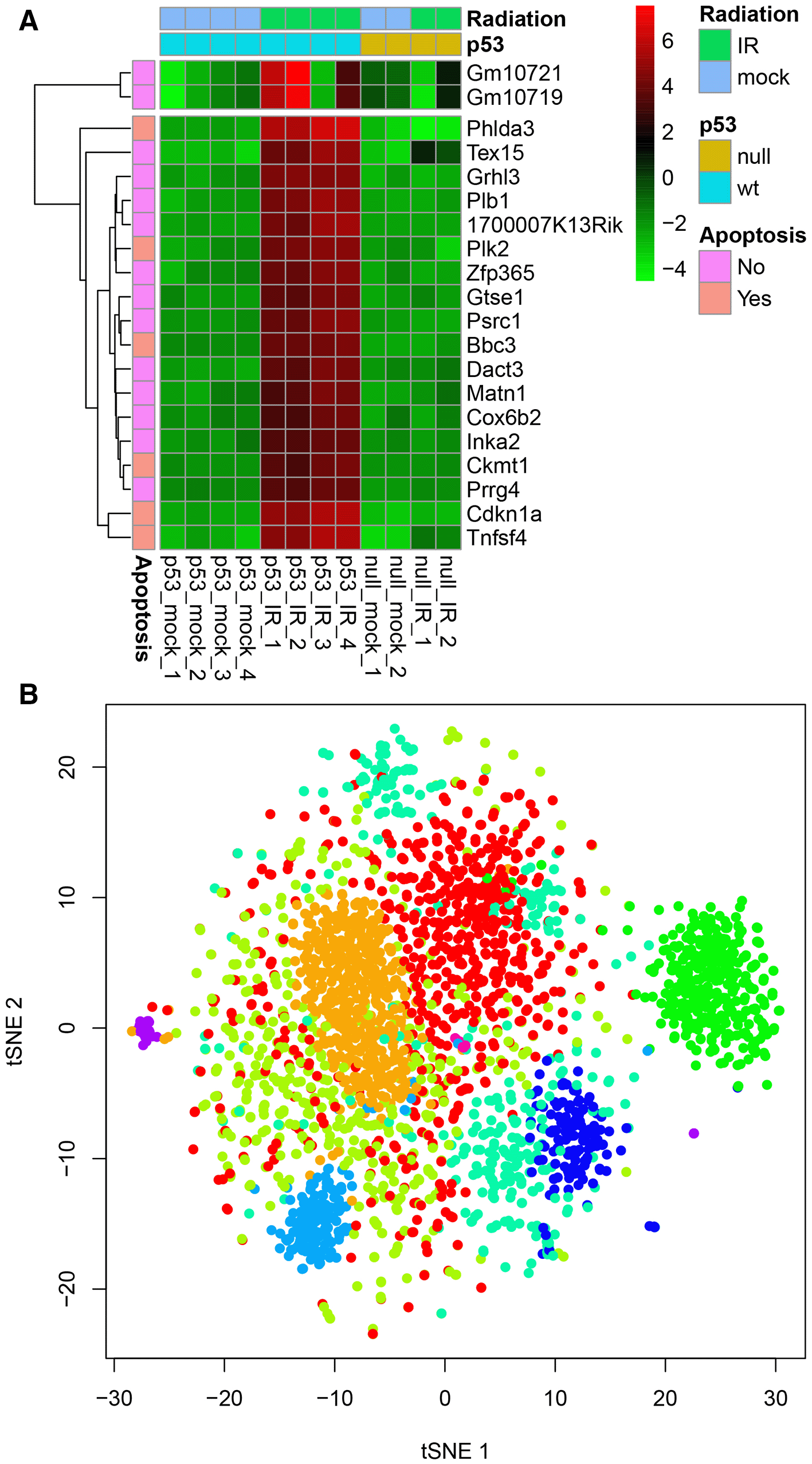
(A) Top 20 genes upregulated by ionizing radiation in mouse B cells with functional p53 gene6, and (B) t-SNE projection of 2700 single-cell RNAseq profiles of peripheral blood mononuclear cells (PBMCs), available from 10X Genomics. Both datasets are included as built-in examples within the application.
When analyzing large datasets, browser-based execution is slower compared to native execution. For example, generating a hierarchical clustering heatmap of a 2700×50 matrix takes approximately 80 seconds when run in the browser, compared to just 5 seconds in native R on the same laptop (Intel 11th Gen Core i7-1185G7, 3.00 GHz). Users are encouraged to install DataMap locally as an R package for extremely large datasets. Another limitation stems from DataMap’s reliance on the WebR, which only supports a subset of R packages with delayed updates.
In summary, DataMap combines secure client-side processing with robust data preprocessing and reproducible workflows. It complements existing web-based tools, equipping biomedical researchers with a powerful tool for exploratory analysis. Future development will focus on expanding visualization capabilities and incorporating additional analytical modules.
Software available from: https://gexijin.github.io/datamap
Source code available from: https://github.com/gexijin/datamap
Archived source code at time of publication: https://doi.org/10.5281/zenodo.15361414
License: GNU General Public License v3.0
| Views | Downloads | |
|---|---|---|
| F1000Research | - | - |
|
PubMed Central
Data from PMC are received and updated monthly.
|
- | - |
Provide sufficient details of any financial or non-financial competing interests to enable users to assess whether your comments might lead a reasonable person to question your impartiality. Consider the following examples, but note that this is not an exhaustive list:
Sign up for content alerts and receive a weekly or monthly email with all newly published articles
Already registered? Sign in
The email address should be the one you originally registered with F1000.
You registered with F1000 via Google, so we cannot reset your password.
To sign in, please click here.
If you still need help with your Google account password, please click here.
You registered with F1000 via Facebook, so we cannot reset your password.
To sign in, please click here.
If you still need help with your Facebook account password, please click here.
If your email address is registered with us, we will email you instructions to reset your password.
If you think you should have received this email but it has not arrived, please check your spam filters and/or contact for further assistance.
Comments on this article Comments (0)