Keywords
phylogeny, visualisation, 3D, fractal, animation, tree of life
This article is included in the Phylogenetics collection.
phylogeny, visualisation, 3D, fractal, animation, tree of life
A new version of this article has been published to correct the author’s affiliation to: Department of Biology & Ecology Center, Utah State University, Logan, UT, USA.
See the author's detailed response to the review by Stephen A. Smith
See the author's detailed response to the review by Rafael Zardoya
See the author's detailed response to the review by Diego San Mauro and Ainhoa Agorreta
A new generation of phylogeneticists are piecing together the entire tree of life, making vast phylogenies of millions of taxa1,2. Many have produced tree-like depictions of the relationships among species, both before and after Darwin described the origin of species3,4, but Haeckel’s drawings are perhaps the most well-known. As our phylogenies become larger, a problem has emerged: humans cannot easily interpret phylogenies with millions of tips. In this brief essay, I will describe recent progress in the visualisation of phylogenies, and outline a new kind of plot in development (the fibre plot). My aim is not to write a review [c.f. 5], but rather to provide an opinionated commentary on some major milestones in the progress of phylogenetic visualisation.
Haeckel’s phylogenies are beautiful to look at, and convey the overall structure of a phylogeny well. Each minor branch rarely maps onto a particular species, but their presence reminds the reader of the ever-changing nature of diversification. Both Haeckel and Darwin convey two kinds of information in their visualisations: time through depth on the page, and relatedness through the branching structure itself. Haeckel is also notable for producing a series of phylogenies, each examining a finer phylogenetic scale. Haeckel grasped that humans cannot process the fine details of all species without becoming lost, and that a series of phylogenies provides the same information in a more digestible format than a single, large, fully-resolved tree.
The last one hundred years have seen transformative changes to phylogenetic inference [see 6, but the same is not true of phylogenetic visualisation. The pace of change of phylogenetic visualisation has not matched that of other aspects of statistical visualisation. A time-traveller from 1859 could decipher a phylogeny from 2016 with On the Origin of Species3 as a guide, but the box-plots7 and histograms8 we rely on today would be foreign to them. Circular (“radial”) phylogenies are sometimes preferred when space is limited, and “magnifiers” in some computer programs highlight certain parts of the tree in more detail [e.g. 9], but for the most part any advances have been relatively minor.
To my knowledge, Paloverde10 was the first openly-released 3D phylogeny viewer. While it offered the user the ability to explore the most tree-like phylogenetic depiction to date, it also permitted the user to fly around a circular phylogeny rendered in a virtual space. Paloverde is notable for its claim that phylogeny is something to be explored, not merely viewed, and that “a 3D world, offers visual cues that aid in navigation and display that is unavailable in strictly 2D versions of the same layout.”10 The author of Paloverde, like Haeckel, recognised that scientists need to shift between finer and coarser phylogenetic scales when examining data, and so allowed users to collapse nodes at will. The program was a major advance in helping phylogeneticists conceptualise their own phylogenetic hypotheses. At least as transformative was the release of OneZoom11: a fractal phylogeny representation capable (theoretically) of displaying the entire tree of life on one page. OneZoom also requires the user to explore the tree, scanning up and down between finer and coarser details to make sense of the entire tree. Critically, OneZoom’s authors recognised that we are reaching the limits of what can be displayed in books: “[w]e now need to take the next step with a transition to data visualization that is optimized for interactive displays rather than printed paper.”11 They suggest that the way to display the next generation of data is to use the next generation of technology. A common thread running through these developments is their capacity to change the information displayed to the viewer, to better emphasise difference in structure across different phylogenetic depths. Consequently, I suggest the use of a new visualisation, the “fibre plot”, which is intended to leverage our natural ability to detect visual change through time. The fibre plot may be considered a horizontal slice through the tree of life, taken at whatever height (depth) the viewer requires (Figure 1). By moving along the tree, from the root to the tip, viewers will see the relative width of each fibre, and so gauge the number of terminal tips subtending that clade. I suggest an animation, with frames recorded at equal intervals along that trunk, which will provide the viewer with an intuitive sense of the timing of the diversification of major clades. I emphasise that, while Figure 1 shows the underlying logic behind the plot, the “plot” should really be called an animation - it is most readily interpretable when the user watches a video composed of successive slices through the trunk of the tree. I have included a toy implementation of this preliminary idea in R (Supplementary File 1), and an example of how it can be used to visualise the entire mammal tree of life12 (Supplementary File 2). Picking an ideal layout of the tips in the two-dimensional plane at the top of the tree is complex; a colleague has suggested using Hilbert curves based on the phylogeny’s distance matrix as an alternate solution to the one I have implemented.
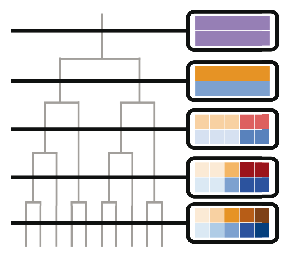
On the left, I show a phylogeny (in grey) with a series of slices cut through it (in black). To the right, I show views through those slices surrounded in black outlines: each of these slices forms the basis of a fibre plot. Within each slice, a square represents descendent tips, and colours of those squares represent the composition of clades within a particular time slice. Squares of the same colour form a “fibre” in the tree of life. A true fibre plot would be an animation of the transition between these slices, showing how the clades (fibres) that make up the tree split as diversification takes place. Alternate colouring schemes are possible for the fibres (e.g., representing clade age), and I suggest displaying the age of each slice as the animation progresses (see Supplementary files for examples).
Despite humanity being closer than ever to a true tree of all life on Earth1,2, phylogenetic visualisation may seem like a niche topic. I strongly feel that phylogenetic visualisation is critical to grasp the full extent of our planet’s biodiversity. Human activity has carelessly altered almost every aspect of our planet, and we must now live with the shame and hubris of a geologic age we named after ourselves13. There has never been a greater need to find a way to show humanity our true place in the world. In whatever sense a phylogeneticist can have a duty, I believe it is ours to show the world that we are nothing more than a twig on a tree that we are cutting down.
| Views | Downloads | |
|---|---|---|
| F1000Research | - | - |
|
PubMed Central
Data from PMC are received and updated monthly.
|
- | - |
Provide sufficient details of any financial or non-financial competing interests to enable users to assess whether your comments might lead a reasonable person to question your impartiality. Consider the following examples, but note that this is not an exhaustive list:
Sign up for content alerts and receive a weekly or monthly email with all newly published articles
Already registered? Sign in
The email address should be the one you originally registered with F1000.
You registered with F1000 via Google, so we cannot reset your password.
To sign in, please click here.
If you still need help with your Google account password, please click here.
You registered with F1000 via Facebook, so we cannot reset your password.
To sign in, please click here.
If you still need help with your Facebook account password, please click here.
If your email address is registered with us, we will email you instructions to reset your password.
If you think you should have received this email but it has not arrived, please check your spam filters and/or contact for further assistance.
Comments on this article Comments (0)