Keywords
Crowding, critical spacing, repeated letters, neural density
This article is included in the Eye Health gateway.
Crowding, critical spacing, repeated letters, neural density
Crowding is a major limitation of visual perception. Because of crowding, a simple object, like a letter, can only be recognized if clutter is a certain critical spacing away (Bouma, 1970; Levi, 2008; Pelli & Tillman, 2008). That needed spacing grows linearly with eccentricity. In the fovea, we find the critical spacing of crowding to be about 0.05 deg in healthy adults, but it is much higher in certain clinical conditions, such as strabismic amblyopia and apperceptive agnosia (Song et al., 2014; Strappini, Pelli, Di Pace, & Martelli, unpublished report). Even when text is scaled in proportion to eccentricity, peripheral reading is slow and may be a useful model for slow central reading (Latham & Whittaker, 1996; Legge et al., 2001; Pelli et al., 2007). There is some evidence that the critical spacing of crowding drops during childhood as reading speed increases (Kwon et al., 2007; Pelli & Tillman, 2008). In shallow orthography languages, children with developmental dyslexia are doomed to read slowly relative to their peers and have an abnormally large critical spacing (Bouma & Legein, 1977; Martelli et al., 2009; O’Brien et al., 2005).
Crowding is only weakly associated with acuity; some patient groups have greatly worsened crowding with near normal acuity and others have greatly worsened acuity with near normal crowding (Song et al., 2014). There is tantalizing evidence suggesting that the critical spacing of crowding indicates neural density (participating neurons per square deg) in the visual cortex (Strappini, Pelli, Di Pace, & Martelli, unpublished report). Similarly, crowding has been linked to reading speed in children and in patients, so it might be a useful assay of cortical health and development. Thus, for basic and applied reasons, it would be very interesting to measure foveal crowding clinically in children and adults with normal and impaired vision, and to track the development of crowding during childhood.
In normal vision, letter acuity size A and the critical spacing of crowding S crowding both grow linearly with eccentricity φ (Levi et al., 1985; Toet & Levi, 1992). Based on their measurements in the peripheral visual field, Song et al. (2014) provided these formulas:
A = 0.029 (φ + 2.72 deg), (1)
S crowding = 0.3 (φ + 0.45 deg) (2)
They showed that a letter is recognized only if it respects three limits: acuity, crowding, and overlap masking. They found no interaction among the three limits. Overlap masking can be completely avoided by using a center-to-center spacing of at least 1.4 letter widths.
To measure crowding with letters, the letters must be above the acuity limit, yet smaller than the critical spacing. This is easy to achieve in the periphery, where the critical spacing is much larger than the acuity. The ratio of critical spacing to acuity is
S crowding / A = 0.3 (φ + 0.45 deg) / 0.029 (φ + 2.72 deg),
= 10.3 (φ + 0.45 deg) / (φ + 2.72 deg), (3)
At large eccentricity, beyond 3 deg, this ratio is large and asymptotically approaches a value of about 10:1. Most studies of crowding are done in the periphery with small targets that are above acuity yet much smaller than the critical spacing to be measured. At small eccentricities, in the fovea, this ratio is approximately 1.7:1. The critical spacing 0.14 deg (according to the formula) is less than twice the threshold size of 0.08 deg. In fact, our foveal measurements reveal a smaller critical spacing, less than 0.1 deg, which is impossible to measure with 0.14 deg letters without overlap. The fovea is the hardest place to measure crowding, but that is the site that is most affected by deficits like strabismic amblyopia and is also the site associated with highest neural density, so it seems worth the effort.
Despite this difficulty, there have been a number of reports of foveal crowding (Atkinson et al., 1988; Atkinson et al., 1986; Bedell et al., 2015; Bedell et al., 2013; Danilova & Bondarko, 2007; Hess et al., 2000; Kwon et al., 2007; Liu & Arditi, 2000; Malania et al., 2007; Semenov et al., 2000; Siderov et al., 2013). The thinnest discriminable target, for this purpose, is the Vernier target (Malania et al., 2007). Observers can detect a 0.01 deg misalignment of two thin lines in a Vernier target. However, binary discrimination is not an ideal clinical task because it yields information slowly. With two choices there is a high, 50%, chance of correctly guessing.
For faster testing, we wanted to use letter identification, with many possible letters, to minimize the guessing rate (Pelli & Robson, 1991). We needed a font that can be identified at a tiny width, a small fraction of the 0.05 deg critical spacing we seek to measure. We evaluated many fonts, and designed several of our own, to achieve a legible width approaching that of a vernier target. We call the new optotypes the “Pelli” font. It has a 5:1 aspect ratio and has a stroke width that is one half the letter width. The Sloan letters, much used in clinical testing, and designated as the standard optotypes for acuity testing in the USA, have a 1:1 aspect ratio and a stroke width of 1/5 the letter size (Sloan, 1959). Both fonts are displayed in Figure 1.

The new “Pelli” font has been designed to measure the spacing threshold. The Sloan font was designed by Louise Sloan to measure the size threshold, and has become the US standard for acuity testing (Sloan, 1959). (See Software availability.)
Figure 2 allows you to test your own eye. The figure is an acuity test chart, but this test is unusual in focusing exclusively on width. It measures the smallest legible width for three fonts. On each line, the letters of the several fonts have various heights, but they all have the same width. From left to right, the fonts are Pelli, Gotham (Condensed Light), and Sloan. The Gotham font, from Hoefler and Co. (http://www.typography.com), is a commercial font for general text setting, with some attention given to performing well at small sizes, e.g. in tables. It comes in a wide variety of styles including Narrow and Condensed, and, of those we tried, the “Condensed Light” style gave the smallest legible width of 0.04 deg. We also tested two other fonts that have been designed to perform well at small visual angles: Hoefler and Co. Retina Micro font, designed for stock price tables in the Wall Street Journal and Clearview Hwy 1-B, designed for highway signs and adopted as the standard in many US states.
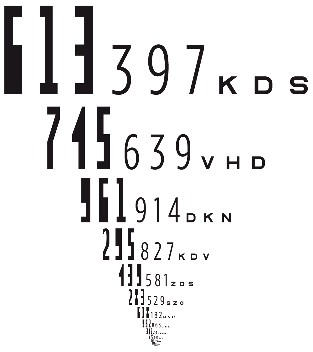
On each horizontal line of numbers and letters there are three fonts, and all characters in the line have the same width, though their heights vary greatly. The next line down is always smaller by a factor of 2-0.5 = 71%. Thus, going down two lines halves the letter size. The Sloan font, or optotype, is the USA standard for acuity testing. It has a 1:1 aspect ratio. Among the commercially available fonts that we tested, Gotham Condensed Light, with an aspect ratio 2.8:1, has the narrowest legible width. We created several experimental fonts (Arouet and Sticks, not shown) and finally created the “Pelli” font, which has the narrowest legible width. It has a 5:1 aspect ratio. Sloan’s stroke is 1/5 its width; Pelli’s stroke is 1/2 its width. In our sample of normally sighted adults, threshold width is about 0.02 deg for Pelli, 0.04 deg for Gotham (Condensed Light), and 0.05 deg for Sloan. You can use this chart to confirm this for your own eyes. At any viewing distance greater than 2 m, once you reach your limit for Sloan, you’ll be able to read four more lines of the Pelli font.
To test children as young as 4 years, we considered the use of popular pictograms, such as Lea Symbols and Patti Pics, used for illiterate testing, but they seemed unlikely to yield the tiny threshold width we need (Mercer et al., 2013). Thus, we decided to use numbers, anticipating that most children will have some familiarity. We gave each child a page with the 9 possible numbers so that they can respond by pointing instead of speaking if that seems easier. We’ve had good results from this with the several children we have tested so far.
The new test uses the digits 1–9, familiar to most children and patients. The 9 categories are sufficiently many to yield a low guessing rate (1/9) for fast threshold estimation. A new font, “Pelli”, with no internal white space, designed for this test with help from Hannes Famira, a professional font designer, is legible down to very small width: 0.02 deg (1.2 minarc) in the normal adult fovea. In the same spirit as David Regan’s repeat-letter acuity chart (Regan et al., 1992), our test alternates two different target digits over the whole display. These two alternating targets crowd each other. As in Regan’s chart, no matter where the observer’s eye lands on the screen, a target will be imaged on the observer’s fovea, so the test can accurately assess foveal function even in observers with poor fixation.
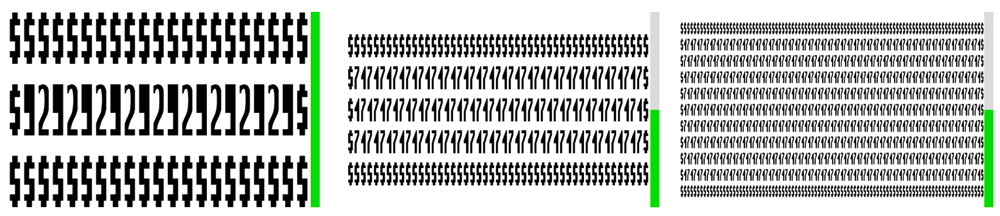
Figure 3 demonstrates the principle. There are two charts, one using the Pelli font, the other using the Sloan font. Each chart has two halves, left and right. These charts measure threshold spacing. Any given row has the same letter or number spacing (center to center), all the way across within each chart and across charts. The two halves of each chart have different character sizes. The ratio of spacing to size is 1.2 on the left and 1.8 on the right, on both charts. When you read down as far as you can go, you might be able to read farther down the left half because it has larger letters. The left-side letters are 1.8/1.2=1.5 times bigger, and the successive rows of the chart are approximately 1.4:1, so, if you are size-limited, you will read one line farther down on the left side. However, if you are spacing-limited, the bigger letters won’t help. This left-right difference is diagnostic. The critical spacing is small, so in order to reach it, letters must be legible at very narrow width. Testing ourselves, we find no left-right difference in our limit of reading on the Pelli chart (left). We do find a one-line difference on the Sloan chart on the right. Thus the Pelli font allows measurement of critical spacing in the healthy fovea, and the Sloan font does not.

The center-to-center letter or number spacing is fixed for each row, all the way across both charts. See text for details.
In our new test, the QUEST adaptive procedure adjusts the spacing of each chart to efficiently estimate threshold spacing (Watson & Pelli, 1983). Size is proportional to spacing, usually with a 1.4:1 ratio of spacing to size. Once overlap masking has been avoided, a target letter is identifiable if and only if the target and flankers satisfy both the size limit of acuity and the spacing limit of crowding.
The observer is asked to identify both targets in each presentation, in any order, and each identification response counts as a trial, so each presentation yields two trials. In 20 trials (i.e. 10 presentations) QUEST achieves an accurate estimate of threshold. We present preliminary results showing that the measured threshold spacing is practically independent of the spacing-to-size ratio used to measure it.
In normally sighted adults, Regan’s repeat-letter acuity chart yields the same acuity as a single-letter chart. That is perhaps surprising, since one might expect crowding. However, the studies reported by Pelli et al. (2004) included experiments showing that simple targets are not crowded by identical flankers, but that finding was not discussed in the paper. Presumably the flankers contribute the same features as the target, so combining features from both yields the same summary statistics as from the target alone, and thus identification is unaffected.
All stimuli are presented on a laptop screen. The observer sits at a long viewing distance (2 to 10 m) away from the display. We compute the minimum viewing distance to achieve at least 400 pixel/deg, so that a 0.02 deg letter will be at least 8 pixels wide. The minimum distance depends on the screen resolution of the particular laptop. The MATLAB formula is
minViewingDistanceCm=57*(minPix/letterDeg)/(screenWidthPix/screenWidthCm); (4)
where letterDeg=0.02, minPix=8.
Our experiments ran in MATLAB 2015b with the Psychtoolbox 3.0.12 extensions on laptop computers running OS X or Windows (Kleiner et al., 2007). The Psychtoolbox software is available, free (http://psychtoolbox.org). Our testing program is called CriticalSpacing.m (see Data and software availability). We are making it available, and hope this will encourage more investigators to measure the critical spacing of crowding.
When testing, we use a wireless keyboard to receive the observer’s responses, since the screen is so far away. Each presentation is a static chart. We ask healthy adults to respond to each chart by typing the character (digit) corresponding to each of the one or two targets presented. Invalid keys are dead and are ignored. When a valid key is typed, it is echoed by computer speech, e.g. “3”. Each correct response is followed by a faint beep. For each presentation, the scoring ignores the order of responses. The observer is informed that the two targets are always different, so that the observer must respond with two digits. Typing the same key again is ignored. After both target responses have been recorded, if testing a child, the computer randomly says, “Good”, “Very good”, or “Nice”.
A green progress bar is always present on the right side of the screen and grows, after each presentation, from the bottom of the screen, reaching the top of the screen at the end of the run (usually 10 presentations). The computer says “Congratulations” at the end of the run. Figure 4 shows screenshots taken during testing.

The green bar at the right of each screenshot indicates progress through the run of 20 trials (ten presentations of repeated targets or 20 presentations of single targets). Threshold for spacing with repeated targets (left upper) and a single target (left below). Threshold for size with repeated targets (right upper) and with a single target (right below).
The static presentation can have one of four configurations. Each measures a size or spacing threshold, using single or repeated targets.
| SPACING OF REPEATED TARGETS | New! Two alternating targets repeated over the whole screen (Figure 4A). |
| SPACING OF SINGLE TARGET | Traditional. A single target surrounded by four flankers, left, right, up, and down. (Figure 4B) (Exception: For Figure 7, we used only two flankers, left and right.) |
| SIZE OF REPEATED TARGETS | The screen is divided into two halves, left and right (Figure 4C). Each half shows a single target, repeated to fill the space. |
| SIZE OF SINGLE TARGET | Traditional. A single target (Figure 4D). |
In the REPEATED-TARGETS conditions there are two different targets; in the SINGLE-TARGET conditions there is one target. The observer is asked to report the targets. The chart is displayed until the observer has given a response for each target (one or two).
The display consists of characters all drawn at the same size from one font and alphabet. We are most interested in our new Pelli font, using “123456789” as possible targets, but we have also tested Sloan, using “DHKNORSVZ”, and Gotham (Condensed Light), using “123456789”. The entire run uses a single ratio of spacing to size, typically 1.4. QUEST (included in the Psychtoolbox) controls the size or spacing; the other parameter tracks it proportionally. QUEST reports horizontal size and spacing. When characters have an aspect ratio that is not 1:1, the spacing is proportional, i.e. vertical spacing is proportional to height and horizontal spacing is proportional to width.
On a REPEATED-TARGETS presentation, if the targets were repeated out to the edge of the display, the outermost targets would be exposed on one side and would be less crowded. Our instructions try to minimize this by asking observers to concentrate on the middle of the display. And our design prevents escape from crowding by using a non-informative “margin” character around the edge on every REPEATED-TARGETS presentation. When the alphabet is “DHKNORSVZ”, we use “X” on the margin. When the alphabet is “123456789”, we use “$” on the margin. This avoids problems with edge effects.
One target is at the center of the display, and other characters are added. In the SINGLE conditions, for SIZE, the target remains alone; for SPACING, we add four random flankers (drawn randomly from the alphabet), left and right, up and down.
In the REPEATED-TARGETS condition, for SIZE, the screen is divided in two, left and right; each half has its own target. The target is repeated left and right and up and down to fill the display, except for the screen margin. For SPACING, the two targets alternate, left and right and up and down, to fill the whole display, except for the screen margins.
The threshold estimation procedure is like that used by Song et al. (2014). One parameter (horizontal size or spacing) is controlled by QUEST. The other parameter scales proportionally in a fixed ratio of spacing to size (Figure 5), which is usually 1.4:1, but we also tested other ratios QUEST assumes a Weibull function describing probability of threshold versus log size or spacing and estimates the threshold parameter alpha. The steepness parameter beta is set at 3.0. Each run is 20 trials. Presentations with repeated targets have two targets and thus count as two trials. Presentations with single targets yield just one trial. At the end of the run, the QUEST procedure provides an estimate of threshold.
To create the Pelli font, we made sketches on paper, which we viewed from a great distance and adjusted to enhance recognition. The sketches were then drawn in GraphicConverter and further adjusted. These pixel-based sketches were traced in RoboFont (Version 1.7). The descender was set to 0 units and x-height, ascender and cap height were set to 1000 units. All characters of this fixed pitch or monospaced font were set to a setwidth of 200 units, except that the space and non-breaking space characters were set to 100 units width. The resulting cubic outlines were generated into an OpenType font. See Data and software availability.
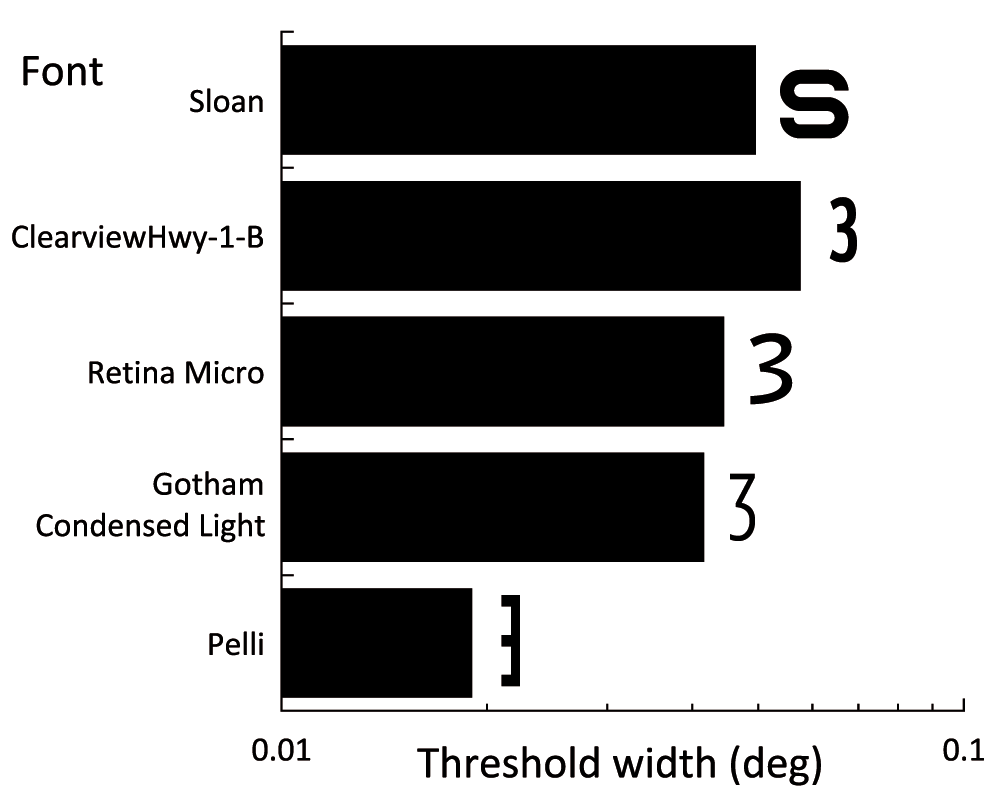
We measured threshold width for various fonts that have a reputation for legibility at small angular subtense (Figure 6). ClearviewHwy (www.clearviewhwy.com) is designed for highway signs, has been approved by the US government, and has been adopted by several states, including New York. Retina Micro was designed for typesetting stock price tables in the Wall Street Journal. Gotham (Hoefler & Co.) is an all-round font that comes in a wide range of styles including a very thin Compressed Light. These thresholds were all measured on one experienced healthy adult observer. Standard errors are about 5% of the plotted means. We are surprised by the cluster including Sloan near 0.05 deg. Only the Pelli font escapes to achieve a much smaller threshold size, of 0.02 deg for this observer, XW.
We measured threshold spacing with repeated targets with the Pelli font on 6 observers (O1–O4 four adults, C1–C2 two 8-year-old children, all healthy) at 3 spacing:size ratios: 1.2, 1.5, 1.8. We collected each threshold once (4 observers, U Rome-Martelli), twice (1 observer, NYU-Pelli-Qiu), or six times (1 observer, NYU-Pelli-Wu). For the latter two observers, we also collected the same number of threshold spacings with a single target.
Figure 7 shows these threshold spacing for the Pelli font. Observers C1 and C2 are 8-year-old children; the rest are adults.
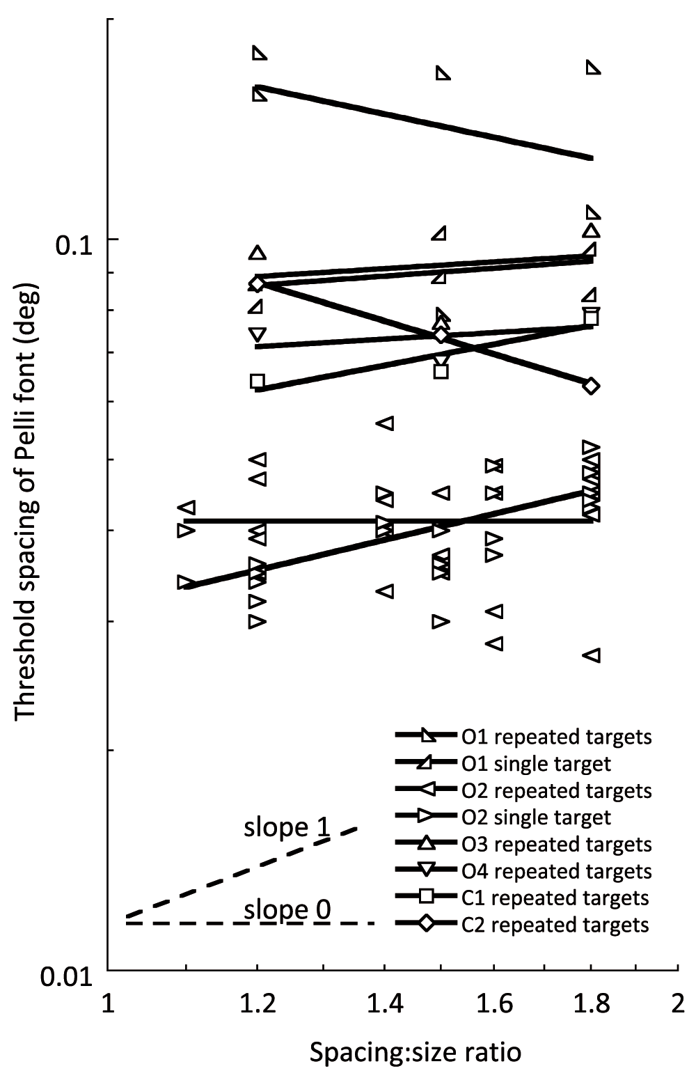
Spacing thresholds were measured with the Pelli font. For each observer, we fit a linear regression line to each kind of threshold (single or repeated target) that was measured at several spacing:size ratio. The slopes are practically zero, showing that threshold spacing of each observer is conserved across this range of spacing-to-size ratio. This is consistent with spacing-limited threshold and inconsistent with the unit slope of a size limit.
A single threshold measured by co-varying size and spacing might be hitting either a size or spacing limit. (Overlap masking is negligible at the large ratios of size to spacing that we used.) The hypothesis that the thresholds are spacing limited predicts that the spacing threshold will be independent of the spacing:size ratio. The hypothesis that the thresholds are size limited predicts that the spacing threshold will be proportional to the spacing:size ratio. Thus the two hypotheses predict that the measured spacing thresholds will have a log-log slope of 0 or 1, if they are spacing- or size-limited, respectively. We did linear regressions to estimate the log-log slope of all the data for each of the 8 observers. Across all the observers the log-log slope mean±se is 0.02±0.17 which is insignificantly different from zero and about 6 standard errors below 1. This confirms that these spacing thresholds are spacing-, not size-, limited.
Threshold spacing mean±se was 0.065±0.006 (repeated target) and 0.049±0.004 (single target). This small difference (0.065 vs. 0.049 deg) is significant, about three standard errors. The slightly stronger crowding in the repeated-target condition is very likely because the repeated target was flanked on all four sides by other digits, whereas the single target was flanked only on left and right (the exception noted above in the SPACING & SIZE table.).
To better compare the repeated- and single-target estimates of threshold spacing with flankers on all four sides, we measured both 4 times on two observers (Table 1). The repeated-target thresholds are 9% higher.
Strappini, Pelli, Di Pace, and Martelli (unpublished report) note that the lesions in apperceptive agnosia are accidental and diverse, from which one might expect diverse effects. Instead they find that the known diversity of the apperceptive agnosic population is roughly accounted for by a one-parameter model: the critical spacing of crowding. Crowding limits vision in the periphery, in strabismic amblyopes, and in patients with apperceptive agnosia, making it urgent to know what drives crowding. Acuity does not. Song et al. (2014) report a double dissociation of acuity and crowding: apperceptive agnosia worsens crowding while sparing acuity, and anisometropic amblyopia worsens acuity while sparing crowding. This shows that acuity and crowding are functionally independent. So what drives crowding? Pelli (2008) shows that the critical spacing of crowding is a fixed distance on the cortical surface, 6 mm in V1. Perhaps the extent of crowding reflects the number of cortical neurons per deg2 participating in the recognition task. This neural density may be reduced by lower cortical magnification (in the periphery), take over by the other eye (in strabismic amblyopia), or cell death (in agnosia).
Posterior Cortical Atrophy (PCA) is Alzheimer’s disease occurring in the visual cortex, which is one etiology for apperceptive agnosia (Crutch, 2014). Crutch & Warrington (2007); Crutch & Warrington (2009) showed that the patients’ reading difficulties are well described as crowding. In their study of crowding in 26 PCA patients, Yong et al. (2014) report a correlation between crowding and lower grey matter volume within the right collateral sulcus, between the fusiform and lingual gyri. With regard to neural density, crowding in the central vision of the agnosic patients might reflect limited plasticity of the ventral stream, i.e. insufficient recruitment of other neurons to entirely make up for the loss in neural density.
We will be using this new test to measure foveal crowding in children and adults, healthy and patients, to develop norms and evaluate the possibility that critical spacing might track neural density.
The critical spacing of crowding in the fovea seems to be an important measure of visual function and cortical health. This new test is a good way to measure it.
F1000Research: Dataset 1. Several size thresholds (in deg) for each font listed, 10.5256/f1000research.7835.d111930 (Pelli et al., 2016a).
F1000Research: Dataset 2. Threshold spacing of six observers at several values of spacingOverSize, 10.5256/f1000research.7835.d111931 (Pelli et al., 2016b).
F1000Research: Dataset 3. 4 spacing thresholds for each of 2 conditions (single and repeated target) for each of two observers, 10.5256/f1000research.7835.d111932 (Pelli et al., 2016c).
The “Pelli” and Sloan fonts are available for noncommercial research use from GitHub: https://github.com/denispelli/Eye-Chart-Fonts/
The Sloan font file was created by Denis Pelli based on Louise Sloan’s specifications and used for the Pelli-Robson contrast sensitivity chart (Pelli et al., 1988). Louise Sloan’s design has been designated the US standard for acuity testing by the National Academy of Sciences, National Research Council, Committee on Vision (NAS-NRC, 1980). The C is a Landolt C. The C and O are particularly hard to discriminate from each other, so Elliott et al. (1990) recommend that most studies omit the C, as we did here.
CriticalSpacing.m is our MATLAB program that uses any font to measure acuity and critical spacing. It allows testing with single or repeated targets. With single targets, it can test at any eccentricity, using brief presentation. We are making it available here, and hope this will encourage more investigators to measure the critical spacing of crowding. If you publish results collected with software based on our program, please cite us (this article). Thanks!
https://github.com/denispelli/CriticalSpacing/
We welcome improvements to the software. Please use GitHub to submit your suggested change.
Written informed consent for participation was obtained from each adult participant. Minors and their parents gave written consent. Children gave verbal assent and their parents gave written consent. All our human testing was conducted according to the principles expressed in the Declaration of Helsinki. Our protocols were approved by: NYU University Committee on Activities Involving Human Subjects IRB #13-9694 and #10-7375; Anglia Ruskin University Faculty Research Ethics Panel #FST/FREP/151538; Ethics Committee of the IRCCS Fondazione, Santa Lucia Rome (Prot. CE-PROG.480). Work at the Dementia Research Centre was ethically approved by the NRES Research Committee London - Queen Square (05/Q0512/47).
| Views | Downloads | |
|---|---|---|
| F1000Research | - | - |
|
PubMed Central
Data from PMC are received and updated monthly.
|
- | - |
Click here to access the data.
Spreadsheet data files may not format correctly if your computer is using different default delimiters (symbols used to separate values into separate cells) - a spreadsheet created in one region is sometimes misinterpreted by computers in other regions. You can change the regional settings on your computer so that the spreadsheet can be interpreted correctly.
Provide sufficient details of any financial or non-financial competing interests to enable users to assess whether your comments might lead a reasonable person to question your impartiality. Consider the following examples, but note that this is not an exhaustive list:
Sign up for content alerts and receive a weekly or monthly email with all newly published articles
Already registered? Sign in
The email address should be the one you originally registered with F1000.
You registered with F1000 via Google, so we cannot reset your password.
To sign in, please click here.
If you still need help with your Google account password, please click here.
You registered with F1000 via Facebook, so we cannot reset your password.
To sign in, please click here.
If you still need help with your Facebook account password, please click here.
If your email address is registered with us, we will email you instructions to reset your password.
If you think you should have received this email but it has not arrived, please check your spam filters and/or contact for further assistance.
Comments on this article Comments (0)