Keywords
Spatial Omics, Interactive Visualization, Dimensionality Reduction, Networks
This article is included in the Bioinformatics gateway.
Spatial Omics, Interactive Visualization, Dimensionality Reduction, Networks
Spatially resolved omics technologies provide a view into the landscape of complex biological processes (Burgess, 2019; Nawy, 2018). For example, they have revealed novel aspects of tissue differentiation and the structure of certain cancers (Rao et al., 2021; Yoosuf et al., 2020). A spatial transcriptomic or proteomic dataset can be viewed as a spatially indexed collection of high-dimensional vectors (Dries et al., 2021a). The coordinates of each vector correspond to different genomic features (genes expression and protein measurements for spatial transcriptomics and proteomics, respectively) while the spatial index locates each measurement at some location in a tissue or cell.
Two challenges in the analysis of spatial omics data are:
• Microenvironment dimensionality reduction: considering the large number of simultaneously measured genomic features, some form of dimensionality reduction is essential for effective exploratory analysis. However, for spatially resolved data, a dimensionality reduction should describe microenvironments and their relationships with one another. It is more useful to embed the genomics signature of a cell’s local neighborhood than simply the cell in isolation.
• Streamlined navigation: low-dimensional representations of microenvironments may not be interpretable on their own. To this end, it is helpful to relate the representations to their original spatial and genomic contexts. Ensuring that these correspondences can be explored efficiently is a challenge in itself.
This paper discusses methods to address these challenges and releases a new R package that implements them. For the first challenge, our approach was to featurize spatial neighborhoods and pass this representation to downstream dimensionality reduction techniques. We explored in-depth features based on (1) histograms of expression levels and (2) local cell network properties. For the second challenge, we designed an interactive visualization that links learned representations with contextual descriptors.
We evaluated these methods using simulation and a qualitative data analysis. The simulation clarifies the difference between learning representations on individual cells and local cellular neighborhoods. The data analysis recapitulates the findings of (Chen et al., 2020; Keren et al., 2019). We believe that the main advantages of the proposed approach are:
• Modularity: the approach can be made use of existing dimensionality-reduction methods while ensuring that results reflect meaningful spatial structure.
• Flexibility: spatial featurizations can be tailored to specific problem contexts with little changes to the overall workflow.
Our methods are implemented in the R package NBFvis, available on GitHub.
The remainder of the paper is organized as follows. The Background subsection reviews relevant literature on analysis of spatial omic data. The Methods section describes the proposed method. The Visualisation subsection introduces what kinds of visualization and interactivity are provided in our package. The Simulation subsection and the Results section illustrate the method in simulation and real data analysis, respectively. The Package subsection gives an overview of NBFVis’s functionality. We conclude with a summary and directions for future work in the Discussion.
The proliferation of spatial omic data has attracted attention from the modeling and visualization communities. Important themes that have emerged include the selection of spatially varying genes, derivation of spatial summary measures, and discovery of spatially consistent microenvironments. The resulting software packages allow analysts to generate overviews of spatial variation as well as focus on specific genomic features of interest.
Several studies propose feature-level models of spatial variation to select those with notable spatial expression patterns. SPARK fits a collection of random effects models with diverse sets of kernels to capture variation at several spatial scales Sun et al. (2020). Alternatively (Zhu and Sabatti, 2020), computed a measure of spatial variation based on a spatially induced graph laplacian; genes exhibiting similar patterns of spatial expression are then clustered. Alternatively (Hsu and Culhane, 2020), proposed an adaptation of Moran’s I-statistic to measure the extent of spatial clustering across cell types, highlighting the potential for the classical spatial statistics methods to support modern spatial omics analysis. Like NBFvis, these methods compute spatial statistics to summarize spatial omics datasets. However, they tend not to provide localized measures of spatial structure, focusing instead on tissue-level properties.
The Giotto package includes approaches to dimensionality reduction and interactive visualization of spatial omics data Dries et al. (2021b). Of particular interest, the package supports interactive visualization that dynamically links embeddings of expression measurements with corresponding cell locations. Note however that these embeddings are derived without reference to spatial features.
Similar to our approach, Spatial-LDA proposes a variation of the topic models that learns spatially consistent patterns of cell type mixing (Chen et al., 2020). This is achieved by tying together mixed memberships of neighboring cells in a structured prior, and the model is fitted using a custom optimization scheme. Regions with similar topic memberships can be interpreted as microenvironments. Our proposal has a similar data analytic goal; however, we aim to support more generic spatial features while preserving simplicity in implementation.
We provided a toy simulation to clarify the differences in embeddings when neighborhood information is and is not used. We found that if only cell-level information is considered, the embeddings will be dominated by cell types and fail to reflect microenvironment structure.
Dataset construction
Assume that there is one tissue section with three cell types. For each cell, five proteins are measured. Different cell types have different protein profiles, which means the average measurements of proteins differ according to cell type. We assume that cell types are clustered spatially, but that these clusters are close enough so that some areas overlap. These overlapping areas can be considered different microenvironments since the local mixture of protein profiles is different from regions of pure cell types.
Figure 1 is the spatial plot for the simulated dataset. Two thousand “cells” are generated and divided into three different cell types according to a multinomial distribution with the probability (0.2, 0.3, 0.5) for Cell Type 1, 2, and 3,
where ci is the cell type of the ith cell.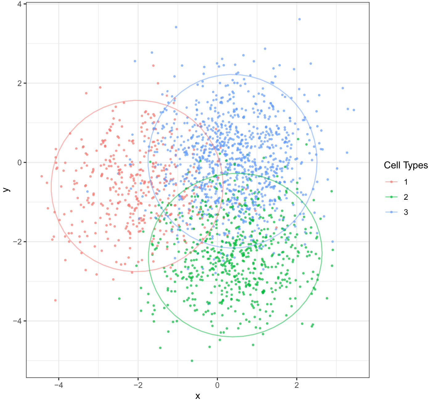
Overlapping regions can be thought of as their distinct microenvironments. The goal is to construct embeddings that reflect different mixing patterns.
For this demonstration, we imagined that protein abundances are drawn from a mixture of multivariate normals. The average of each mixture component represents the typical cell profile for each cell type. That is, for each cell, the measurements for each of the five proteins have the form,
where μj is the average protein profile for the jth cell type and pi is a five-dimensional measurement for the ith cell.Next, we simulated cell locations to get mixed spatial patterns. We used a different mixture of (now two-dimensional) multivariate normals. As before, component means center1, center2, and center3 were drawn from a multivariate normal. Denoting the coordinates of cell i by and the spatial mean of cell type j by centerj, we drew,
After simulation, we obtained a 2000 × 5 expression matrix, each row of which corresponds to the simulated observation of one cell. We called this matrix the “single cell matrix”.
To extract neighborhood information for each cell, we first found neighborhoods with a given radius (here we used 0.2 units in length). We then calculated statistics within each neighborhood. We chose quantiles of protein content as neighborhood-based statistics, which are simple but effective. For every cell and protein, we derived 21 quantiles q0, q0.05, …, q1 in the neighborhood. After calculation, an extended 2000 × 105 matrix was obtained. We called this the “neighborhood matrix”.
Comparison
We next applied dimensionality reduction methods to both the single cell and the neighborhood matrices, in order to clarify the difference in the resulting embeddings.
First, we applied uniform manifold approximation and projection (UMAP) McInnes et al. (2018) to the single cell matrix, whose low-dimensional embeddings are shown in Figure 2. Only three separate clusters are visible in the embedding plot, each corresponding to a cell type. These UMAP embeddings ignore the microenvironments of mixed cell types along cluster borders in the spatial plot. This result indicates that, when spatial information is not directly incorporated, the low-dimensional embeddings are dominated by cell types and fail to distinguish microenvironments.
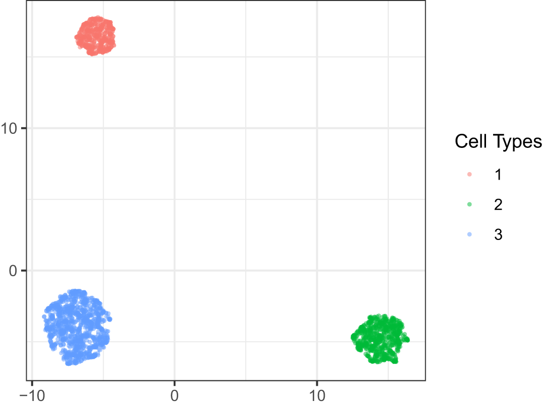
Cell types clustered with one another, but different mixture patterns were not observed. The embeddings were dominated by the cell types, obscuring the presence of microenvironments.
In contrast, the embedding plot of the neighborhood matrix detects microenvironment structures; see Figure 3. We noticed that there were still three clusters consisting of pure cell types. However, there were additional clusters of mixed cell types. Between the three pure clusters is a region corresponding to microenvironments with mixed cell types in the spatial plot. Furthermore, we noticed that this region can be further divided into spatially consistent “subclusters”. For instance, one region with only blue and green cells was related to the blue-green spatial boundary. This can be treated as a unique microenvironment. Similar red-blue and red-green regions were also visible.
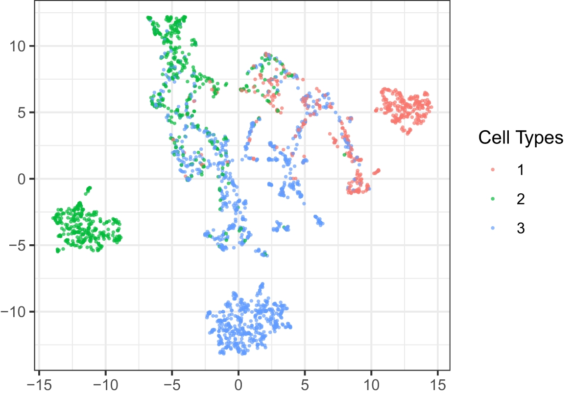
Though simple, the neighborhood quantile statistics make it possible to detect mixture microenvironments. We could further find subclusters like the red-green mixture in the central cluster.
In summary, UMAP embeddings using the single cell matrix were dominated by cell types and failed to detect microenvironments with mixed cell types. However, by simply applying UMAP to the neighborhood matrix, we were able to detect these spatially meaningful microenvironments.
First, we established notation and an overview of the general approach. Let contain expression measurements for gene or protein expression features across cells. We call the expression matrix. Let contain the spatial locations of the cells. We first applied a preliminary dimensionality reduction, like principal component analysis (PCA), to the expression matrix before the following neighborhood-based featurization. We called the reduced matrix , where is the number of dimensions after dimensionality reduction.
Before we can embed properties of cell neighborhoods, we need to define and derive features for each neighborhood. For each cell , we defined its neighborhood using distances induced by , either containing all cells within a certain radius or simply the K-nearest neighbors. Denote the neighborhood for the cell by , where are the neighbors in the neighborhood and is the number of neighbors surrounding . We featurized the neighborhoods using neighborhood-based featurizaton functions . We then rescaled all the derived featurization matrices and concatenated them to obtain an extended neighborhood-based featurization . The neighborhood matrix from the Simulation subsection is a special case of using quantile features.
In more detail, let be a set of featurization functions. By applying every to each neighborhood , we can construct . The matrix can be rescaled and then combined into a widened neighborhood matrix . This neighborhood matrix was input to a dimensionality reduction method to recover a set of embeddings. Our final set of microenvironments was found by clustering these embeddings. Below, we applied K-means to the set of neighborhood-level embeddings.
We next discuss a specific instantiation of this general procedure, describing the neighborhood and featurization choices used in the Results section and implemented in NBFvis. There, gives the number of cells in one tissue section, is the number of proteins measured, and is the spatial location matrix of the segmented cells. We applied a PCA to the expression matrix and then derived the reduced expression matrix . Neighborhoods were constructed by keeping the K nearest neighbors that are also within a given radius.
We used two types of featurization functions – quantile features and network features. For the ith cell’s neighborhood, Z quantiles were calculated for the kth protein, where . It means that we derived a PZ-dimensional vector for each neighborhood. Thus, . After featurization, we obtained an matrix, which we called the “quantile matrix”. Next, consider the construction of network features. Let denote the geometric graph associated with , using the metric induced by . Based on , we can calculate a variety of node or edge features. The associated network featurization here is , where is the number of network statistics. For example, in the experiments below, we used the number of edges and a variety of centrality measures. We used an ensemble of 29 network-based statistics in our example, detailed in Table 1 and the Extended Data XTH1114 and Sankaran (2022).
We use implementations of these centrality measures from the R packages igraph (Csardi and Nepusz, 2006), centiserve (Jalili, 2017) and sna (Butts, 2020). Network statistics implemented in NBFvis. These functions could be found in centiserve and snr package.
The final featurization combined both quantile and network features,
is a neighborhood matrix. Rescaling was applied to this neighborhood matrix so that every column was on a similar scale. This rescaled neighborhood matrix was passed to UMAP to obtain low-dimensional embeddings. These embeddings could then be clustered to identify distinct microenvironments. The whole workflow is shown in Figure 4.
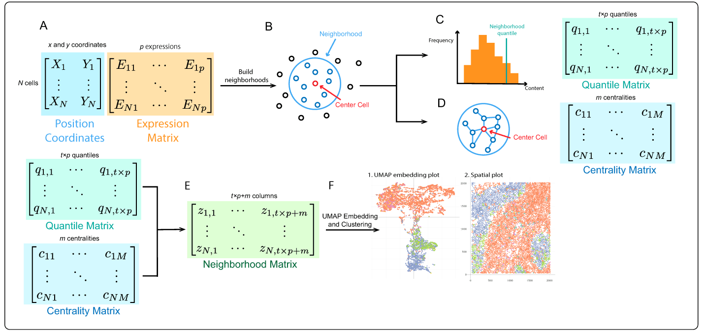
A) The spatial omics datasets are composed of two parts: spatial coordinates and expressions of each cell. We applied dimensionality reduction to the expression matrix to derive a reduced one on which features are derived. B) We treat each cell as a center and build a neighborhood for it. There are two general ways to construct a neighborhood: using distance between spatial coordinates and using the K-nearest neighbors. In our example, we combined these methods in the following way. First, we included cells whose distance from the central cell was less than a given length. Then we only kept the nearest K cells as its neighbors. C) To derive the quantile featurization for a gene, the quantiles of the distribution of each neighborhood’s expression for that gene are calculated. D) For the centrality featurization, we built a network within the neighborhood. Edges exist between two cells that are close enough. Then, we calculated centralities with respect to the center cell . E) We concatenated and rescaled these derived features into what we call a neighborhood matrix. F) We applied uniform manifold approximation and projection (UMAP) to the neighborhood matrix to obtain embeddings for each cell, where we directly applied clustering algorithms. See the Example subsection below for details of the implementation.
Several subtle but important details are worth noting. Before we calculate a featurization matrix, a preliminary dimensionality reduction method is needed. First, applying dimensionality reduction decreases the computational burden of downstream analysis. Computing quantiles for each feature in a high-dimensional dataset further increases the dimensionality. For example, computing 10 quantiles for each of 100 variables results in 1000 columns, which significantly increases the computational burden of embedding. Second, a statistical reason for dimensionality reduction is to reduce the noise in the original high-dimensional dataset. If the original data are effectively low-rank, then dimensionality reduction method will reduce unnecessary noise while preserving most statistical information, which is beneficial for the following embedding.
Another detail is the rescaling of the neighborhood matrix. Although the neighborhood matrix could have hundreds or even thousands of columns, there is no need to apply a preliminary dimensionality reduction to it, since all values are approximately comparable. However, it is necessary to rescale the neighborhood matrix because the ranges of different statistics vary dramatically, causing one or two variables with large variance to dominate the whole UMAP embedding. For instance, the entries in the quantile matrix were between -1.5 and 1.5 in the TNBC dataset, but for the network matrix, it is common to have some network statistics larger than 10. These network statistics would dominate the UMAP embedding if no rescaling is applied.
We devised an interactive Shiny app (Chang et al., 2015) to analyze outputs from the neighborhood-based analysis, supporting visualization of microenvironment differences. In this subsection, we discuss the design and visual queries supported by the interface.
Figure 5 shows the first component of the Shiny app, the UMAP embedding and linked spatial plot. This is used to relate the low-dimensional embeddings of each cell’s neighborhood features to its overall spatial context. Figure 5a is the two-dimensional UMAP embedding plot derived from the neighborhood matrix. Each point corresponds to one cell. The closer these points are, the more similar their neighborhood featurizations are. To clearly visualize the distribution of cell types, the points in Figure 5a are colored according to cell types.
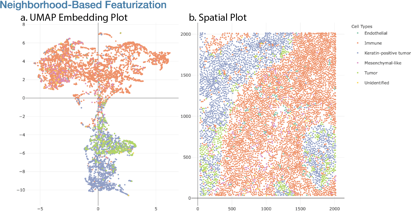
Part (a) is the two-dimensional embedding of the neighborhood matrix, and (b) is the original spatial layout of cell types.
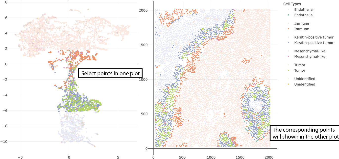
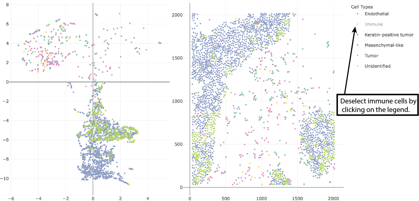
Figure 5b is the spatial plot. Each point here represents a cell center, derived from the original cell polygon in the tissue section. As before, different cell types are distinguished by colors. Furthermore, the two panels in Figure 5 are dynamically linked. When points are selected in one plot through a mouse brush, the corresponding points will also be highlighted in the other plot. Figure 6 shows the highlighted points in these two plots after one such selection. We can click on the legend on the sidebar to deselect these cell types so that they do not appear. Figure 7 shows the embedding plot and scatter plot after deselecting the immune cells.
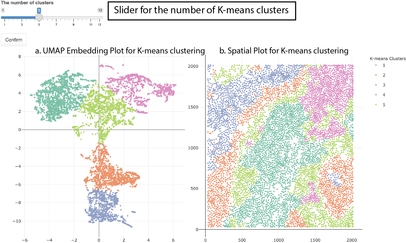
The second component of the Shiny app shows the same embeddings but colored by K-means cluster rather than cell type. For example, in Figure 8, the positions of points are still the same as in Figure 5, but they are clustered into five K-means clusters. A slider is provided at the top of the second component in Figure 8, which is used for changing the value of K in the K-means clustering.
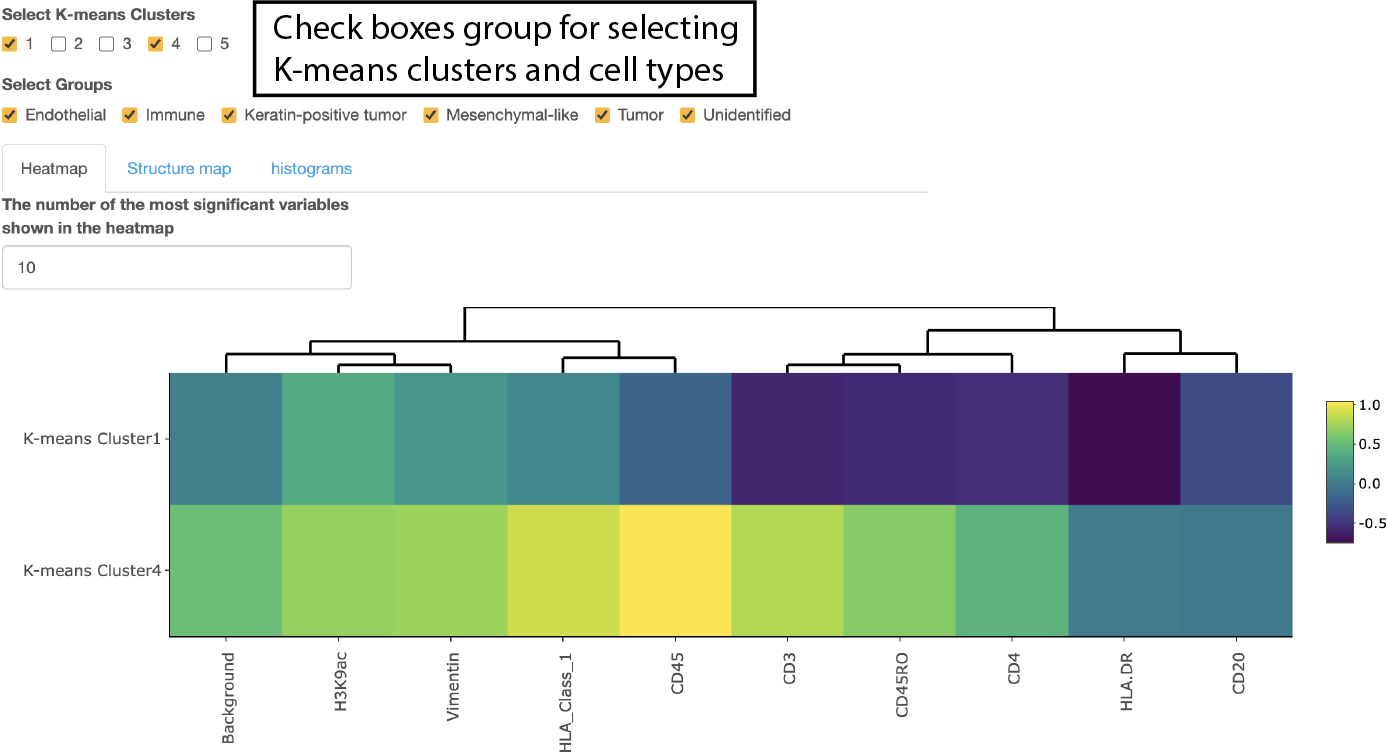
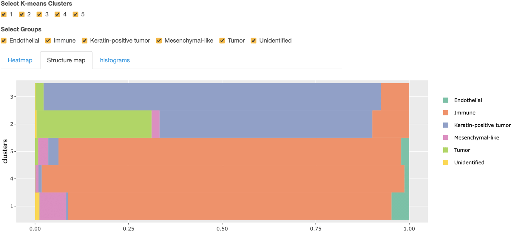
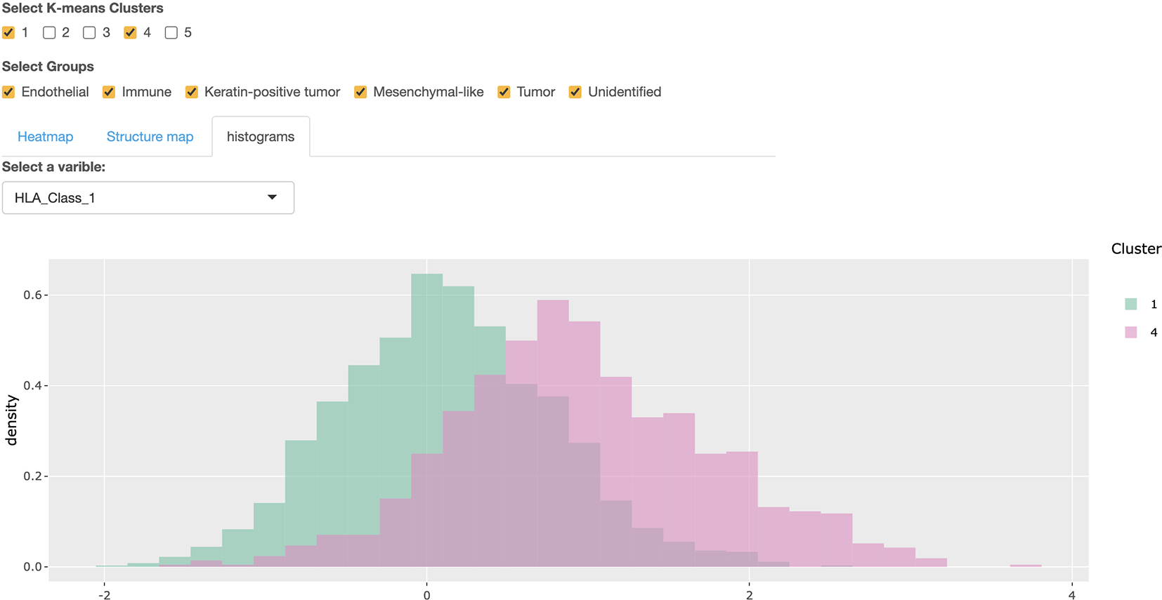
The third component of this Shiny app supports the comparison of expression levels across K-means clusters using a heatmap, structure plot, and histogram; see Figure 9. There are three tab panels with which we can switch between these three plots. Before making a further comparison, we can filter to cells of interest using the checkboxes at the top of Figure 9. Two groups of checkboxes are offered to select the cell types and K-means clusters to focus on. Based on the filtered cells, an expression heatmap of K-means clusters is provided in Figure 9. By default, it shows the top 10 most differentially expressed features across the selected clusters, based on the median of expression value in each cluster. A numeric input is offered above the heatmap – this controls the number of features appearing in the heatmap. The structure plot of the selected K-means clusters is provided in Figure 10, with which we can see the proportion of each cell type across every cluster. The histogram of expression is available to compare the selected feature’s expression across clusters. For example, Figure 11 is the histogram of the HLA Class 1 content in Clusters 1 and 4. Note that a selection input box is offered above the histogram to change the selected feature easily.
These views help describe clusters identified by K-means.
The dominant cell types in each clusters are shown clearly.
Users could select different expressions by the selection input box above the histogram.
To show the spatial distribution of a specific feature’s expression, another combination of the embedding and spatial plot is provided in Figure 12. The colors of the points in Figure 12 reflect Human Leukocyte Antigen (HLA) Class 1 content. This expression plot highlights spatial characteristics of the expression content. In this case, expression is elevated in immune cells, especially those closest to the tumor-immune boundary.
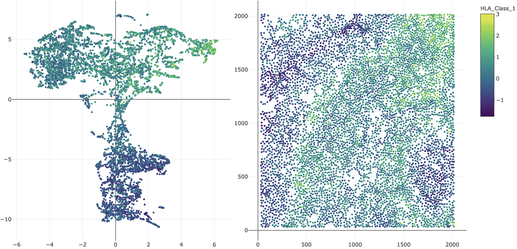
Instead of coloring by cell type or K-means cluster, each cell is shaded according to the selected genomic feature.
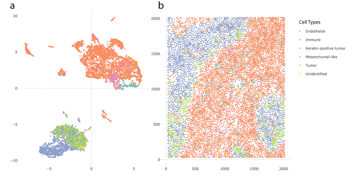
To illustrate our approach and package, we re-analyzed theTriple Negative Breast Cancer (TNBC) dataset of Keren et al. (2019) (Underlying data). To study this data, Chen et al. (2020) proposed Spatial-LDA, which was found to reveal novel microenvironments. Spatial-LDA models the distribution of cell types within neighborhoods but does not model protein expression directly. In contrast, our proposal considers quantitative protein measurements and network statistics within spatial neighborhoods. Here, we choose the tissue section of Patient 4, which had 6643 cells belonging to six cell types: immune cells (62.6%), keratin-positive tumor cells (25.2%), tumor cells (6.4%), mesenchymal-like cells (3.2%), endothelial cells (1.9%), and unidentified cells (0.5%). We used 41 expression variables, two-dimensional coordinates of cell centers, and cell types for further analysis.
The first step was to construct the neighborhood quantile matrix. We applied PCA to reduce the dimension of the expression matrix. We kept 19 principal components, which is the smallest number of components required to explain 90% of the variance. These components were labelled as , …, . Next, neighborhoods were defined using a radius of 60 pixels. We only include the cells among the top 40 nearest neighbors to the center cell of the neighborhood. Quantiles for each principal component were calculated based on neighborhoods. To avoid the influence of extreme values, only quantiles , , …, were included. Hence, we derive a 6643 × 323 quantile matrix of neighborhoods after featurization. The second step was to obtain the network matrix of the neighborhoods. We again used a radius of 60 pixels to define neighborhoods and kept only the 40 closest cells. Networks were constructed based on these neighborhoods. We linked cells whose centers were within 30 pixels of one another. Then, 29 network statistics were calculated according to the neighborhood networks; most of these network statistics were different kinds of network centralities. This resulted in a 6643 × 29 neighborhood network matrix.
The third step was to combine the quantile and network matrices together into an extended neighborhood matrix. The network matrix was rescaled in this step. The result was a 6643 × 352 neighborhood matrix. The final step applied dimensionality reduction and clustering to the neighborhood matrix. We applied UMAP to the neighborhood matrix to generate two-dimensional embeddings of each cell. K-means was applied to the UMAP embeddings to find potential clusters. These can be interpreted as microenvironments.
We used a Shiny app implemented in NBFvis to explore the result of UMAP embeddings and K-means clusters. Figure 13 shows the UMAP embeddings and spatial plot of the neighborhood matrix. Figure 13a gives the embeddings based on the reduction of the neighborhood matrix. The points in the embedding plot are colored according to their cell types. There are two main clusters in the embedding plot, composed primarily of immune and tumor cells, respectively. These two clusters are connected by a transition zone of a mixture of tumor and immune cells. Figure 13b is the spatial plot of the cells in the tissue section. By selecting the transition zone in the embedding plot, we found that the cells in this area are located on the boundary of immune cells, tumor cells, and keratin-positive tumor cells. This is shown in Figure 14.
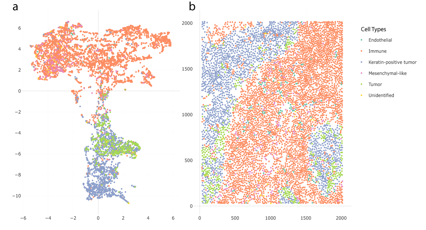
Panel (a) is the UMAP embedding plot colored in cell types. Panel (b) is the spatial plot of the real positions of cell centers. We observe a transition zone between clusters of tumor cells and immune cells in part (a).
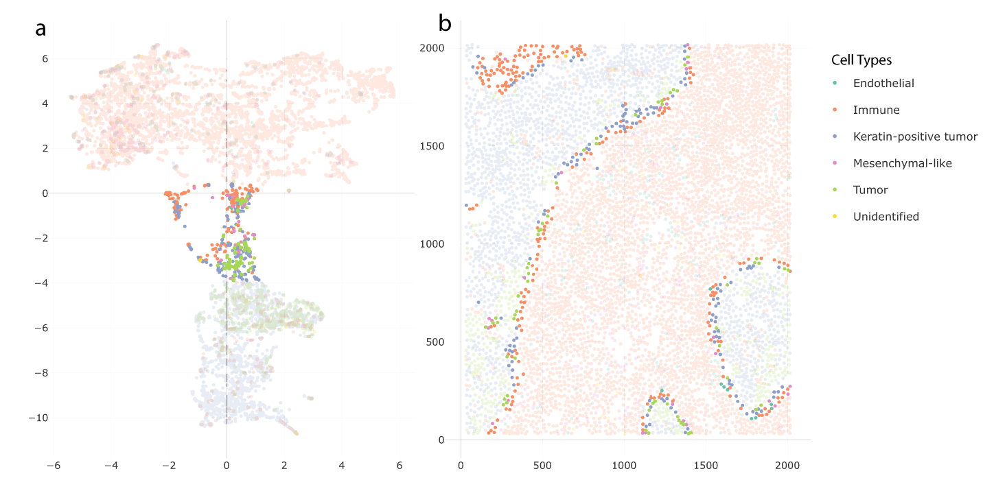
The corresponding cells whose embeddings are in the transition zone in panel (a) are located close to the tumor-immune boundary in panel (b).
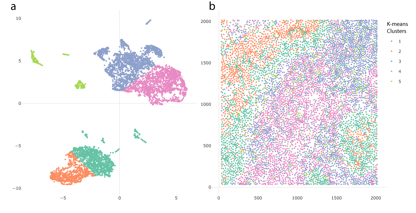
K-means clustering applied to the UMAP embeddings suggests potential microenvironments. Figure 15 shows clustering results with K = 5. The clusters are distinguished by their colors. In the embedding plot Figure 15a, the embeddings are divided into five clusters, and the corresponding locations of these clusters are shown in the spatial plot Figure 15b. One finding of note is that the clusters in the embedding space were spatially consistent.
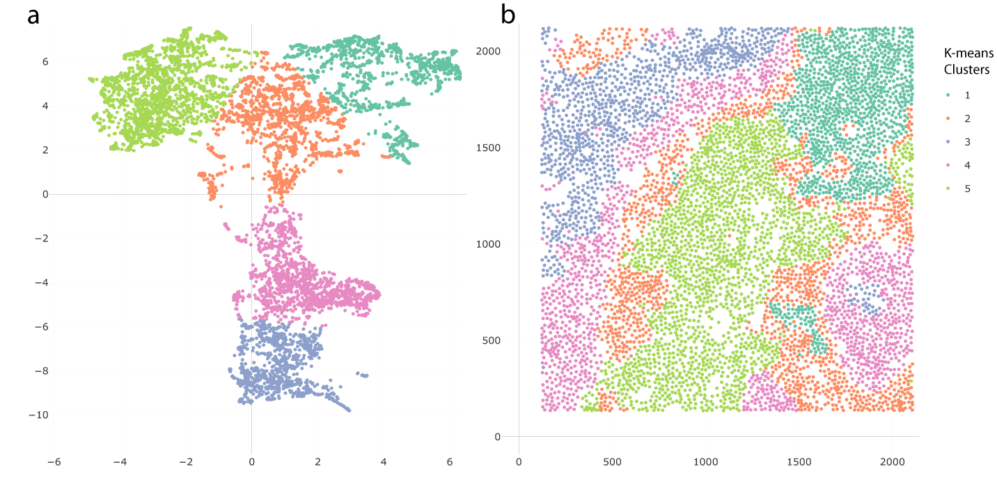
Clusters in panel (b) are spatially consistent. There are two special clusters on the tumor-immune boundary, whose embeddings are in the transition zone in panel (a).
In Figure 15b, two microenvironments were found among the tumor cells and keratin-positive tumor cells, Cluster 3 in the inner part of the tumor cell groups and Cluster 4 close to the boundary of immune cells. This mirrors the findings of Chen et al. (2020). Another finding was a special immune cell microenvironment, Cluster 2, lying on the boundary of immune cells, tumor cells, and keratin-positive tumor cells. This microenvironment was distinguished from the immune microenvironment in the inner part of immune cell groups, which is Cluster 5 in Figure 15b. Notice that Clusters 4 and 5, which are the microenvironments close to the tumor-immune boundary, are in the transition zone in the UMAP embedding plot in Figure 14. Moreover, another microenvironment, Cluster 3, was found in the top-left corner of Figure 15b, separate from the previous two immune microenvironments, Clusters 2 and 5.
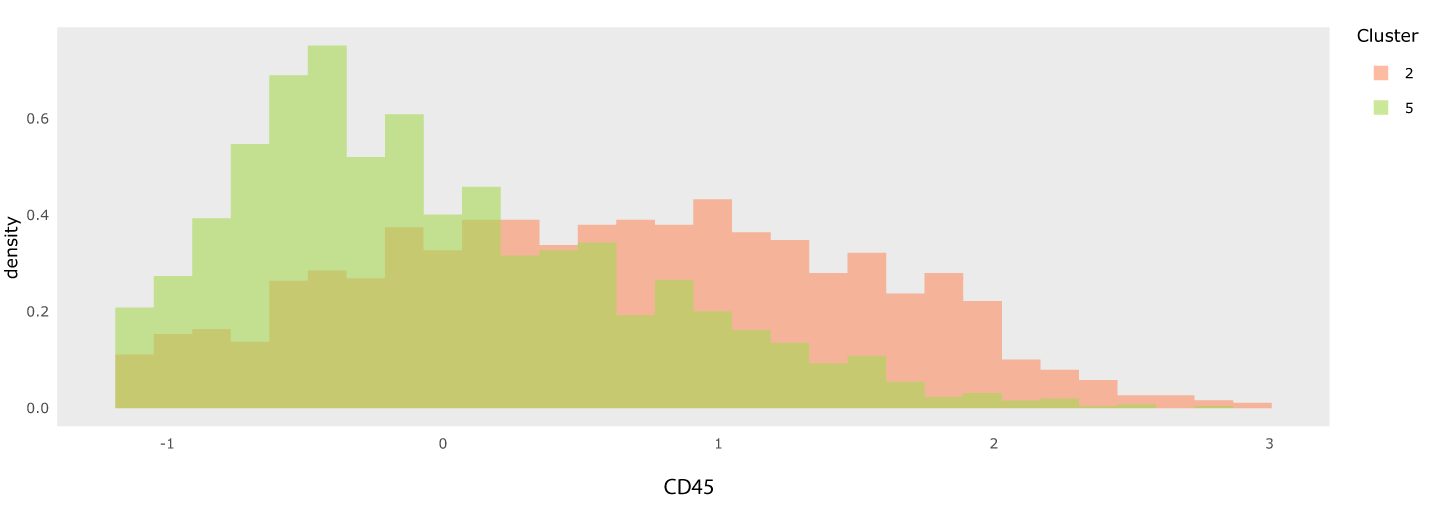
Next, we explored the differences between these microenvironments by studying their expression patterns. Figure 16 is the heatmap of the inner and boundary immune microenvironments, which are Clusters 2 and 5 in the Figure 15b, respectively. The heatmap shows the top 10 most differentially expressed proteins between these two clusters, determined by the differences between medians of expressions in each group. We chose the two most differentially expressed proteins, CD45 and CD45RO, for further exploration. The histograms in Figure 17 show the contents of CD45 across these two microenvironments. The inner immune microenvironment has a right-skewed distribution of CD45, indicating that many cells in this microenvironment have a low content of CD45. In contrast, the distribution of CD45 in the boundary immune microenvironment was significantly higher than that in the inner immune microenvironment. Figure 18 is the expression plot of CD45, this confirms that cells along the tumor-immune boundary had elevated CD45.
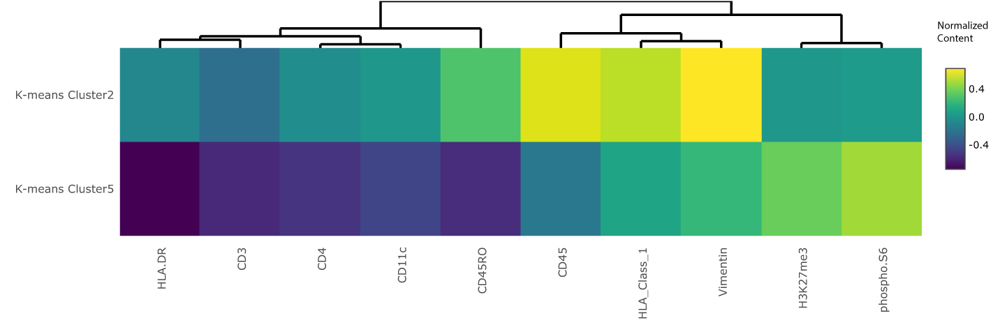
Cluster 2 is on the tumor-immune boundary and Cluster 5 is in the inner part of immune cell groups. The most obvious difference in expressions between these two clusters are CD45 and CD45RO. Cluster 5 had significantly lower CD45 and CD45RO content than Cluster 2.
Histograms for different features can be selected using the interface, and the choice can be guided by a heatmap like in Figure 16.
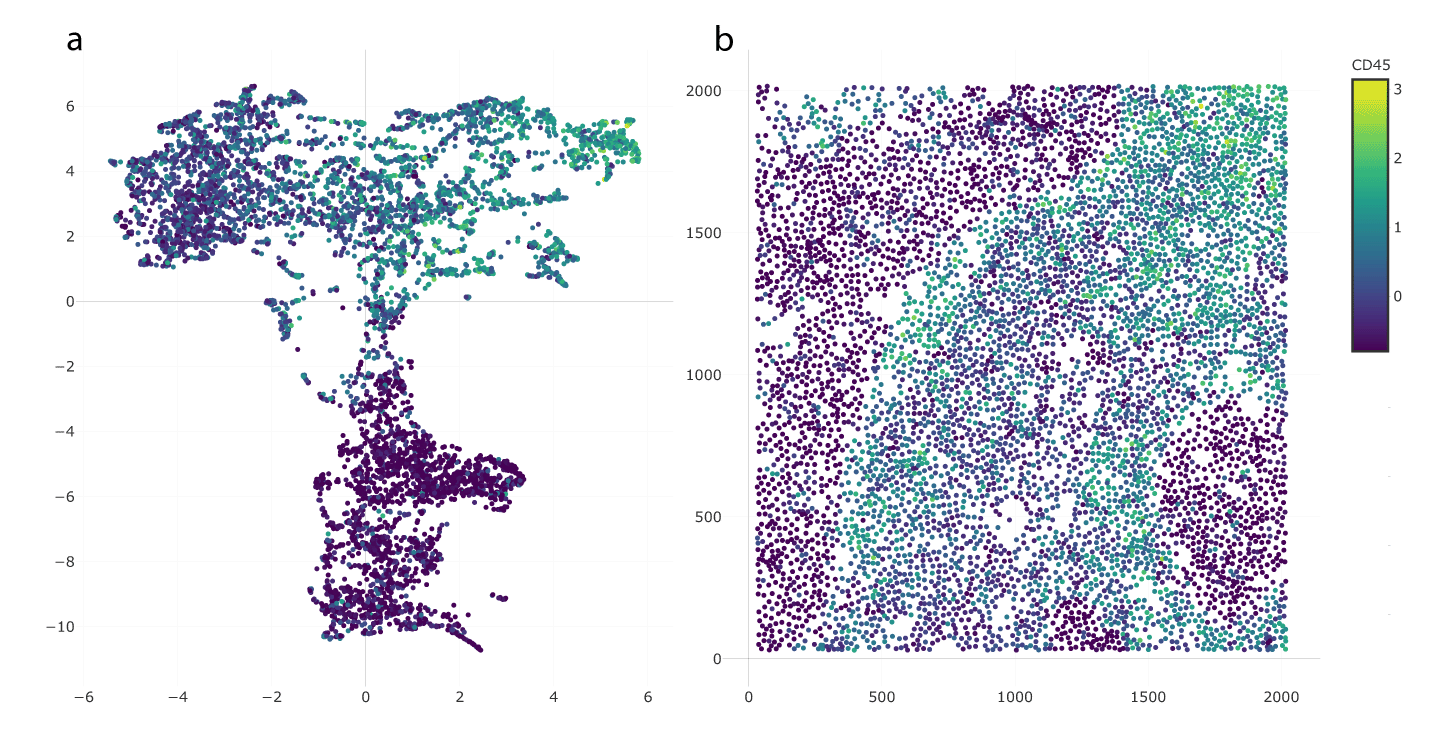
The existence of brighter cells near the tumor-immune boundary is consistent with Figures 16 and 17. This view also reveals elevated CD45 in the top-right region, corresponding to Cluster 3.
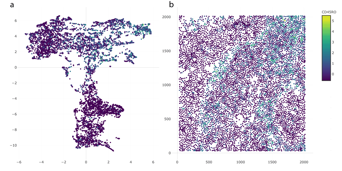
Checking the histogram and spatial expression of CD45RO in the inner and boundary immune microenvironments, we arrived at similar conclusions. Figure 19 is the histogram of these two microenvironments. The histogram for the inner immune microenvironments has a peak near the minimal value, which does not appear on the histogram of the boundary immune microenvironments. It shows that there were lower contents of CD45RO in the inner immune microenvironment but higher contents of CD45R0. Figure 20 also shows that there was a lighter boundary on the tumor-immune cells, highlighting this microenvironment.
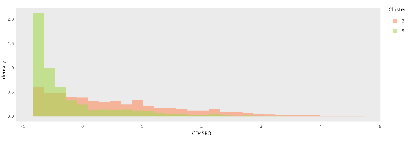
In contrast to CD45, the distribution in both clusters is strongly right-skewed, even after the preprocessing applied by Keren et al. (2019).
We also used the visualization tool to show the UMAP embedding and clustering results when directly applied to the original cell-level protein expression matrix. We used the same preprocessing as Keren et al. (2019). This serves as a reference point against which to compare the proposed neighborhood-based featurization.
Figure 21 gives the UMAP embedding and spatial plot using the cell-level approach. We found two clusters in the Figure 21a, one mainly made up of immune and one of tumor cells, respectively. The result was similar to the simulation, where UMAP embeddings were dominated by the differences between cell types and microenvironments were hardly distinguishable.
Cells are shaded by cell type. Compare with Figure 13.
Figure 22 shows the clustering results after K-means clustering with K = 5. The clustered microenvironments were mixed with each other; in particular, it was difficult to distinguish a tumor-immune boundary microenvironment. Figure 23 compares the clustered spatial plots based on the cell-level and neighborhood-based approaches. In Figure 23a, the cells in Region 1 were a mixture of three microenvironments derived from the cell-level approach. It was difficult to identify which microenvironment this region belonged to. Although Region 2 of Figure 23a was mainly composed of Cluster 3, there were cells from Clusters 4 and 5 distributed throughout. Though in principle it is possible to distinguish microenvironments based on particular mixture patterns across cell types, doing so requires much more effort than examining the neighborhood-based representation.
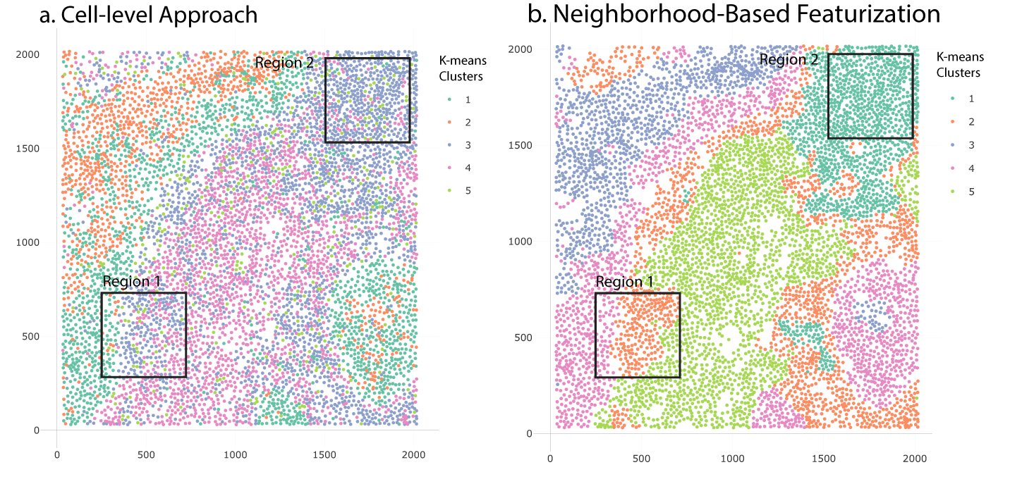
Microenvironments with similar expression patterns (and stable cell type mixtures) are enclosed in black boxes. Microenvironments are more clearly visible when using neighborhood-based featurization.
Compared with the cell-level approach, the neighborhood-based featurization has a noticeably clearer clustering result. In Region 1 of Figure 23b, the cells in the boundary of tumor cells are spatially consistent according to their own cell types. Further, in Region 2 of Figure 23b, we observe a dominant microenvironment without needing to parse mixed patterns of cell types.
Overall, the neighborhood-based featurization provides representations with better spatial consistency, simplifying the discovery of microenvironments.
We next summarize how to use NBFvis to implement the proposed workflow. We first loaded the packages and dataset we need. The dataset patient4 is a 6643 × 59 data frame of all cells in the tissue section of Patient 4 in the TNBC data (Keren et al., 2019). We added two columns named x_center and y_center, which are the coordinates of the calculated cell centers from the spatial raster data.
library (NBFvis)
library (dplyr)
data (patient4)
We selected 41 variables from dsDNA to HLA Class 1, most of which are proteins and cell type markers. The quantile_matrix function generates the quantile matrix from each cell’s neighborhood.
Quantiles_patient4 <- quantiles_matrix(
   data = patient4 %>% select (dsDNA:HLA_Class_1),
   coordinate = patient4 %>% select(x_center,y_center),
   index = patient4$index,
   NN = 40,
   distance = 60,
   min_percentile = 0.1,
   max_percentile = 0.9,
   quantile_number = 17,
   method = pca_)
The function network_matrix first builds the network inside the neighborhood and then calculates the corresponding network statistics using the argument given by fun. In this example, we used the function centralities, also exported by our package.
centrality_patient4 <- network_matrix(
   coordinate = patient4 %>% select (ends_with("_center")),
   index = patient4$index,
   radius = 60,
   NN = 40,
   edge = 30,
   fun = centralities,
   length_output = 29,
   name_output = NULL)
The scales of these two matrices are not the same, which means rescaling is needed. Here we removed Column, index and n_neighborhood in the quantile matrix so that all the columns left were quantile and network variables. Normalization and centering were applied to the centralities matrix so that they had a similar scale to the quantile matrix. We then combined the quantile matrix and the rescaled network matrix to construct an extended featurization matrix, which we called the neighborhood matrix earlier.
neighborhood_info_patient4 <- cbind(
   Quantiles_patient4 %>% select(-index, -n_neighbor),
   scale (centrality_patient4 %>% select(-index)))
The final step was to input the neighborhood matrix, the cell dataset patient4, and the names of the variable of interest in the function NBFvis. This returned an interactive Shiny app that was the source of figures in the Results section,
NBF_vis(
   matrix = neighborhood_info_patient4,
   origin_data = patient4,
   var_names = colnames (patient4)[17:57])
We have presented a method for visualizing spatial omics datasets that integrates dimensionality reduction methods like UMAP with neighborhood-based featurization based on quantiles and network properties. According to the results of our simulation, dimensionality reduction based on genomic features alone has difficulty identifying microenvironments because the associated embeddings are dominated by differences in expression patterns across cell types. Also, K-means clustering on the UMAP embeddings from this approach results in spatially inconsistent clusters, making it difficult to identify potential microenvironments. In contrast, our approach, though simple to implement, is able to avoid these problems by leveraging neighborhood information of cells. After combining neighborhood-based statistics like quantiles and centralities, we can detect microenvironments with mixed cell types, paralleling our simulation results. Furthermore, spatially consistent K-means clusters can be derived, supporting discovery of microenvironments.
We applied our methodology to the spatial omics dataset of (Keren et al., 2019) and found five spatially continuous microenvironments in the cells’ spatial plot. We compared this result with the analogous approach based on cell-level data and found that it is more difficult to identify meaningful microenvironments without an initial featurization step.
One advantage of our methodology is that the choice of neighborhood-based featurization is flexible. In our example, we used neighborhood quantiles of principal components and network statistics to build the neighborhood matrix for UMAP. These statistics could be replaced by other neighborhood-based statistics like cell-type diversity or local modularity. Also, the embedding and clustering methods are not fixed. We could use alternative dimensionality reduction methods like t-distributed stochastic neighbor embedding (t-SNE) and PCA or clustering methods like spectral clustering depending on the problem structure.
There are several avenues to develop this work. First, we treated the nodes in the neighborhood networks identically, ignoring their cell types. This is convenient for the computation of network statistics, but the information is nonetheless lost. To address this, it may be possible to build neighborhood networks with different node types and compute corresponding network statistics. A second question is how to combine matrices. Our featurization is based on matrices from two groups of statistics (quantiles and network statistics), and their variances and interpretation could be quite different according to their groups. Is there a more principled approach to scaling and combining these measures into a single featurization? One possible solution could be multiple factor analysis, which distinguishes between groups of statistics (Pagès, 2014). Thirdly, we used K-means clustering in our methodology, which is a common choice but far from the best clustering algorithm for low-dimensional embeddings. K-means clustering is sensitive to outliers in the embedding plot and assumes spherical clusters, making it potentially unreliable. Spectral clustering could be a potential improvement because it is more sensitive to the gradient structures in the UMAP embeddings.
The TNBC dataset of Keren et al. (2019) can be downloaded from https://www.angelolab.com/mibi-data.
Analysis code available from: https://github.com/XTH1114/NBFvis
Archived analysis code as at time of publication: DOI: 10.5281/zenodo.6639613
License: GNU General Public License
| Views | Downloads | |
|---|---|---|
| F1000Research | - | - |
|
PubMed Central
Data from PMC are received and updated monthly.
|
- | - |
Provide sufficient details of any financial or non-financial competing interests to enable users to assess whether your comments might lead a reasonable person to question your impartiality. Consider the following examples, but note that this is not an exhaustive list:
Sign up for content alerts and receive a weekly or monthly email with all newly published articles
Already registered? Sign in
The email address should be the one you originally registered with F1000.
You registered with F1000 via Google, so we cannot reset your password.
To sign in, please click here.
If you still need help with your Google account password, please click here.
You registered with F1000 via Facebook, so we cannot reset your password.
To sign in, please click here.
If you still need help with your Facebook account password, please click here.
If your email address is registered with us, we will email you instructions to reset your password.
If you think you should have received this email but it has not arrived, please check your spam filters and/or contact for further assistance.
Comments on this article Comments (0)