Keywords
RNA-seq, pipeline, quality metrics, differential expression, functional analysis, RMarkdown, report
This article is included in the Bioinformatics gateway.
This article is included in the Bioconductor gateway.
This article is included in the RPackage gateway.
RNA-seq, pipeline, quality metrics, differential expression, functional analysis, RMarkdown, report
RNA sequencing (RNA-seq) analysis seeks to identify differential expression among groups of samples, providing insights into the underlying biology of a system under study1. Automating a full analysis from raw sequence data to functionally annotated gene results requires the coordination of multiple steps and tools. From the first data processing steps to quantify gene expression, to the data quality checks necessary for identification of differentially expressed genes2 and functionally enriched categories, RNA-seq analysis involves the repetition of commands using various tools. This is done on a per-sample basis, and each step can require varying degrees of user intervention. As a bioinformatics core facility that processes a large number of RNA-seq datasets, we have developed a Bioconductor (BioC)3 package called bcbioRNASeq to aggregate and automate the execution of tools for RNA-seq quality control (QC), differential expression and functional enrichment analysis as much as possible, while still retaining full, flexible control of critical parameters.
This package relies on the output of bcbio, a python framework that implements best-practice pipelines for fully automated high-throughput sequencing analysis (including RNA-seq, variant discovery, and ChIP-seq). bcbio is a community driven resource that handles the data processing component of sequencing analysis, providing researchers with more time to focus on the downstream biology. For RNA-seq data, bcbio generates QC and gene abundance information compatible with multiple downstream BioC packages. We briefly describe some of the tools included in the bcbio RNA-seq pipeline to help our users understand the outputs of bcbio that are used in the bcbioRNASeq package.
To ensure that the library generation and sequencing quality are suitable for further analysis, tools like FastQC4 examine the raw reads for quality issues. Cutadapt5 can optionally be used to trim reads for adapter sequences, along with other contaminant sequences such as polyA tails and low quality sequences with PHRED6,7 quality scores less than five. Salmon8 generates abundance estimates for known splice isoforms. In parallel, STAR9 aligns the reads to the specified reference genome, and featureCounts10 generates counts associated with known genes. bcbio assesses the complexity and quality of the RNA-seq data by quantifying rRNA content and the genomic context of alignments in known transcripts and introns using a combination of custom tools and Qualimap11. Finally, MultiQC12 generates an interactive HTML report in which the metrics from all tools used during the analysis are combined into a single dynamic file. bcbio handles these first stages of RNA-seq data processing with little user intervention.
The next stages of an RNA-seq analysis include assessing read and alignment qualities, identifying outlier samples, clustering samples, assessing model fit, choosing cutoffs and finally, identifying differentially expressed genes. These steps often occur in multiple iterations, and require more active analyst involvement to integrate multiple tools that accept input data with incompatible formats and properties (see Use Case section). For example, the featureCounts gene counts from STAR-based alignments (a simple matrix) are useful for quality control, providing many more quality metrics than the quasi-alignments from Salmon. However, the quasi-alignments from Salmon (which are imported by tximport into a list of matrices) have been shown to be more accurate when testing for differential gene expression13,14. Managing these disparate data types and tools can make analyses unnecessarily time consuming, and increases the risk of inconsistency between analyses. Given the complexity of the analysis, it is essential to report the final parameters and associated results in a cohesive, reproducible manner.
bcbioRNASeq was developed to address these issues and ease the process of documentation and report generation. The package offers multiple R Markdown templates that are ready-to-render after configuration of a few parameters and include example text and code for quality control metrics, differential expression, and functional enrichment analyses. Although other packages have been developed to solve similar issues, bcbioRNASeq allows for tight integration with the bcbio framework, and provides a unified package with objects, functions and pre-made templates for fast and simple RNA-seq analysis and reporting.
As noted, bcbio runs a number of tools to generate QC metrics and compute gene counts from RNA-seq data. Additional information on the bcbio RNA-seq pipeline is available on readthedocs). At the end of a bcbio run, the most important files are stored in a separate directory specified by the user in the bcbio configuration YAML file under the upload: parameter; this directory is called "final" by default. Within this directory there is a dated project directory containing quality metrics, provenance information, and data derived from the analysis that have been aggregated across all samples, e.g. count files. In addition, there is a directory corresponding to each sample that contains the binary alignment map (BAM) files and Salmon count data for that sample.
final/
2017-01-01_illumina_rnaseq/
annotated_combined.counts
bcbio-nextgen-commands.log
bcbio-nextgen.log
combined.counts
combined.dexseq
combined.dexseq.ann
data_versions.csv
multiqc/
programs.txt
project-summary.yaml
tx2gene.csv
sample1/
qc/
salmon/
sample1-ready.bam
sample1-ready.bam.bai
sample1-ready.counts
sample1-transcriptome.bam
The final upload directory generated by bcbio is used as the input for bcbioRNASeq. Once the bcbio run is complete, you can open an R session and load the bcbioRNASeq library (available from our GitHub repository). Use the loadRNASeq() function to create a structured S4 object (see below) that contains all of the necessary information for downstream analysis. The only required argument when creating this object is the full path to the final directory. We also recommend that you use the interestingGroups argument to indicate variables that are present in your metadata that are of interest for the analysis. Note that bcbioRNASeq will transform all metadata column headings to lowerCamelCase format without spaces, dashes, periods or underscores; therefore interestingGroups should be specified in the same format. Once the S4 object is created, use the saveData() function to save it as an RData (.rda) file.
> library(bcbioRNASeq)
> bcb <- loadRNASeq(
+      file.path("bcbio_example_run", "final"),
+      interestingGroups = c("genotype", "treatment"))
> saveData(bcb)
This S4 object is unique to the bcbioRNASeq package, as it contains all of the necessary data from the bcbio run required for analysis. From here, you can use various functions in bcbioRNASeq to perform analysis, make figures, and generate data tables and results files as we describe in later sections. This object is also used as the input for the R Markdown templates for report generation. First, we begin by describing the object in more detail.
We have designed a new S4 class named bcbioRNASeq, which is an extension of SummarizedExperiment15. Our S4 class adds a slot to SummarizedExperiment named bcbio that facilitates the inclusion of additional objects related to the experiment that cannot be contained in a regular SummarizedExperiment. The bcbio slot allows the incorporation of three additional data structures: the Salmon quasi-alignment data for differential expression analyses from tximport13, an automatically generated DESeqDataSet to provide support for quality control plots, and alternative counts generated by featureCounts. To see all available slots in the bcbioRNASeq object listed by name, you can use slotNames(bcb). Each of the slots are described in more detail below:
@assays: ShallowSimpleListAssays containing count matrices derived from Salmon quasi-aligned counts imported with tximport. This slot is accessible with assays().
– raw: raw counts, generated by Salmon and imported with tximport. These are the primary counts and can be accessed with assay().
– normalized: Normalized counts, with DESeq2 sizeFactors applied.
– tpm: transcripts per million (TPM), calculated by tximport.
– tmm: trimmed mean of M-values, calculated by edgeR.
– rlog: regularized log transformation, calculated by DESeq2.
– vst: variance stabilizing transformation, calculated by DESeq2.
@colData: DataFrame describing the columns (samples) of the count matrices slotted in assays(). This slot is accessible with colData().
@elementMetadata: DataFrame describing the rows (genes) of the count matrices slotted in assays(). This slot is accessible with rowData().
@NAMES: Ensembl gene identifiers; rownames of the matrices slotted in assays(), used in conjunction with rowData().
@metadata: SimpleList containing any metadata relevant to the dataset and the information pertaining to/generated from previous steps in the workflow. This slot is accessible with metadata().
– version: Version of bcbioRNASeq package used to generate the object.
– uploadDir: Path to bcbio final upload directory.
– sampleDirs: Paths of sample directories contained in bcbio upload.
– projectDir: Path to project directory in bcbio upload.
– template: Name of YAML file used to configure bcbio run.
– runDate: Date of bcbio run completion.
– interestingGroups: Groups of interest to use by default for quality control plot coloring.
– organism: Latin species name (e.g. "Homo sapiens").
– genomeBuild: Genome build (e.g. "hg38" or "mm10").
– ensemblVersion: Ensembl annotation version (e.g. "Ensembl Genes 90"). Defaults to "current".
– annotable: Ensembl annotations obtained from AnnotationHub with ensembldb16,17.
– tx2gene: Transcript to gene identifier mappings.
– lanes: Number of flow cell lanes used during sequencing.
– yaml: bcbio run YAML containing summary statistics and sample metadata saved during configuration.
– metrics: Sample quality metrics from bcbio analysis, generated from aligned counts produced by STAR and featureCounts.
– sampleMetadataFile: Path to custom sample metadata file, used to override metadata saved in run YAML.
– dataVersions: Genome versions used by bcbio.
– programs: Program versions used by bcbio.
– bcbioLog: bcbio run log.
– bcbioCommandsLog: bcbio commands log.
– allSamples: Whether the object contains all samples from the run.
– date: Date the bcbio run was loaded into R with loadRNASeq().
– wd: Working directory.
– utilsSessionInfo: utils::sessionInfo() output.
– devtoolsSessionInfo: devtools::sessionInfo() output.
– unannotatedGenes: Character vector of gene identifiers present in the RNA-seq counts matrix (assays()) that are missing from the internal Ensembl annotations data.frame. This includes gene identifiers that are now deprecated on Ensembl or FASTA spike-ins.
@bcbio: SimpleList used to store different R objects which are computed once and used as input for different plots or to other R packages functions. To access these secondary objects use bcbio().
– tximport: tximport list of Salmon counts, to be used in conjunction with DESeq2.
– DESeqDataSet: DESeq2 dataset generated from featureCounts derived data using an empty design formula. Used for quality control report.
– featureCounts: aligned counts generated by STAR aligner and featureCounts. Used to generate quality metrics summary.
To demonstrate the functionality and configuration of the package, we have taken an experiment from the Gene Expression Omnibus (GEO) public repository of expression data to use as an example use case. The RNA-seq data is from a study of acute kidney injury in a mouse model (GSE65267)18. The study aims to identify differentially expressed genes in progressive kidney fibrosis and contains samples from mouse kidneys at several time points (n = 3, per time point) after folic acid treatment. From this dataset, we are using a subset of the samples for our use case: before folic acid treatment, and 1, 3, 7 days after treatment.
A pre-computed version of the example bcbioRNASeq object used in this workflow (bcb.rda) and the code for reproduction are available at the f1000v1 branch of our package repository. Alternatively, a minimal version of this example dataset is automatically loaded with the package library, and is accessible using data(bcb).
First, load the bcbioRNASeq object and a few other libraries to demonstrate how to access the different types of information contained in the object.
> library(bcbioRNASeq)
> library(DESeq2)
> library(DEGreport)
> load("bcb.rda")
The counts() function returns the abundance estimates generated by Salmon. Read counts for each sample in the dataset are aggregated into a matrix, in which columns correspond to samples and rows represent genes. Multiple normalized counts matrices are saved in the bcbioRNASeq object, and are accessible with normalized argument:
1. Raw counts (normalized = FALSE); default.
2. DESeq2 normalized counts (normalized = TRUE).
3. Transcripts per million (normalized = "tpm").
4. Trimmed mean of M-values normalization method (normalized = "tmm"). Also accessible with tpm().
5. Regularized log transformation (normalized = "rlog").
6. Variance stabilization transformation (normalized = "vst").
Functions exist to extract expression abundances in the various formats. Outlined below are the steps to save these counts external to the bcbioRNASeq object. These steps utilize functions from the DESeq2, edgeR and tximport packages both directly as well as within wrapper functions. For discussions on RNA-seq data normalization methods and count formats see 19; we typically save at least the DESeq2 normalized counts (library size adjusted) and transcripts per million counts (gene length adjusted) for further analyses.
> raw <- counts(bcb, "raw")
> normalized <- counts(dds, "normalized")
> rlog <- counts(bcb, "rlog")
> tpm <- tpm(txi)
> saveData(raw, normalized, rlog, tpm)
> writeCounts()(raw, normalized, rlog, tpm)
Note, the raw counts generated by featureCounts are different from the Salmon-derived counts slotted in assays(), as described above. This alternative counts matrix will have a different number of rows, and is accessible using bcbio(bcb, "featureCounts").
A typical RNA-seq analysis requires multiple quality control assessments at the read, alignment, sample and model level. Most of the data required to make these assessments is automatically generated by bcbio; the bcbioRNASeq package makes it easier for users to access it. For instance, the Qualimap tool run as part of the bcbio pipeline generates various metrics that can be used to assess the quality of the data and consistency across samples. The output of Qualimap is stored in the bcbioRNASeq object, and the package has several functions to visualize this output in a graphical format. These plots can be used to check data quality. Visual thresholds appear in many plots to help the user to assess quality. For example, a vertical burgundy line is used as a warning threshold, indicating that any samples with values below that require close attention. A vertical black line threshold represents the optimal value. The default cutoffs for these thresholds can be easily changed using function arguments. Using metrics(bcb) allows the user to extract a data.frame with all metrics information used by the functions in the QC report. In this way, custom figures can also be easily created using the same data but with user-preferred packages.
Below, we provide several examples of recommended QC steps for RNA-seq data with a short explanation outlining their usefulness.
Total reads per sample and mapping rate are metrics that can help identify imbalances in sequencing depth or failures among the samples in a dataset (Figure 1A–B). Generally, we expect to see a similar sequencing depth across all samples in a dataset and mapping rates greater than 75%. Low genomic mapping rates are indicative of sample contamination, poor sequencing quality or other artifacts.
> plotTotalReads(bcb)
> plotMappingRate(bcb)
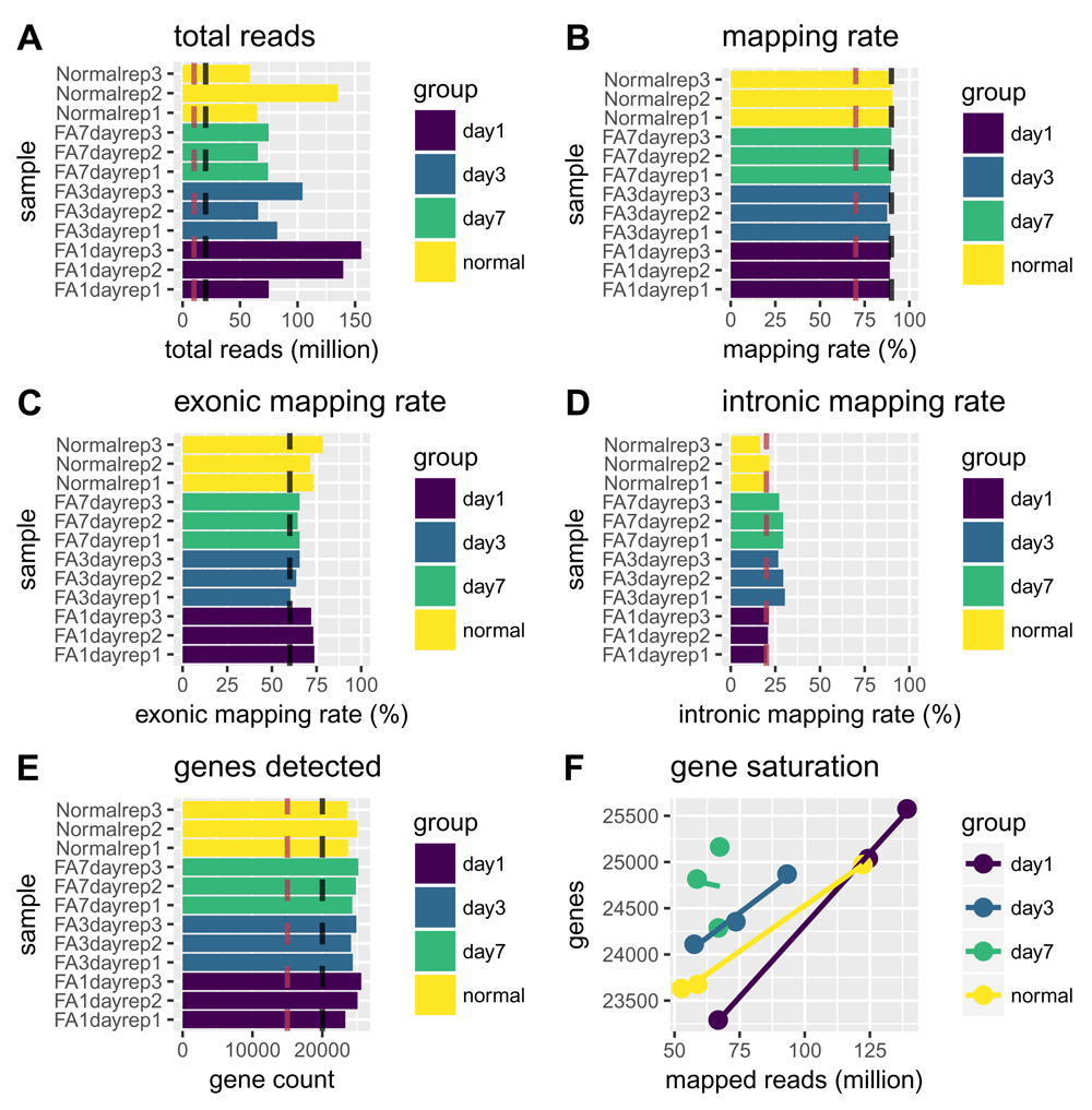
Sample classes, as defined by the interestingGroups argument, are represented by the different colors as defined in the legend of each plot. Vertical black lines indicate optimal values while vertical burgundy lines indicate cutoffs for substandard values. The total reads plot (A) indicates the total number of reads sequenced per sample and the mapping rate plot (B) shows the percentage of reads mapping to the reference genome. Here, all samples are well within recommended ranges, having well over 25 million reads and almost 90% of reads mapping. The exonic and intronic mapping rate plots (C and D) indicate the percentage of reads mapping to exons or introns, respectively. Here, all samples are within recommended ranges, with samples from day 3 and day 7 showing higher proportions of reads mapping to intronic versus exonic regions as compared to the day 1 and normal sample classes. The genes detected plot (E) indicates the total number of genes for each sample with a least one mapped read. Optimal gene detection values will vary based on an organism’s transcriptome size. The gene detection saturation plot (F) shows the relationship between the number of reads mapped and the number of genes detected. If this trend is not linear, it indicates that the sequencing may have been saturated in terms of detecting gene expression.
For RNA-seq, the majority of reads should map to exons and not introns. Ideally, at least 60% of total reads should map to exons. High levels of intronic mapping may indicate high proportions of nuclear RNA or DNA contamination. Samples should also have ribosomal RNA (rRNA) contamination rates below 10% (not shown) (Figure 1C–D).
> plotExonicMappingRate(bcb)
> plotIntronicMappingRate(bcb)
Determining how many genes are detected relative to the number of mapped reads is another good way to assess the sample quality (Figure 1E–F). Ideally, all samples will have similar numbers for genes detected, and samples with higher number of mapped reads will have more genes detected. Large differences in gene detection numbers between samples can introduce biases and should be monitored at later steps for potential influence on sample clustering.
> plotGenesDetected(bcb)
> plotGeneSaturation(bcb)
Comparing the distribution of normalized gene counts across samples is one way to assess sample similarity within a dataset. We would expect similar count distributions for all genes across the samples unless the library sizes or total RNA expression are different (Figure 2). The plotCountsPerGene() and plotCountDensity() functions provide two ways to visualize this comparison.
> plotCountsPerGene(bcb)
> plotCountDensity(bcb, style = "line")
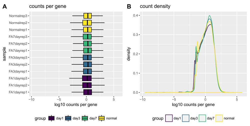
Normalized count distributions are displayed as boxplots (A) and density plots (B). The log10 TMM-normalized counts per gene normalization method equates the overall expression levels of genes between samples under the assumption that a majority of them are not differentially expressed20. Therefore, by normalizing for total RNA expression by sample, we expect the spread of the log10 TMM-normalized counts per gene to be similar for every sample. Sample classes (as set with the interestingGroups argument) are highlighted in different colors. Here, there is high similarity among the samples.
It is important to explore the fit of the model for a given dataset before performing differential expression analysis. The normalized and transformed data can be used to assess the variance-expression level relationship in the data, to identify which method is best at stabilizing the variance across the mean. The plotMeanSD() function wraps the output of different variance stabilizing methods (including the vst() and rlog() transformations from the DESeq2 package) and plots them with the vsn package’s meanSdplot() function21 (Figure 3).
> plotMeanSD(bcb)
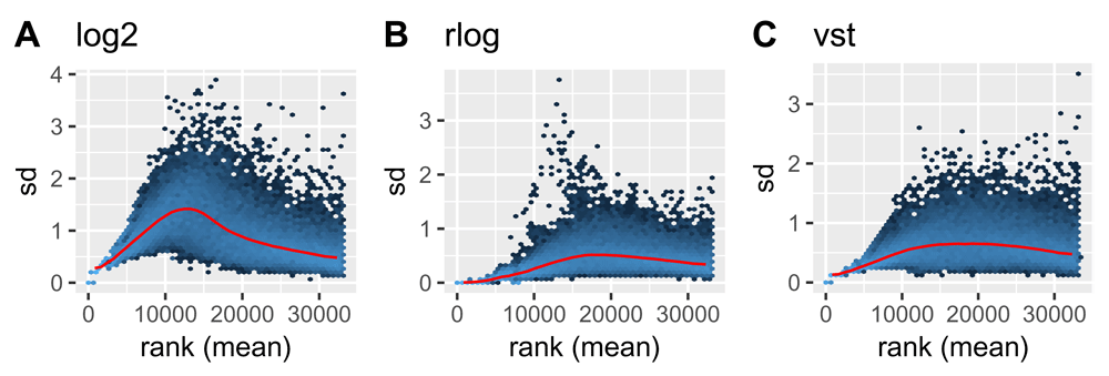
Plots show the standard deviation of normalized counts (normalizedCounts) using log2() (A), rlog() (B), and variance stabilizing (vst()) (C) transformations by rank(mean). The red line shows the running median estimator. As (B) and (C) show, the transformations greatly reduce the standard deviation, and the rlog() transformation is most effective at stabilizing the variance across the mean.
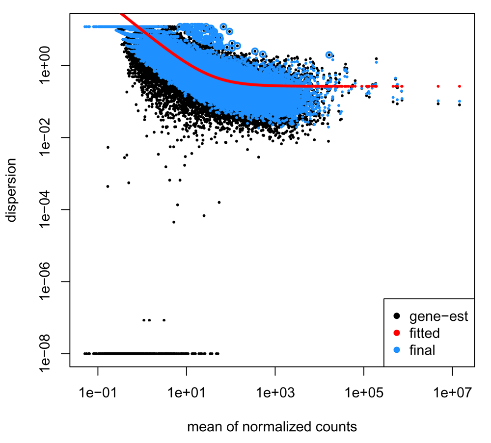
Another plot that is important to evaluate when performing QC on RNA-seq data is the plot of dispersion versus the mean of normalized counts. For a good dataset, we expect the dispersion to decrease as the mean of normalized counts increases for each gene. The plotDispEsts() function provides easy access to model information stored in the bcbioRNASeq object, using the plotting code provided in the DESeq2 library (Figure 4).
> plotDispEsts(bcb)
The QC metrics assessed up to this point are performed to get a global assessment across the dataset and look for similar trends across all samples . However, often we have a dataset in which samples can be classified into groups and it is common to interrogate how similar replicates are to each other within those groups, and the relationship between groups. To this end, bcbioRNASeq provides functions to perform this level of QC with Inter-Correlation Analyses (ICA) and Principal Components Analyses (PCA) between samples. Furthermore, we can use the results of the PCA to identify covariates that correlate with principal components.
Since these analyses are based on variance measures, it is recommended that the variance stabilized rlog transformed counts be used. Using these transformed counts minimizes large differences in sequencing depth and helps normalize all samples to a similar dynamic range . Simple logarithmic transformations of normalized count values tend to generate a lot of noise for low expressor genes, which can consequently dominate the calculations in the similarity analysis. An rlog transformation will shrink the values of low counts towards the genes’ averages across samples, without affecting the high expression genes.
Inter-Correlation analysis allows us to look at how closely samples are related to each other by first computing pair-wise correlations between expression profiles of all samples in the dataset and then clustering based on those correlation values. Samples that are similar to one another will be highly correlated and will cluster together. We expect samples from the same group to cluster together (Figure 5), although this is not always the case. We can also identify potential outlier samples using ICA, if there are samples that show low correlation with all other samples in the dataset. For more control over the graphing parameters of the ICA heatmap, other packages can be used to generate these plots by using the normalized data, accessed with counts (bcb, normalized = "rlog"), as input. One example is the pheatmap () function from the pheatmap package22, which underlies this plot.
> plotCorrelationHeatmap(bcb)
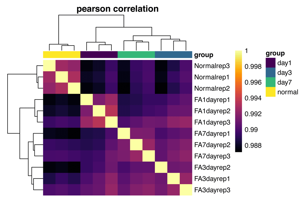
All pairwise sample Pearson correlations are shown. Correlations are clustered by both row and column, with sample classes (as set with the interestingGroups argument) highlighted across the top of the heatmap. Here, the sample classes cluster well, with the normal and day 1 samples showing the highest intra-group correlations.
PCA is a multivariate technique that allows us to summarize the systematic patterns of variations in the data23. PCA takes the expression levels for genes and transforms them in principal component space, reducing each sample to a single point. It allows us to separate samples by expression variation , and identify potential sample outliers. The PCA plot is a great way to explore both inter- and intra-group clustering (Figure 6). As with the ICA plots, other packages can be used to generate these kinds of plots from the normalized data, which can be accessed with counts(bcb, normalized = "rlog").
> plotPCA(bcb, label = FALSE)
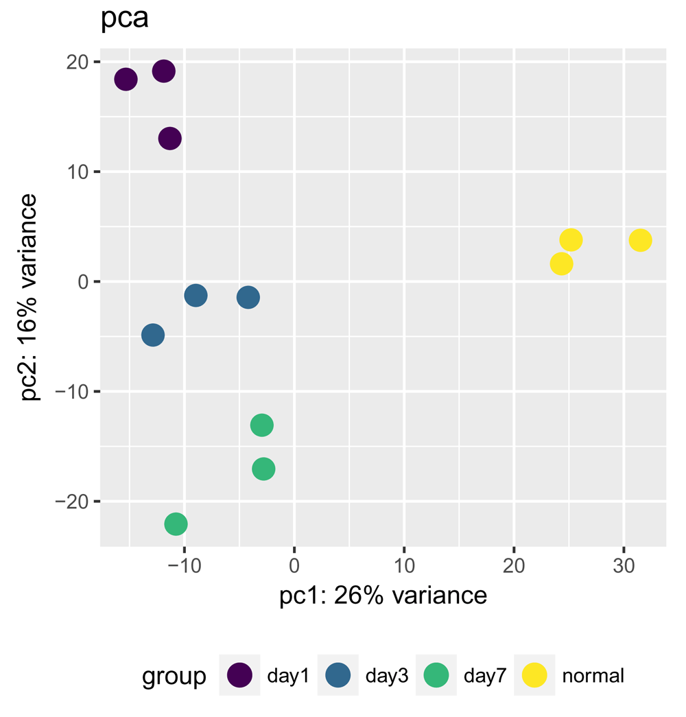
The first two principal components of the gene expression dataset are plotted here for each of the samples. Sample classes (as set with the interestingGroups argument) are highlighted in different colors. Alternatively, sample labels can be added with the label = TRUE argument (not shown) to identify individual samples, which is particularly useful for identifying outliers. Here, we see good clustering of the samples by group with no apparent outliers.
When there are multiple factors that can influence the results of a given experiment, it is useful to assess which of them is responsible for the most variance as determined by PCA (Figure 7). The plotPCACovariates() function passes transformed count data and metadata from the bcbioRNASeq object to the degCovariates() function of the DEGreport package24. This method adapts the method described by Daily et al. for which they integrated a method to correlate covariates with principal components values to determine the importance of each factor25 (Figure 7).
> plotPCACovariates(bcb, fdr = 0.1)
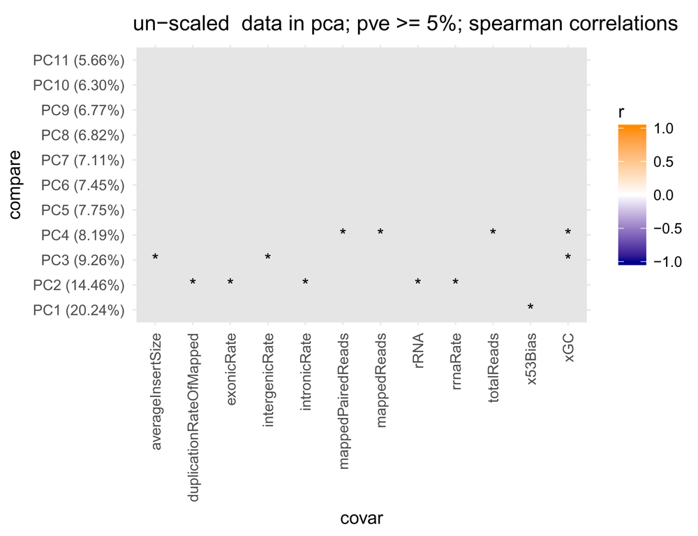
PCA is performed on transformed counts (rlog by default; but vst is also supported) and correlations between principal components and the different metadata covariates are computed. Significant correlations (FDR < 0.1) are shaded from blue (anti-correlated) to orange (correlated), with non-significant correlations shaded in gray. Here, none of variables show a significant correlation with any principal component of the data. Asterisks indicates p-value < 0.05.
Once the QC is complete and the dataset looks good, the next step is to identify differentially expressed genes (DEG). For this part of the workflow, we follow instructions and guidelines from the DESeq2 vignette, using Salmon-derived abundance estimates imported with tximport. As previously noted, a Differential Expression R Markdown template is available with the bcbioRNASeq package for these steps.
The first step is to define the factors to include in the statistical analysis as a design formula. We chose to study the difference between the normal group and the day 7 group in our dataset. In our example, we have only one variable of interest; however, DESeq2 is able to model additional covariates. When additional variables are included, the last variable entered in the design formula should generally be the main condition of interest. More detailed instructions and examples are available in the DESeq2 vignette.
> # DESeqDataSet
> dds <- DESeqDataSetFromTximport(
+      txi = bcbio(bcb, "tximport"),
+      colData = colData(bcb),
+      design = formula(~group)
+     ) %>%
+      DESeq()
> saveData(dds)
The results from DESeq2 include a column for the P values associated with each gene/test as well as a column containing P values that have been corrected for multiple testing (i.e. false discovery rate values). The multiple test correction method performed by default is the Benjamini Hochberg (BH) method26. Since it can be difficult to arbitrarily select an adjusted P value cutoff, the alphaSummary() function is useful for summarizing results for multiple adjusted P value or FDR cutoff values (Table 1).
> alphaSummary(dds,
+     contrast = c(
+          factor = "group",
+          numerator = "day7",
+          denominator = "normal"))
Use the results() function to generate a DESeqResults object containing the output of the differential expression analysis. The desired BH-adjusted P value cutoff value is specified here with the alpha argument (< 0.05 shown).
> res <- results(dds,
+      contrast = c(
+          factor = "group",
+          numerator = "day7",
+          denominator = "normal"),
+      alpha = 0.05)
> saveData(res)
The plotMA() function plots the mean of the normalized counts versus the log2 fold changes for all genes tested (Figure 8).
> plotMA(res)
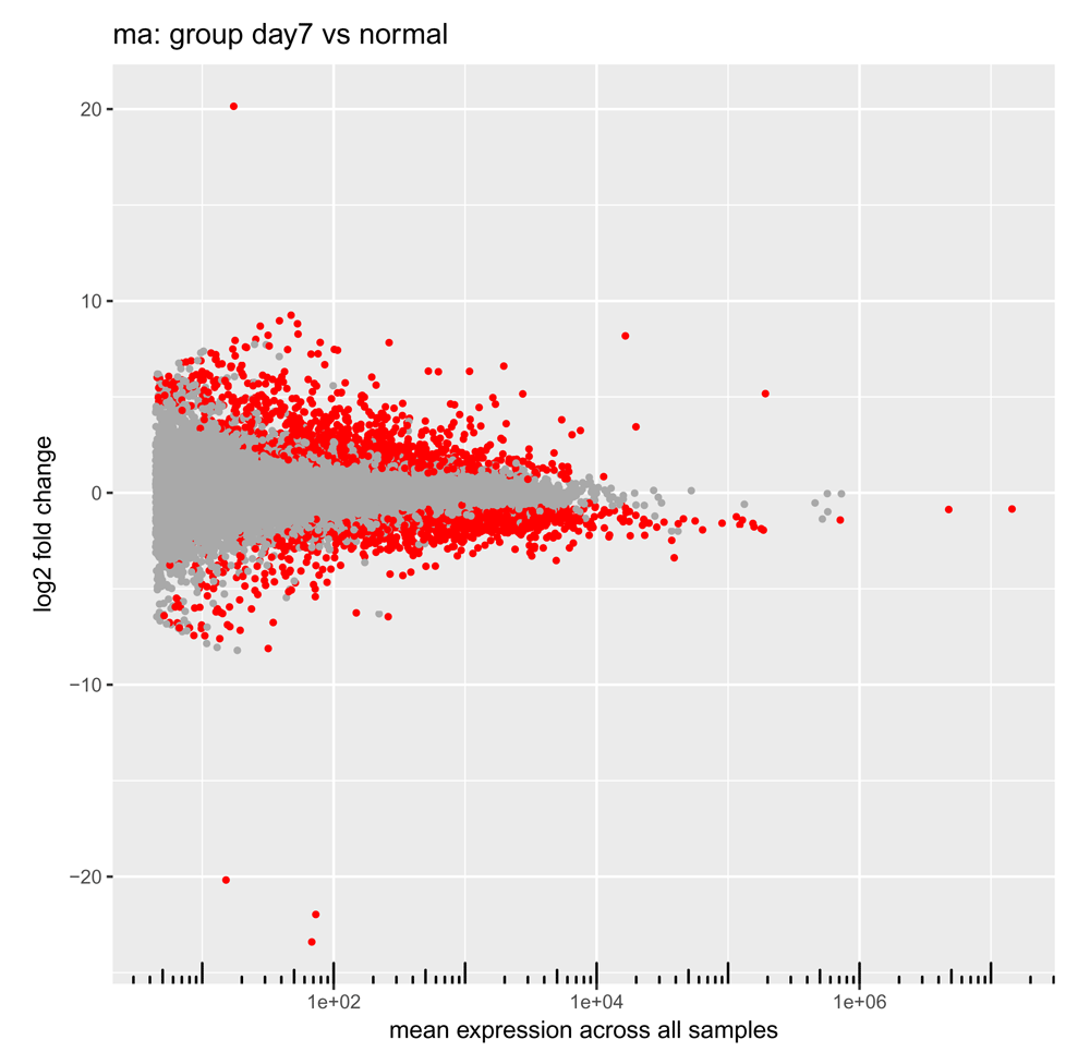
Each point represents one gene, with mean expression levels across all samples plotted on the x-axis and the log2 fold change observed in the contrast of interest on the y-axis. Significant differentially expressed genes (with an adjusted P value less than the adjusted cutoff P value we chose earlier) are colored red27.
The plotVolcano() function produces a volcano plot comparing significance (here the BH-adjusted P value) for each gene against the fold change (here on a log2 scale) observed in the contrast of interest28 (Figure 9).
> plotVolcano(res)
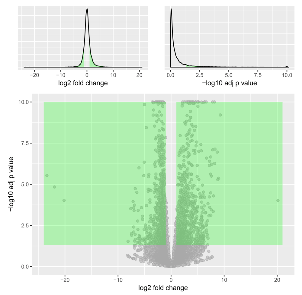
This plot compares the amount of gene expression change (not strictly interpretable here as these fold changes were derived from an LRT test) to the significance of that change (here plotted as the -log10 transformation of the multiple test adjusted P value), with each grey point representing a single gene. Options are available to highlight top gene candidates by shading (here, genes in the green shaded areas are bounded by a minimal fold change and -log10 adjusted P value cutoffs) and by text labeling. The two (optional) marginal plots showing the distributions of the log2 fold changes and negative log10 adjusted P values are useful in assessing cutoff choices and trade-offs.
The plotDEGHeatmap() function produces a gene expression heatmap useful for visualizing the expression of differentially expressed (DE) genes across samples. The heatmap shows only DE genes on a per-sample basis, using an additional log2 fold change cutoff. By default, this plot is scaled by row and uses the ward.D2 method for clustering29. The gene expression heatmap is a nice way to explore the consistency in expression across replicates or differences in expression between sample groups for each of the DE genes (Figure 10).
> # DESeqResults, DESeqTransform
> plotDEGHeatmap(res, counts = assays(bcb)[["rlog"]])
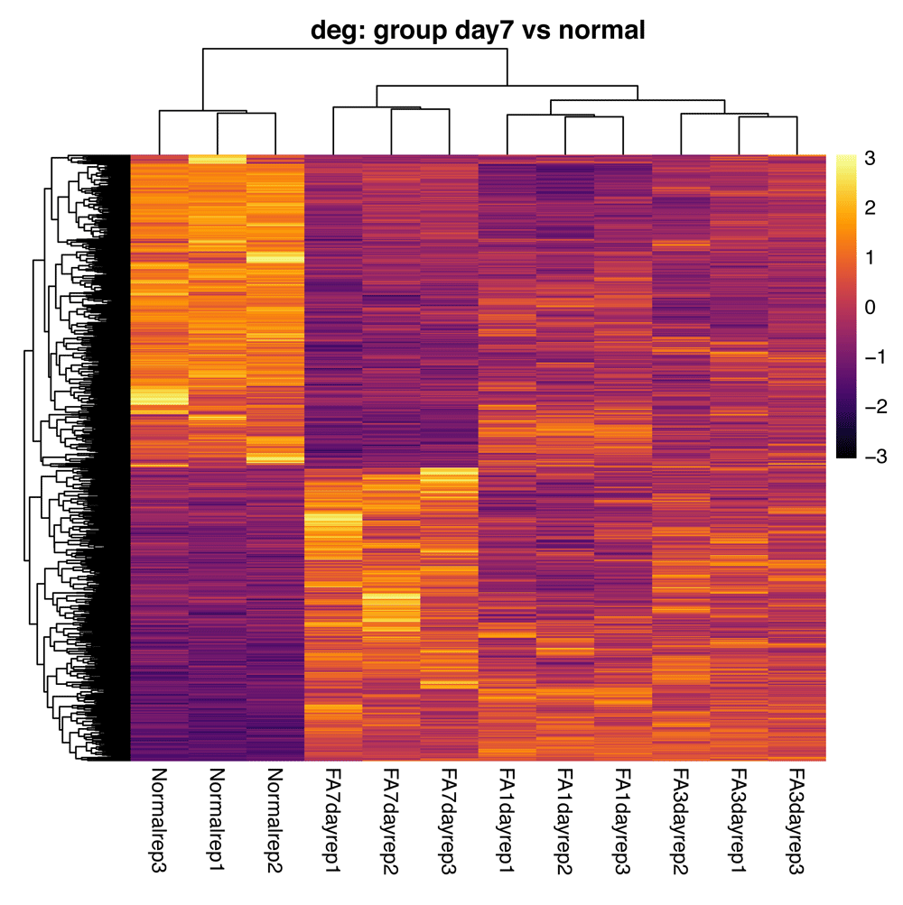
The heatmap shows only DE genes on a per-sample basis, using an additional log2 fold change cutoff. By default, this plot is scaled by row (centered and scaled) and uses the ward.D2 method for clustering29, with red and blue colors denoting higher and lower expression levels respectively. Results are clustered by both row and column. Heatmaps are drawn with the pheatmap() function of the pheatmap package22.
In addition to looking at the overall results from the differential expression analysis, it is useful to plot the expression differences for a handful of the top differentially expressed genes. This helps to check the quality of the analysis, by validating the expression for genes that are identified as significant. It is also helpful to visualize trends in expression change across the various sample groups (Figure 11). As bcbioRNASeq is integrated with the DEGreport package24, we can use DEGreport’s degPlot() function to view the expression of individual DE genes.
> degPlot(
+     bcb,
+      res = res,
+      n = 3,
+      slot = "normalized",
+      # Use the ’ann’ argument for gene to symbol mapping
+     ann = c("ensgene", "symbol"),
+      xs = "group")
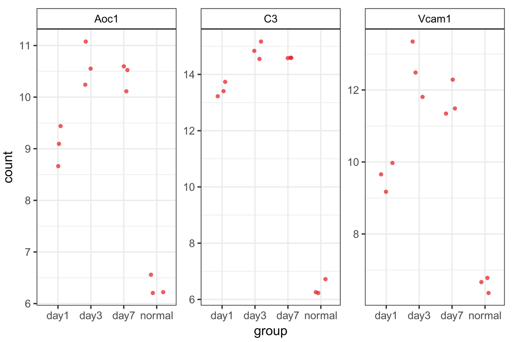
Gene expression patterns are shown for the top 3 (as selected in the function options) differentially expressed genes (by BH-adjusted P value). Normalized, transformed counts are shown for each replicate from each sample group; groups are set within the function options. Interestingly, even though our analysis compared day 7 to normal, all 3 genes show their greatest increases in gene expression at day 3, with some leveling off or relative decreases in expression at day 7.
The full set of example data is from a time course experiment, as described previously. Up to this point, we have only compared gene expression between two time points (normal and day 7), but we can also analyze the whole dataset to identify genes that show any change in expression across the different time points. As recommended by DESeq2, the best approach for this type of experimental design is to perform a likelihood ratio test (LRT) to test for differences in gene expression between any of the sample groups in the context of the time course. More information about time-course experiments and LRT is available in the DESeq2 vignette. This approach will yield a list of differentially expressed genes, but will not report how the expression is changing. Visualizing patterns of expression change amongst the significant genes is helpful in identifying groups of genes that have similar trends, which in turn can help determine a biological reason for the changes we observe (Figure 12). The DEGreport package includes the degPatterns() function, which is designed to extract and plot genes that have a similar trend across the various time points. More information about this function can be found in the DEGreport package24. Note that this function works only with significant genes; significants() returns the significant genes based on log2FoldChange and padj values (0 and 0.05 respectively, by default).
> ddsLRT <- DESeqDataSetFromTximport(
+      txi = bcbio(bcb, "tximport"),
+      colData = colData(bcb),
+      design = formula(~group)) %>%
+      DESeq(test = "LRT", reduced = ~1)
> resLRT <- results(ddsLRT)
> # This step is CPU intensive
> resPatterns <- degPatterns(
+      counts(bcb, "rlog")[significants(res), ],
+      metadata = colData(bcb),
+      time = "group",
+      col = NULL)
> saveData(ddsLRT, resLRT, resPatterns)
> resPatterns[["plot"]]
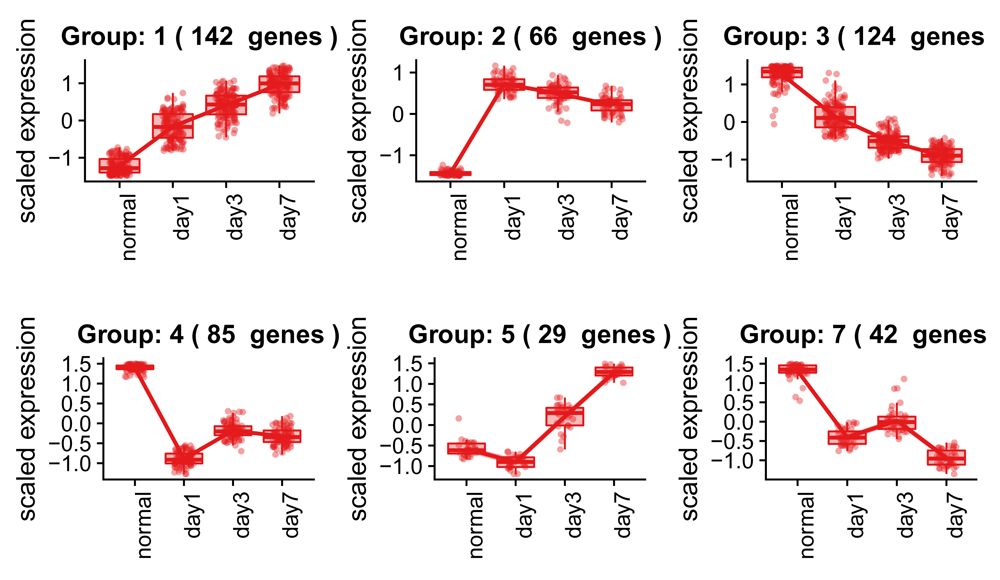
Clustered and scaled expression patterns for the top 500 differentially expressed genes. Each group represents a gene expression pattern shared among different DE genes, with the number of groups determined by the expression correlation patterns of the groups. Boxplots are shown for the expression patterns of each gene within the group to give a better idea of how well the groupings fit the expression data.
The output of the degPatterns() function is the plot, as well as a list object that contains a data.frame with two columns - the "genes" and the corresponding "cluster" number. To extract genes from a specific cluster for further analysis, the base function subset() can be utilized as follows to obtain the list of genes from cluster 8:
> subset(resPatterns[["df"]], cluster == 8, select = "genes")
Finally, at the end of the analysis a results table can be extracted containing the DE genes at a specified log fold change threshold. These results can be written to files in the specified output folder. In addition to the DE genes, a detailed summary and description of results and the output files are generated along with the cutoffs used to identify the significant genes.
> resTbl <- resultsTables(res, lfc = 1, write = TRUE, dir = deDir)
Once the results table object is ready, the top up- and down-regulated genes (sorted by log2 fold change) can now be displayed. Here, we output the top 5 DE genes in each direction (Table 2).
> topTables(resTbl, n = 5)
Output files from this use case include the following gene counts files (output at the count normalization step):
normalized_counts.csv.gz: Use to evaluate individual genes and/or generate plots. These counts are normalized for the variation in sequencing depth across samples.
tpm.csv.gz: Transcripts per million, scaled by length and also suitable for plotting.
raw_counts.csv.gz: Only use to perform a new differential expression analysis. These counts will vary across samples due to differences in sequencing depth, and have not been normalized. Do not use this file for plotting genes.
If desired, rlog variance stabilized counts can also be output for future use in variance based plotting methods such as PCA. DEG tables containing the differential expression results from the analysis summary step are sorted by BH-adjusted P value, and contain the following columns:
ensgene: Ensembl gene identifier.
baseMean: Mean of the normalized counts per gene for all samples.
log2FoldChange: log2 fold change.
lfcSE: log2 standard error.
stat: Wald statistic.
pvalue: Wald test P value.
padj: BH-adjusted Wald test P value (corrected for multiple comparisons; false discovery rate).
symbol: Ensembl gene name.
description: Ensembl description.
biotype: Ensembl biotype (e.g. protein_coding).
broadClass: Broad class definition, based on the biotype (e.g. coding).
To gain greater biological insight into the list of DE genes, it is helpful to perform functional analysis. We provide the Functional Analysis R Markdown template, which contains code from the clusterProfiler package30, to identify potentially enriched biological processes among the DE genes. We use this tool to take the significant gene list and the background gene list (all genes tested) as input to perform statistical enrichment analysis of gene ontology (GO) terms using hypergeometric testing. The template includes a table of GO terms that are significantly enriched among the DE genes and a variety of plots summarizing the significantly enriched GO processes. The plots included are:
dotplot: shows the number of genes associated with the top 25 most enriched terms (size) and the p-adjusted values for these terms (color).
enrichMap: shows the relationship between the top 25 most significantly enriched GO terms, by grouping similar terms together. The color represents the P values relative to the other displayed terms (brighter red is more significant) and the size of the terms represents the number of genes that are significant from the significant genes list.
cnetplot: shows the relationships between the genes associated with the top five most significant GO terms and the fold changes of the significant genes associated with these terms (color). The size of the GO terms reflects the P values of the terms, with the more significant terms being larger.
To facilitate analyses and compile results into a report format, we have created easy-to-use R Markdown templates that are accessible in RStudio31,32. Once the bcbioRNASeq package library has been installed, you can find these templates under FILE -> NEW FILE -> R MARKDOWN... -> FROM TEMPLATE. There are three main templates for RNA-seq: (1) Quality Control, (2) Differential Expression, and (3) Functional Analysis. You may need to restart Rstudio to see the templates. It is recommended that users run the reports in the order described above, as there may be functions that depend on data generated from the previous report. If you are not using RStudio, you can create new documents based on the templates using the rmarkdown::draft() function:
> rmarkdown::draft("quality_control.Rmd",
+    template = "quality_control",
+    package = "bcbioRNASeq")
> rmarkdown::draft("differential_expression.Rmd",
+    template = "differential_expression",
+    package = "bcbioRNASeq")
> rmarkdown::draft("functional_analysis.Rmd",
+    template = "functional_analysis",
+    package = "bcbioRNASeq")
The instructions above will create an R Markdown (.Rmd) file from each of the templates. Each file begins with a YAML header, followed by sub-sections containing code chunks and some relevant text and/or a sub-heading to describe that step of the analysis. Each R Markdown file takes as input the bcbioRNASeq object, such that various functions from the package can be run on the data stored within the object to output figures, tables and carefully formatted results.
Note you can add more text, headings and code chunks to the body of the R Markdown files to customize the reports as desired. Before rendering the file into a report you will want to run the prepareRNASeqTemplate() function in order to obtain the accessory files necessary for a fully working template.
> library(bcbioRNASeq)
> prepareRNASeqTemplate()
Finally, the main analysis parameters need to be specified in the YAML section on the top part of each document. For this example we assume R objects are stored in the folder data. Edit the following parameters in the Quality Control template:
params:
    bcbFile: "data/bcb.rda"
    outputDir: "."
bcb.rda refers to the bcbioRNASeq object.
In the YAML section on the top of the Differential Expression template, modify the following parameters:
params:
    bcbFile: "data/bcb.rda"
    design: !r formula(~group)
    contrast: !r c("group", "day7", "normal")
    alpha: 0.05
    lfc: 0
    outputDir: "."
In the YAML section on the top of the Functional Analysis template, modify the following parameters (clusterProfiler and pathview have to be installed previously using this report):
params:
    bcbFile: "data/bcb.rda"
    res: data/res.rda
    organism: "Mm"
    species: "mouse"
    goOnt: "BP"
    alpha: 0.05
    lfc: 0
    outputDir: "."
res.rda refers to a DESeqResults object from DESeq2 package.
The downloaded accessory files will be saved to your current working directory and should be kept together with your main analysis R Markdown files that were generated from the templates. These accessory files include: a) _output.yaml, to specify the R Markdown render format; b) _header.Rmd and c) _footer.Rmd, to add header/footer sections to the report; d) bibliography.bib, BibTex file for citations; and e) setup.R, to fill in some of the parameters related to figures and rendering format.
Here we describe bcbioRNASeq, a Bioconductor package that provides functionality for quality assessment and differential expression analysis of RNA-seq experiments. This package supplements the bcbio community project, as it takes the output from automated bcbio RNA-seq runs as input, allowing for the data to be stored in a structured S4 object that can easily be accessed for various steps of the RNA-seq workflow downstream of bcbio. Built as an open source project, bcbio is a well-supported and documented platform for effectively using current state-of-the-art RNA-seq methods. Taken together, bcbio and bcbioRNASeq provide a full framework for rapidly and accurately processing RNA-seq data. The package also provides a set of configurable templates to generate comprehensive HTML reports suitable for biological researchers. With the use of R Markdown, all steps of the analysis are fully configurable and traceable.
We provide a full set of instructions for using bcbioRNASeq, including an example use case that demonstrates all of the main functionality. Quality control (pre- and post-quantification), model fitting, differential expression, and functional analysis provide a comprehensive set of metrics for evaluating the robustness of the RNA-seq results. Methods such as hierarchical clustering, principal components analysis, and time point analysis allow for an interactive examination of the data’s structure. Collectively, the workflow we describe can help researchers to identify true biological signal from technical noise and batch effects when analyzing RNA-seq experiments.
Current source code: https://github.com/hbc/bcbioRNASeq
Workflow code: https://github.com/hbc/bcbioRNASeq/tree/f1000v1
Archived source code (v0.1.1) as at time of publication: http://doi.org/10.5281/zenodo.103743933
License: MIT
The data used in the use case can be accessed from NCBI GEO using accession GSE65267.
| Views | Downloads | |
|---|---|---|
| F1000Research | - | - |
|
PubMed Central
Data from PMC are received and updated monthly.
|
- | - |
Provide sufficient details of any financial or non-financial competing interests to enable users to assess whether your comments might lead a reasonable person to question your impartiality. Consider the following examples, but note that this is not an exhaustive list:
Sign up for content alerts and receive a weekly or monthly email with all newly published articles
Already registered? Sign in
The email address should be the one you originally registered with F1000.
You registered with F1000 via Google, so we cannot reset your password.
To sign in, please click here.
If you still need help with your Google account password, please click here.
You registered with F1000 via Facebook, so we cannot reset your password.
To sign in, please click here.
If you still need help with your Facebook account password, please click here.
If your email address is registered with us, we will email you instructions to reset your password.
If you think you should have received this email but it has not arrived, please check your spam filters and/or contact for further assistance.
Comments on this article Comments (0)