Keywords
single-cell RNAseq, differential expression, functional analysis, interactive visualization, R Shiny, data sharing
This article is included in the RPackage gateway.
This article is included in the Bioinformatics gateway.
single-cell RNAseq, differential expression, functional analysis, interactive visualization, R Shiny, data sharing
The development of high-throughput single-cell RNA sequencing (scRNAseq) methods, including droplet-based (Klein et al., 2015; Macosko et al., 2015; Zheng et al., 2017) and multiplexed barcoding (Rosenberg et al., 2018) techniques, has led to a rapid increase in experiments aiming to map cell types within tissues and whole organisms (Ecker et al., 2017; Han et al., 2018; Regev et al., 2017; Saunders et al., 2018). The most common initial analysis of such scRNAseq data is clustering and annotation of cells into cell types based on their transcriptomes. Many workflows have been built and published around this use case (Kiselev et al., 2018; Lun et al., 2016; Sandrine, 2016; Satija, 2018), and many clustering algorithms exist to find cell type-associated structure in scRNAseq datasets (Li et al., 2017; Ntranos et al., 2016; Shao & Höfer, 2017; Xu & Su, 2015; Žurauskienė & Yau, 2016). This paper focuses on how to interpret the results of a scRNAseq clustering analysis performed by existing methods, specifically when it comes to selecting parameters for the clustering algorithm used and analysis of the results. This is implemented as an R Shiny software tool called scClustViz, which provides an interactive, web-based graphical user interface (GUI) for exploring scRNAseq data and assessing the biological relevance of clustering results.
Nearly all unsupervised classification (clustering) algorithms take a parameter that affects the number of classes or clusters found in the data. Selection of the appropriate resolution of the classifier heavily impacts the interpretation of scRNAseq data. An inappropriate number of clusters may result in missing rare but distinct cell types, or aberrantly identifying novel cell types that result from overfitting of the data. While there are general machine-learning-based methods for preventing overfitting, we propose a biology-based cluster assessment method; namely whether you could identify a given cluster-defined cell type in situ using imaging techniques based on marker genes identified, such as single molecule RNA fluorescence in situ hybridization (FISH). To identify marker genes and quantify the measurable transcriptomic difference between putative cell types given a clustering solution, scClustViz uses a standard differential expression test between clusters. If there are few differentially expressed genes between two clusters, then those clusters should not be distinguished from each other and over-clustering is likely. The researcher can then select a cluster solution that has sufficiently fine granularity, while still maintaining statistically separable expression of genes between putative cell types.
Once cell types are defined using the clustering method and parameters of choice, the researcher must then go through several data interpretation steps to assess and annotate these clusters and identify marker genes for follow-up experimentation. Before a final clustering result is chosen, it is important to assess the impact of technical factors on clustering. While that may have been done as part of the upstream workflow, it is helpful to see the cluster-wise distribution of technical factors such as library size, gene detection rates, and proportion of transcripts from the mitochondrial genome (Ilicic et al., 2016). To annotate cell types identified by the classifier, it is helpful to see the genes uniquely upregulated per cluster, as well as assess the gene expression distribution of canonical marker genes for expected cell types in the data. Finally, novel marker genes may be identified for a cell population of interest, which requires identifying genes that are both upregulated in the cluster in question and detected sparingly or not at all in all other clusters in the experiment.
We describe scClustViz, an R package that aids this common scRNAseq analysis workflow of identifying cell types and their marker genes from a heterogenous tissue sample. The package comprises two parts: a function to perform the differential gene expression testing between clusters for any set of clustering solutions generated by existing scRNAseq analysis workflows, and a R Shiny GUI that provides an interactive set of figures designed to help assess the clustering results, annotate cell types, and identify marker genes. The package was designed with transparency and modularity in mind to ease merging into existing workflows and sharing the results with collaborators and the public. This enables the tool to be of value to both experienced bioinformaticians developing workflows and bench scientists interpreting the results of a scRNAseq experiment.
We propose a metric for assessing clustering solutions of scRNAseq data based on differential gene expression between clusters. We use the Wilcoxon rank-sum test to evaluate differential gene expression between clusters. This test was selected based on the rigorous differential expression methodology review carried out by Soneson and Robinson (Soneson & Robinson, 2018). In their testing, the Wilcoxon test had accuracy on par with that of the majority of methods tested (most methods were adequately accurate), and identified sets of differentially expressed genes similar to MAST (Finak et al., 2015) and limma (Ritchie et al., 2015), two popular alternatives. In terms of power and control of type I error rate, the Wilcoxon test was less powerful than more advanced methods, with a false discovery rate (FDR) more conservative than expected. However, unlike some more complicated tests, the Wilcoxon test is compatible with parallel processing of testing calculations to increase computation speed. Ultimately, the simplicity of the Wilcoxon test made it appealing for use in this tool, as it is understood by most users, is fast to compute and is available in base R.
Prior to differential expression testing, expression ratios between genes from two cell types are calculated and reported in log base 2 (logGER, log gene expression ratio). Expression ratio calculations are one method used to filter the gene list prior to differential expression testing, thereby removing some of the multiple testing burden for the Wilcoxon test step. Given that scRNAseq gene expression data is expected to be sparse, and that some clusters may not contain any cells in which a certain gene was detected, it is necessary to add a pseudocount to the logGER calculations to prevent divide-by-zero errors and the resulting +/- Inf values. As exemplified in Figure 1, the choice of pseudocount impacts logGER results. A pseudocount of 1 is commonly used but tends to compress the magnitude of the ratio (Figure 1a). However, this does result in comparisons to zero being near the range of other logGER values. Using a small pseudocount such as 10-99, on the other hand, results in logGER values being very close to their true value, rather than suffering from the compression caused by the integer pseudocount. The only problem with this is that comparisons with zero result in very high magnitude logGER values, well outside the range of the rest of the results (Figure 1b). If zero counts of a transcript in a cell library truly represented that gene not being expressed at all in that cell (i.e. if high-throughput single-cell RNAseq experiments were exquisitely sensitive), then this wouldn’t be a problem, since the true expression ratio would be infinitely large. However, zero counts are better interpreted to mean that transcripts for the gene in question were not detected in that cell. Given the relatively poor sensitivity of current high-throughput scRNAseq technology on a per cell basis, this does not necessarily mean that the gene was not expressed. Thus, it would be better if logGER values for comparisons with zero were reasonably close in magnitude to the rest of the results. To accomplish this, we use a pseudocount representing the smallest possible “step” in the count-based data, set to the inverse of the number of cells in the data. This is sufficiently small as to not compress logGER magnitudes, while keeping comparisons with zero reasonably close to the range of potential logGER values.
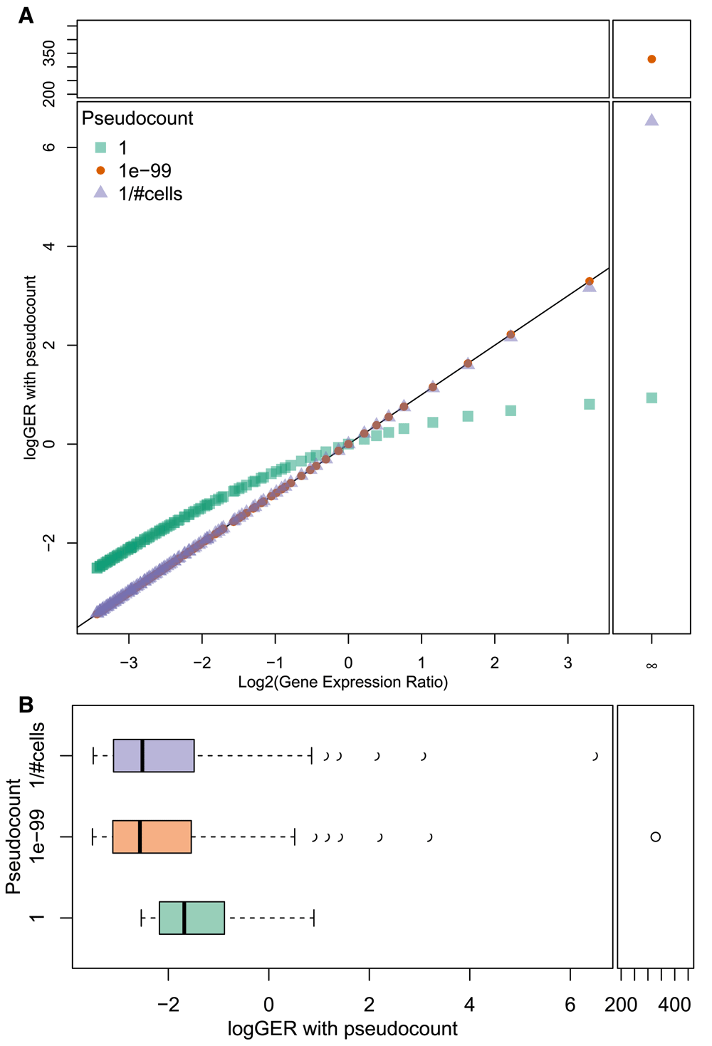
A. A scatter plot comparing true logGER (x-axis) with logGER calculated with various pseudocounts (y-axis). With a pseudocount of 1 (green squares), the magnitude of logGER is compressed at both ends relative to true logGER, while smaller pseudocounts are much closer to the true values (as denoted by the black line). A very small pseudocount (1e-99, orange circles) is far from the range of values when calculating a log gene-expression ratio where the gene is undetected in one cluster (dividing by zero). An alternative is to set the pseudocount to the smallest possible “step” in count-based data (1 / # of cells, light purple triangles) to prevent magnitude compression of logGER calculations while keeping division-by-zero values within the range of the data. B. Boxplots showing ranges of logGER values with various pseudocounts. With a very small pseudocount (1e-99, in orange), comparisons with zero yield values far from the range of the other data. Setting the pseudocount to the smallest possible “step” in count-based data (1 / # of cells, in light purple) ensures that the logGER values remain close to their true value, while comparisons with zero don’t yield logGER results too far outside the range of other logGER values.
An alternative to using gene expression ratio to quantify the magnitude of expression differences between clusters is to consider the difference in proportions of cells from each cluster in which the gene in question was detected (per cluster gene detection rate). The concept of detection rate in scRNAseq data stems from the low per-cell sensitivity and minimal amplification noise of droplet-based assays. Since there is a correlation between gene expression magnitude and per cluster gene detection rate, the detection rate may be a meaningful quantification of gene expression, and more suitable to use for identifying genes that uniquely “mark” certain cell populations. Further, the Wilcoxon rank-sum test tends to falsely identify genes as differentially expressed if they are detected at lower rates in the data (Soneson & Robinson, 2018), so filtering based on magnitude of detection rate differences will reduce the number of poorly detected genes tested. To test whether difference in detection rate (dDR) could be used as a filter prior to differential expression testing, its ability to predict significant differential expression (alpha < 0.01, Wilcoxon rank-sum test) was compared to that of a logGER filter. As shown in Figure 2, filtering using difference in detection rate had much better precision when predicting genes that were significantly differentially expressed in pairwise cluster comparisons in mouse cerebral cortex data collected by DropSeq or human liver data collected by 10X Genomics Chromium (MacParland et al., 2018; Yuzwa et al., 2017). Thus, scClustViz uses a 15% difference in detection rate as a default filter prior to differential expression testing between clusters. Given that this statistic may not be as effective when using more sensitive assays such as full-length scRNAseq, using logGER as the filter statistic is an optional parameter. Filtering with logGER is also used when comparing one cluster to the remaining cells in the data, as gene detection rates are less meaningful in such a typically heterogenous data set.
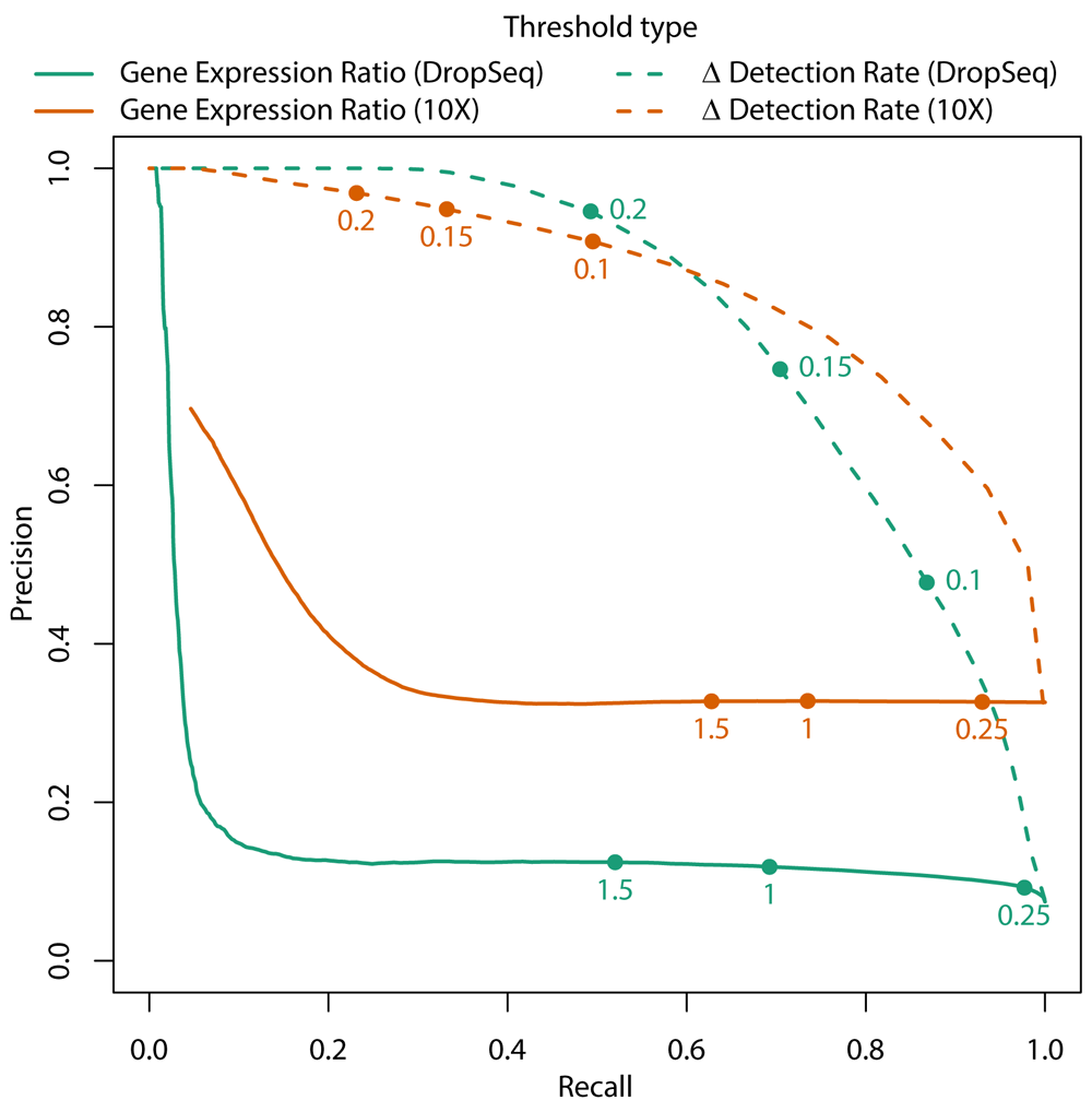
Using DropSeq data from embryonic day 13.5 from mouse cerebral cortex (green) and 10X Genomics Chromium data from the human liver (orange), a Wilcoxon rank-sum test was used to test the differences in gene expression for all genes between every pair of clusters. P-values less than or equal to 0.01 were considered significant. Difference in detection rate (dDR – dashed line) and gene expression ratio (logGER – solid line) were calculated for all genes between pairs of clusters, and the ability to predict significance differences in gene expression at different thresholds of logGER or dDR were used to generate precision-recall curves. Highlighted are potential thresholds for dDR or logGER.
Three different comparisons are made during differential expression testing. First, marker genes for each cluster are determined by pairwise differential gene expression tests versus every other cluster. This is done by testing for differential gene expression for all genes above the dDR threshold in every combination of clusters, then finding genes that have a positive gene expression ratio and pass FDR threshold (default FDR < 1%) for a cluster in every comparison. This method is one of the two differential expression tests used in scClustViz to quantify cluster granularity. It ensures that there are marker genes for all clusters that are unique to each cluster, given all other clusters in the data.
The second way cluster granularity is quantified by scClustViz is by comparing each cluster to its nearest neighbouring cluster. By ensuring there is at least one positively differentially expressed gene (default FDR < 1%) between each set of neighbouring clusters, this metric enforces the requirement for having statistically separable clusters, which is less restrictive than requiring unique marker genes per cluster. Nearest neighbours are clusters with the fewest differentially expressed genes between them, as calculated above.
Finally, scClustViz calculates differential gene expression between genes in each cluster versus the rest of the data combined. This is not used to assess clustering results but may be visualized by the user to identify distinguishing genes for that cluster, although this will only be valuable if there is enough heterogeneity in the data to identify differential genes. Though this represents an unbalanced comparison, the non-parametric nature of the Wilcoxon rank-sum test makes it robust to such imbalances.
To support quick display of the various figures in the user interface, other cluster-wise gene statistics are calculated. Detection rate (DR) is the proportion of cells in a cluster in which a given gene has a non-zero expression value. Mean detected transcript count (MDTC) is the mean of the normalized transcript counts for a gene in the cells of the cluster in which that gene was detected. And mean transcript count (MTC) is the mean normalized transcript count for a gene for all cells in the cluster. These are stored as a nested list object in R: a named list of cluster resolutions, containing a named list of clusters per resolution, containing a dataframe storing the cluster-wise gene statistics. This nested list format is also used to store each of the three differential expression test results. For comparison between a cluster and the rest of the data (DE vs. tissue), the dataframe stores log2 fold-change (logGER), p-value, and q-value (FDR) results for each gene per cluster that is determined to be positively differentially expressed (logGER > 1, FDR < 1%). For comparison between a cluster and each other cluster (marker genes), the dataframe stores log2 fold-change (logGER), difference in detection rate (dDR), and q-value for each cluster being compared to, with variable names indicating the cluster being compared to. For comparison with the neighbouring cluster, the relevant three variables from the marker genes are stored in the dataframe. Since all pairwise cluster comparisons are done once, they are also stored as a separate list of lists, and are accessed by the Shiny app when comparing clusters.
The package was built in R v3.5.0 (R Core Team, 2018). The R Shiny interactive web page generating tool (shiny v1.1.0) was used to generate the scClustViz user interface (Chang et al., 2018). Silhouette plots are generated using the R package cluster v2.0.7-1 (Maechler et al., 2018). Colour-split dots for plotting use code from the R package TeachingDemos v2.10 (Snow, 2016). Colour scales with transparency use the R packages scales v1.0.0, viridis v0.5.1, and RColorBrewer v1.1-2 (Garnier, 2018; Neuwirth, 2014; Wickham, 2017).
The scClustViz tool is available as an R package from GitHub. Usage details and example code is available on the website, but in short there are two steps involved prior to viewing data in the GUI: importing the data and running the differential gene expression testing. Each step is a single function call, and the output of these two steps is saved so that they only need to be run once. This allows the user to quickly view and easily share the results of their analysis following setup.
The first step is to import scRNAseq clustering output from an existing analysis pipeline. scClustViz takes the normalized gene expression matrix, cell-wise metadata, cluster assignments, and cell embeddings from dimensionality reduction methods (i.e. principal component analysis (PCA) and t-Distributed Stochastic Neighbor Embedding (tSNE)) from an existing scRNAseq analysis and stores them as a list in R. While there are some existing data structures designed to handle scRNAseq data, such as the Bioconductor SingleCellExperiment class (Lun & Risso, 2017), building this small custom list reduces the risk of unexpected inputs while minimizing both file size and dependencies on any particular data structure. There are currently two functions for passing existing data to scClustViz. The function readFromSeurat automatically pulls the relevant data from a Seurat data object generated using the analyses outlined in their tutorial (Butler et al., 2018). Alternatively, the readFromManual function enables the user to specify the relevant data from their analysis object of choice.
The second step is to run the differential expression testing. This is done using the function clustWiseDEtest, which takes as input the list generated in the first step, as well as optional arguments describing the state of the data and customizing testing thresholds. To calculate means of log-normalized data accurately, the function needs to know the log base and pseudocount used in the normalization. In most cases, gene expression data is transformed in log base 2, though Seurat uses the natural log. A pseudocount of 1 is generally used to avoid log-zero errors. As such, the function defaults to expecting log2-normalized data with a pseudocount of 1. The function also provides options for gene filter type and threshold prior to differential expression testing. As outlined above, difference in detection rate can be a better predictor of significant differential gene expression and is thus the default gene filtering method, but gene expression ratio can be used if desired. Thresholds for each method can also be set (defaulting to 0.15 for dDR and 1 for logGER). The false discovery rate threshold for determining significance can also be set, and defaults to 1%. Finally, since iteratively testing differential gene expression between clusters for many cluster solutions takes time, there is an option to stop testing cluster solutions once there are no longer statistically significant gene expression differences between the closest pair of nearest neighbouring clusters. This is determined by first sorting the clustering solutions in order of increasing number of clusters found, then testing them in order, stopping when no significant differential expression has been found between a pair of nearest neighbour clusters. If this option is selected, only cluster solutions tested will appear in the Shiny GUI. This has the potential to save time during setup.
The objects generated in the setup steps are saved to disk as a single compressed RData file prior to viewing them in the GUI. This is done to ensure that setup is a one-time process, and to simplify sharing of analyses. The function runShiny launches the R Shiny instance with the interactive data figures in the R integrated development environment (IDE) or a web browser. It loads the data from file, and has optional arguments to specify the annotation database and marker genes for expected cell types, as well as setting thresholds for differential expression testing. The latter arguments describing testing thresholds shouldn’t be necessary, as the parameters used in the differential testing step are saved and loaded as defaults by this function. The annotation database is used to find gene names to improve clarity of some figures and expects a Bioconductor AnnotationDbi object such as org.Mm.eg.db for mouse or org.Hs.eg.db for human. Finally, if passed a named list of canonical marker genes for expected cell types in the data, scClustViz will automatically generate cluster annotations (labels). This is done by assigning each cluster to the cell type with the top aggregate rank of gene expression for its marker genes. More in-depth and unbiased methods for assigning cell type identities to clustering results exist (Crow et al., 2018; Kiselev et al., 2017), so this is meant more as a convenience option for labelling purposes than a definitive automatic cluster annotation method.
System requirements for this tool will depend heavily on the dataset in question, since the data will have to be loaded into memory, and the memory footprint of scRNAseq data depends on the number of cells being analysed. However, in all tests loading objects from Seurat into scClustViz, the saved objects after the setup and differential expression testing steps were smaller than the original Seurat object. It is thus safe to assume that scClustViz will run on the computer on which the dataset in question was analysed. For the data from the MouseCortex package, the largest dataset (E15, containing nearly 3000 cells) uses less than 1.2GB of memory.
To demonstrate the convenience of sharing analysed data with scClustViz, the MouseCortex package was built with data from a recent publication exploring the development of the mouse cerebral cortex using scRNAseq (Yuzwa et al., 2017). A tutorial for building similar R data packages calling scClustViz as the visualization tool can be found on the scClustViz website.
The MouseCortex package contains the four datasets published in the paper, and a wrapper function for runShiny that loads each dataset with the appropriate arguments. The embryonic day 17.5 dataset (opened by the command viewMouseCortex(“e17”)) will be used to demonstrate the purpose of the various figures in scClustViz and highlight its role in identifying a core gene set expressed in the neurogenic stem cell population of the cerebral cortex in the next sections. All figures from this point on were generated in the scClustViz Shiny app and saved using the “Save as PDF” buttons.
The first step in the post-clustering workflow is to assess the results of the various clustering parameterizations used. scClustViz uses a combination of differential gene expression between clusters and silhouette analysis for this. Differential gene expression is used as a metric in two ways: the number of positively differentially expressed genes between a cluster and its nearest neighbour, and the number of marker genes (positively differentially expressed vs. all other clusters in pairwise tests) per cluster. In Figure 3a, differential expression to the nearest neighbouring cluster is represented as a series of boxplots per cluster resolution, arranged on the x-axis to indicate the number of clusters in each boxplot. The highlighted boxplot indicates the currently selected cluster from the pulldown menu in the user interface. Both differential expression-based metrics can be visualized this way by switching the metric used, via the interface.
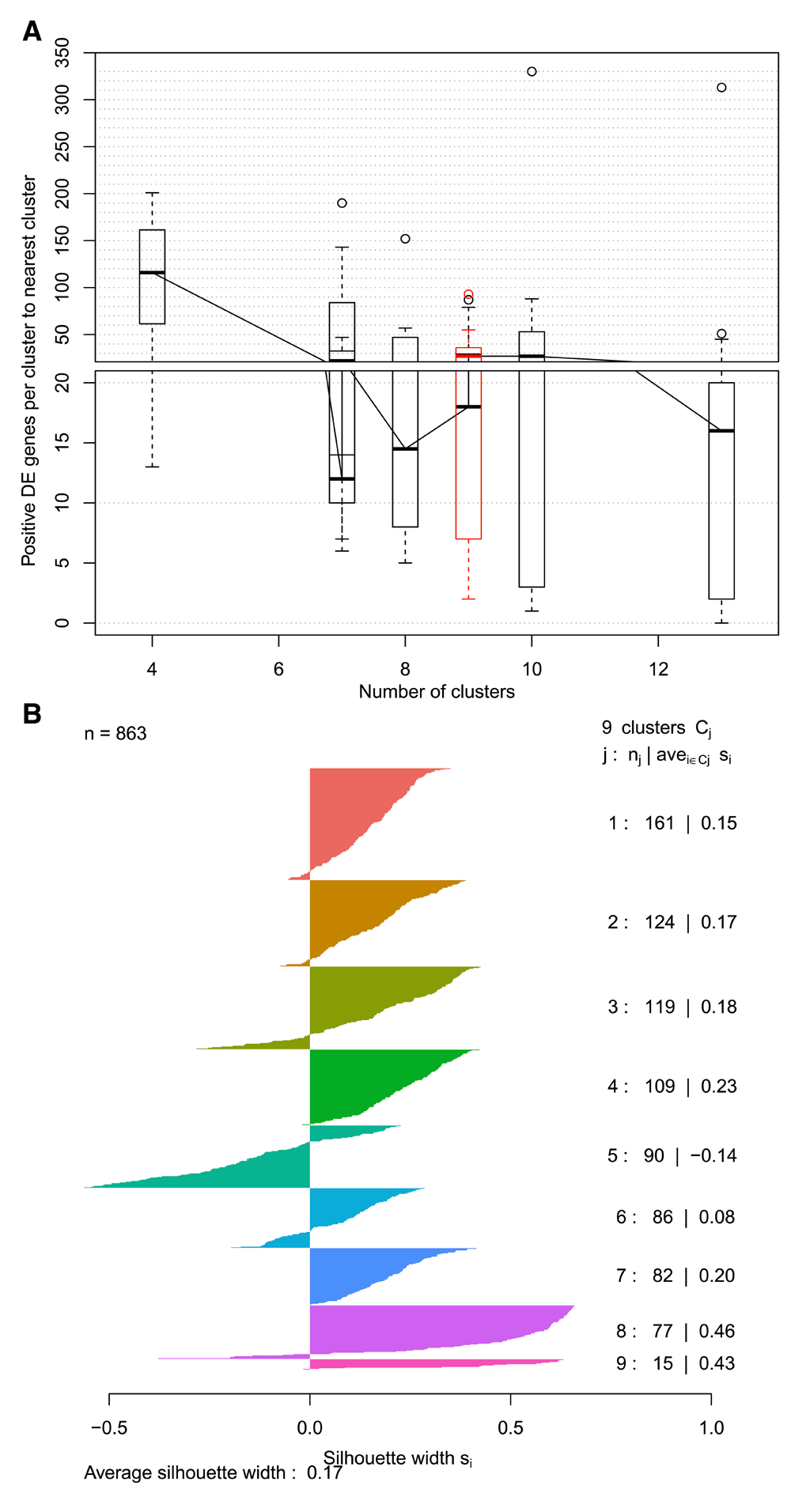
A. Boxplots representing number of differentially expressed genes between neighbouring clusters for each cluster resolution. For each cluster at a specific resolution, the number of positively differentially expressed genes to its nearest neighbouring cluster is counted, and those counts are represented as a boxplot. The boxplots are arranged along the x-axis to reflect the number of clusters found at that resolution. Highlighted in red is the cluster resolution currently selected in the interface. A similar figure is also available for number of marker genes per cluster. B. Silhouette plot for the selected cluster resolution. A horizontal bar plot where each bar is a cell, grouped by cluster. Silhouette width represents the difference between mean distance to other cells within the cluster and mean distance to cells in the neighbouring cluster. Distance is Euclidean in reduced dimensional (generally PCA) space. Positive values indicate that the cell is closer to cells within its cluster.
When a cluster resolution is selected, its silhouette plot is rendered to add another method of cluster assessment (Figure 3b). A silhouette plot is a horizontal bar plot where each bar is a cell, grouped by cluster. The width of each bar, referred to as silhouette width, represents the difference between mean distance to other cells within the cluster and mean distance to cells in the neighbouring cluster. Distance is Euclidean in the reduced dimensional space saved in the original analysis object (generally this is defined using PCA). Positive values indicate that the cell is closer to cells within its cluster. It is worth noting that the dimensions returned by methods such as PCA are not equally meaningful, since each explains a different proportion of the variance in the data, while Euclidean distance treats them all equally. This can be addressed by weighting the PCs by variance explained, a method implemented in newer versions of Seurat (Butler et al., 2018). To prevent unexpected results caused by assuming a PC weighting option in upstream analysis, the silhouette plot in scClustViz does not reweight PCs, so users are encouraged to consider this when interpreting this plot.
Once the user has chosen the appropriate cluster solution, they can click the “View clusters at this resolution” button to proceed to in-depth exploration and visualization of the results. They can also save this as the default resolution for future sessions. If a cluster resolution is saved as default, a file specifying the saved resolution will be generated in the same directory as the input data (or an optional output directory). Specifying a separate output directory is useful when the input data is part of a package, as in MouseCortex. If the same output directory is specified the next time the command is run, all saved data in that directory will be reloaded in the app.
In this section, the user can explore the dataset as a whole. The first panel, Figure 4a shows a two-dimensional representation of cells in gene expression space. This is generally a tSNE plot, but the user can use the 2D cell projection results of their choice by specifying the relevant data (i.e. UMAP) in readFromManual (van der Maaten & Hinton, 2008; McInnes & Healy, 2018). The cells are coloured by cluster and can be labelled by cluster number or automatically annotated with a predicted cell type based on known marker genes for expected cell types passed to runShiny. The user can select any cluster for downstream exploration by clicking on a cell from that cluster in this plot. This will highlight the cluster in other plots in the interface. Since we are interested in identifying marker genes for the precursor cell population, we may click on cluster 8 (purple) to select it for downstream analysis.
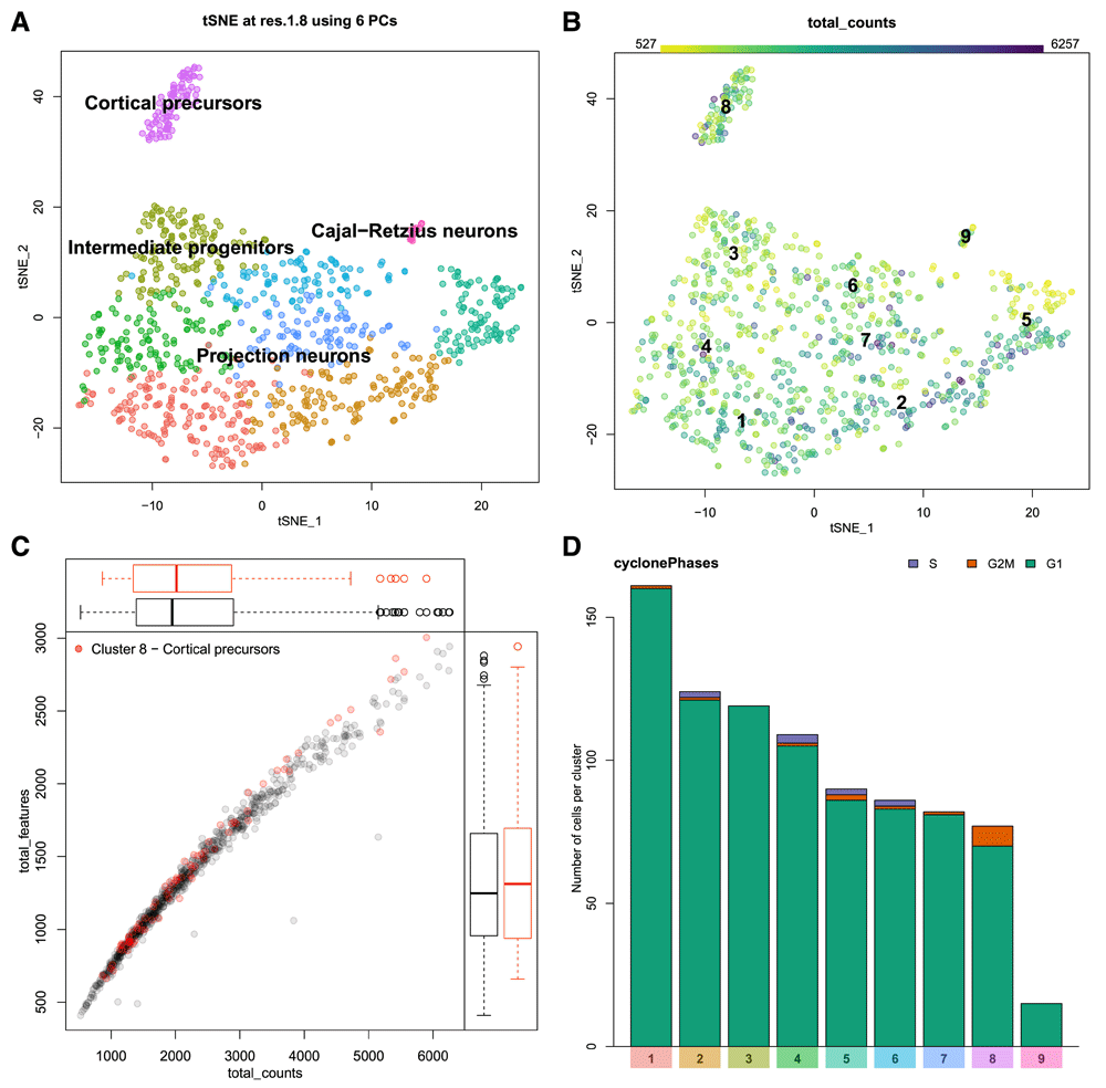
A. A 2D projection of cells in gene expression space (frequently a tSNE plot) is coloured by cluster. Clusters can be labelled by number, or automatically annotated as seen here. B. An example of a metadata overlay on the cell projection. The library size (number of transcripts detected) per cell is represented by colour scale, where darker cells have larger library sizes. C. Metadata can be represented as a scatter plot. The relationship between gene detection rate (number of unique genes detected – y-axis) and library size (x-axis) is shown here. The cells from the selected cluster (cluster 8, cortical precursors) are highlighted in red. D. Categorical metadata is represented as a stacked bar plot showing the number of cells contributing to each category per cluster. This plot shows predicted cell cycle state, with G1 phase in green, G2/M in orange, and S phase in purple.
The distribution of various cellular metadata can be visualized in Figure 4b. Metadata is selected from a pulldown menu and is represented as colours on the cells in the 2D projection. In this manner the user can inspect the impact of technical artifacts such as gene detection rate, library size, or cell cycle stage on the clustering results. Numeric metadata can also be assessed as a scatter plot, where the axes can be defined by selecting from pulldown menus. Figure 4c shows the relationship between gene detection rate and library size per cell for both the dataset as a whole and the selected cluster. The cells from cluster 8, a cortical precursor cluster, were selected in the previous plot and are thus highlighted in red here. The cluster 8 cells are similar to other cells in the data, thus do not seem to be biased by the measures visualized in this plot. If this was not the case, we may want to consider confounding variables in the normalization process. For example, many authors have noted that gene detection rate is often strongly correlated with the first few principal components, and can thus influence clustering results (Finak et al., 2015; Risso et al., 2018). There are a few ways to handle this, from simply excluding those principal components, or explicitly normalizing for those factors when scaling the data (as implemented in Seurat), to including the offending technical variables as covariates in more complex dimensionality reduction (i.e. ZINB-WaVE) or differential expression testing (i.e. MAST) models. While those analyses are outside the scope of this tool, it is important to be able to visualize these technical factors in the analysed data to assess the efficacy of the chosen correction method.
Categorical metadata is represented as a stacked bar plot in Figure 4d, as either absolute counts or relative proportions. Here we see that by E17.5 the cortical precursors of cluster 8 are not predicted to be actively in the cell cycle using the cyclone method (Scialdone et al., 2015). This fits expectations from known developmental biology, since neurogenesis is nearly complete by this stage, and the stem cell population that persists into adulthood is thought to enter quiescence around E15.5 (Fuentealba et al., 2015). For demonstration purposes, we will continue to focus on cluster 8, which is predicted to form the adult neurogenic stem cell population in the cerebral cortex. We will aim to identify marker genes for these cells.
Once the user is satisfied that their cluster solution is appropriate and unaffected by technical factors, the next step in data interpretation is to determine the cellular identity of each cluster by its gene expression. The three different differential expression tests done prior to running the visualization assist with this by highlighting the most informative genes in the dataset. In a sufficiently heterogeneous dataset, differential expression between a cluster and the rest of the data can be useful for identifying genes that uniquely define a cluster’s cellular identity. A more conservative form of this is the identification of marker genes – those genes that are significantly positively differentially expressed in all pairwise tests between a cluster and all other clusters. This highlights genes expected to be found at a significantly higher expression in this cluster than anywhere else in the data. Finally, there is the testing between each cluster and its nearest neighbour to highlight local differences in expression. Each of these sets of differentially expressed genes can be presented as a dot plot comparing clusters, as seen in Figure 5. A dot plot is a modified heatmap where each dot encodes both detection rate (by dot diameter) and average gene expression in detected cells (by dot colour) for a gene in a cluster. Here up to the top ten marker genes per cluster are shown, but both the type of differential expression test used to generate the gene set and the number of differentially expressed genes contributed per cluster can be adjusted using the interactive interface. At this point in the analysis, it is also possible to download any of these differential gene expression results as tab-separated value files for further analysis, by selecting the cluster of interest and differential expression type and clicking “Download gene list”. This may be of value if the user is using this platform to share the data online, or with those who would prefer not to use R for further analysis. In this dot plot, we can see the top 10 marker genes for our putatively quiescent cortical precursor cell population (cluster 8) include known marker genes for cortical radial precursors (Fabp7, Slc1a3, Vim, and Sox2), a known marker for adult neural stem cells (Dbi), as well as novel marker genes for this population (Mfge8, Ttyh1, Ddah1, and Ednrb) (Yuzwa et al., 2017). The dot plot format also shows us that while Ckb is significantly positively differentially expressed in cluster 8 relative to all other clusters, it is still quite highly expressed in all cells in the data, and thus would not be an optimal marker gene.
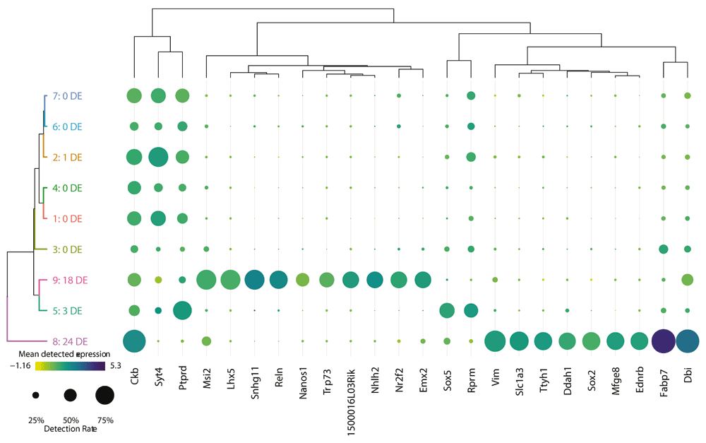
A dot plot showing the relative expression of a subset of marker genes (x-axis) across all clusters (y-axis). A dot plot is a modified heatmap where each dot encodes both detection rate and average gene expression in detected cells for a gene in a cluster. Darker colour indicates higher average gene expression from the cells in which the gene was detected, and larger dot diameter indicates that the gene was detected in greater proportion of cells from the cluster. Cluster colours are indicated for reference on the left side of the plot. Cluster numbers are also indicated on the left side, along with the number of differentially expressed genes in each cluster. The genes included can be changed to reflect those differentially expressed per cluster when compared to the rest of the dataset as a whole (i.e. the tissue), the nearest neighbouring cluster, or marker genes unique to that cluster. The number of differentially expressed genes contributed per cluster can also be adjusted.
To more closely inspect the gene expression of an individual cluster, scClustViz presents gene expression data per cluster as a scatter plot with the proportion of cells from that cluster in which a gene is detected (more than zero transcript counts) on the x-axis, and mean normalized transcript count from cells in which the gene was detected on the y-axis, as seen in Figure 6a. This visualization method helps separate the contribution of zeros from the mean gene expression value, since like the dot plot it separates magnitude of gene expression from gene detection rate. It also highlights the strong relationship between magnitude of gene expression and likelihood of detection in droplet-based single-cell RNAseq data, since the trend goes from the plot’s bottom left (genes have low expression and are rarely detected) to top right (genes have high expression and are detected often). In this figure, the cortical precursor cluster 8 is shown, but the user can select the cluster shown from a pulldown menu in this panel as well. There are three ways to highlight various genes in this plot. First, the genes passed as known marker genes for expected cell types can be highlighted in colours corresponding to their cell type, if a marker gene list is defined by the user (Figure 6a). This figure indicates that this cluster was classified as cortical precursors based on the high relative expression of both Sox2 and Pax6, as well as Nes and Cux1 (markers for both cortical precursors and projection neurons). In Figure 6b, the plot shows differentially expressed genes, specifically the genes contributed by this cluster to the dot plot shown immediately above in the app (Figure 5). Thus, by changing the differential gene set or number of genes in the heatmap, the user can also adjust the genes highlighted in this scatter plot. Finally, the user can search for genes manually by entering a list of gene symbols or using a regular expression in the search box below the figure. To identify and compare gene expression for any point in this figure, the user can click on the point.
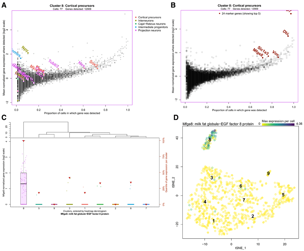
A. A scatter plot representing gene expression in the highlighted cluster, the cortical precursor cluster 8. The x-axis represents the proportion of cells from that cluster in which a gene is detected (more than zero transcript counts), and the y-axis is the mean normalized transcript count from cells in which the gene was detected. The cell type marker genes are highlighted, indicating that this cluster was classified as cortical precursors based on the high relative expression of both Sox2 and Pax6, as well as Nes and Cux1 (markers for both cortical precursors and projection neurons). B. The same scatter plot is shown with the top 10 marker genes for cluster 8 highlighted, though the user can choose other differentially expressed gene sets from the heatmap, or search for genes of interest using the interface. The identity of any point can be determined by clicking on it in the interface. C. Boxplots comparing the expression of a gene of interest across all clusters. Clusters are arranged on the x-axis based on the cluster dendrogram generated for the dot plot above (Figure 5), and normalized transcript count for the gene of interest (Mfge8, in this case) is represented on the y-axis. The dots on each boxplot represent the individual data points, gene expression per cell. The red triangles indicate the rank of relative gene expression in that cluster, as indicated on the y-axis on the right side. This figure shows that Mfge8 may be a marker of cortical precursors. D. Gene expression overlaid on the cell projection. Gene expression is represented by a colour scale on the cells of the two-dimensional projection, where darker indicates higher expression. If multiple genes are selected, the maximum gene expression value per cell is shown. Clusters can be labelled by number or annotation. This figure shows the distribution of Mfge8 expression in the dataset.
Clicking on a point in the figure above will generate a series of boxplots comparing gene expression for the selected gene across all clusters (Figure 6c). Since the above scatter plot can be crowded, all genes near the clicked point are shown in a pulldown menu, so that the user can select their gene of interest. Alternatively, the gene(s) entered in the search box in the previous panel can be used to populate the pulldown list for selecting the gene of interest for this figure. By comparing gene expression across clusters, it is easier to assess the utility of putative marker genes. Here we see that Mfge8 is expressed nearly exclusively in cluster 8, with rare detection in any other clusters. This suggests that Mfge8 may be effective for identifying the cells of this cluster in situ. In fact, both fluorescence in situ hybridization for Mfge8 and immunohistochemistry for its protein lactadherin showed specificity for the cortical precursor cells in the embryonic mouse brain, as well as the B1 neural stem cells of the adult ventricular/subventricular zone (Yuzwa et al., 2017).
Finally, the user can directly plot the expression of a gene or genes of interest on the tSNE plot to better visualize the distribution of gene expression in the dataset, as shown in Figure 6d. Genes are selected by entering gene symbols or a using a regular expression and selecting the matching gene symbols from a dropdown list. Gene expression is represented by a colour scale on the cells of the two-dimensional projection. If multiple genes are selected, the maximum gene expression value per cell is shown. This serves as another way of highlighting the specificity of Mfge8 for the cortical precursor cells in this dataset.
The final feature of scClustViz is the ability to generate MA plots comparing gene statistics for any two clusters, or any two sets of cells specified by the user (Figure 7a). MA plots (also known as Tukey’s mean-difference plot or Bland-Altman plot) show differences between samples comparing the log-ratio of gene expression between samples (y-axis) to the mean gene expression across those samples (x-axis). We take this one step further by giving the user the option of viewing the difference and average of all three gene statistics used in scClustViz: mean gene expression, mean detected gene expression, and detection rate. Furthermore, the user can manually select sets of cells to compare, and scClustViz will calculate differential gene expression statistics between the selected cells and the remaining cells in the data, and between sets of selected cells. Once the calculations are complete, the resulting comparison is represented as a separate “cluster solution” and can be explored in all the figures of scClustViz. These results can be saved to disk by clicking “Save this comparison to disk” when selecting it in the pulldown menu for cluster solution selection. Any saved comparisons will be loaded along with the data any time runShiny is run.
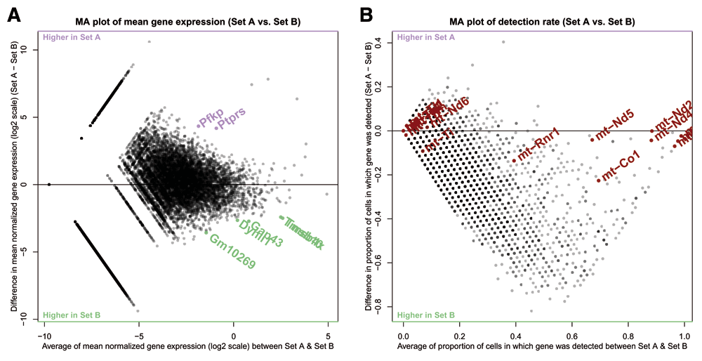
A. An MA plot showing log-ratio of gene expression between cell sets on the y-axis, and average gene expression across sets on the x-axis. Set A here is a subset of cluster 5 with low library sizes, while set B is the subset of cluster 5 with high library sizes. Highlighted are the top differentially expressed genes upregulated in set A over set B (purple) and set B over set A (green). B. An MA-style plot showing difference in gene detection rate between set A and set B on the y-axis, and average gene detection rate across sets on the x-axis. The horizontal line is at zero difference in detection rate. Highlighted are genes from the mitochondrial genome, which are generally used as markers of damaged cells in single-cell RNAseq analyses.
In Figure 7 we’re investigating a potential technical artifact in the data, specifically the poor cohesion of cluster 5 as seen in the silhouette plot in Figure 3b. This poor cohesion could be due to the differences in library size within the cells of the cluster, as seen in Figure 4b. To investigate this, the cell selection tool in scClustViz was used to select the cells of cluster 5 with low library sizes (Set A) and those with high library sizes (Set B). After running the differential gene expression calculations, we can view the differentially expressed genes between the sets in the dot plot or MA-plot (Figure 7a). Set B seems to have more positively differentially expressed genes, which may be due to improved gene detection rate from higher library sizes. This can be seen in Figure 7b, where an MA-style plot showing difference in detection rate vs average detection rate across sets is shown. Most genes are more detected in the set with larger library sizes (set B), which might be expected, since more transcripts detected correlates with higher average transcript counts per gene. Clicking on a gene in this figure has the same functionality as the scatter plot in Figure 6; it will be selected for viewing in the boxplot above (Figure 6c). Using this, we noticed that genes from the mitochondrial genome were seemingly unaffected by the difference in library sizes, as they tended to fall near zero difference in detection rate. To highlight this, we searched for all genes from the mitochondrial genome using the search tool, which allowed us to highlight them here. If cells are damaged and leaking cytoplasm, they are likely to have smaller library sizes as they lose mRNA. However, since RNA from the mitochondrial genome is sequestered in a separate organelle, they are less likely to lose those transcripts (Ilicic et al., 2016). We can see evidence for this in the cells of cluster 5 with small library sizes, since the detection rate of their mitochondrial genes is unchanged. While this dataset was filtered to remove cells with higher than average mitochondrial gene transcript proportions, including that metric in the metadata would allow for tuning of the threshold used. Since these cells have both low library sizes and higher relative detection rate of mitochondrial transcripts, it is safe to assume they are damaged cells and remove them from the analysis.
We developed scClustViz to aid in the annotation of cell types and identification of marker genes from scRNAseq data. It provides both a metric for cluster assessment based on inter-cluster differential gene expression, as well as a convenient user interface for accomplishing this analysis and interpretation task. Using differential gene expression to assess clustering solutions ensures that the results are suited to addressing the relevant biological task of identifying cell types and their marker genes. The user interface is also focused specifically on this task by generating publication quality figures and providing analyses that help the user determine the appropriate number of clusters, identify cell types, and highlight genes unique to those cell types. There are other user interfaces available for the analysis of scRNAseq data (Rue-Albrecht et al., 2018; Zhu et al., 2017). However, scClustViz fills a niche between existing GUIs, which are either very user-friendly for non-technical users, at the cost of the ability to customize analysis, or very powerful and customizable, at the cost of providing a simple framework for accomplishing a common analysis task. The one-time setup step for scClustViz also simplifies data sharing, as it generates a file that can be shared for viewing by anyone using R. Data sharing can be made more user-friendly by building an R data package with a wrapper function calling scClustViz, as seen in the use case outlined in this paper. Building such a package is a quick process, and a tutorial is available on the scClustViz website. scClustViz is available at https://baderlab.github.io/scClustViz/ as free, open source software under the permissive MIT open source license.
The example dataset used is available as an R package: https://github.com/BaderLab/MouseCortex
Archived code at time of publication: http://doi.org/10.5281/zenodo.1411462 (Innes, 2018a)
Licence: MIT
scClustViz is available from: https://baderlab.github.io/scClustViz/
Source code is available from GitHub: https://github.com/BaderLab/scClustViz
Archived source code at time of publication: http://doi.org/10.5281/zenodo.1411464 (Innes, 2018b)
Licence: MIT
| Views | Downloads | |
|---|---|---|
| F1000Research | - | - |
|
PubMed Central
Data from PMC are received and updated monthly.
|
- | - |
Provide sufficient details of any financial or non-financial competing interests to enable users to assess whether your comments might lead a reasonable person to question your impartiality. Consider the following examples, but note that this is not an exhaustive list:
Sign up for content alerts and receive a weekly or monthly email with all newly published articles
Already registered? Sign in
The email address should be the one you originally registered with F1000.
You registered with F1000 via Google, so we cannot reset your password.
To sign in, please click here.
If you still need help with your Google account password, please click here.
You registered with F1000 via Facebook, so we cannot reset your password.
To sign in, please click here.
If you still need help with your Facebook account password, please click here.
If your email address is registered with us, we will email you instructions to reset your password.
If you think you should have received this email but it has not arrived, please check your spam filters and/or contact for further assistance.
Comments on this article Comments (0)