Keywords
Image Publication, FIJI, Good principles of figure design, Beginner's workflow, Image processing, open source, Visualization, Image analysis
This article is included in the NEUBIAS - the Bioimage Analysts Network gateway.
This article is included in the Bioinformatics gateway.
This article is included in the Research on Research, Policy & Culture gateway.
Image Publication, FIJI, Good principles of figure design, Beginner's workflow, Image processing, open source, Visualization, Image analysis
The revised version of our Manuscript “Effective image visualization for publications – a workflow using open access tools and concepts” was improved and extended substantially based on the reviewers' comments. In particular, we clarified that our workflow is aimed strictly for presentation purposes and does not apply to images used for quantification. We have expanded the glossary and provide more details for every step of the workflow. In addition, we have fixed errors in the figures and cheat sheets.
See the authors' detailed response to the review by Guillaume Jacquemet
See the authors' detailed response to the review by Georgina Fletcher and David Barry
Every year, about 800,000 articles are newly indexed at Pubmed (https://www.nlm.nih.gov/bsd/index_stats_comp.html) of which 25% contain images1; this amounts to about 500 new articles with image figures per day. These published images provide new insights, but each day also the number of problematic images increases. While intentionally manipulated images are rare2,3, erroneous handling of images is more common. Another problem is that methods often insufficiently inform about image acquisition and processing4. Last, images frequently have low legibility, as only 10–20% of published images provide all key information (annotation of color/inset/scale/specimen)5. In the long run, problematic images may undermine the trust in scientific data and, when published in emerging image archives, reduce the value of such repositories6,7.
Today’s scientists face rapidly evolving technologies and employ many methodologies, with microscopy and image analysis8 just one among many. Problematic images thus partially arise from: 1) lack in training, as ethical and legible processing of microscopy data is not systematically taught4, 2) lack in local expertise, as image facilities are restricted to a few research hubs, and 3) while publishers established guidelines for handling image forgeries9–11, actionable and clear instructions for legible image publishing are lacking.
Here, we introduce an image processing workflow to effectively and ethically present images. The step-by-step workflow enables novice users, with no image processing experience and occasional microscopists, with no intention towards specializing in image processing to take the first steps towards publishing truthful and legible images.
Obtaining high quality bioimages starts with specimen preparation such as fixation, labelling and clearing. To acquire and resolve the biological structure of interest, choose a microscopy system with an objective lens that allows suitable resolution, optical sectioning and spatial sampling. It is vital to sample intensity information properly by choosing a sufficient bit depth and avoiding saturation of high intensities. If the microscope-system allows changing the detector offset, low intensities should not be cut off. Rather than down sampling and cropping the image data, choose an appropriate magnification. When possible, align or rotate the sample to avoid image rotations. For comparison of image data, sample preparation and image acquisition settings need to be the same12–19.
After acquisition, bioimages can be processed and prepared for publication using the workflow below (Figure 1), which is visually summarized in cheat-sheet style (Figure 3 and Figure 4). Both are based on Fiji20, an open source, free image analysis program for bioimages. Images are quantitative data. While image visualizations allow qualitative assessments, it is important to accompany them with quantitative measurements and appropriate statistical analysis. This workflow strictly addresses the image processing necessary for presentations and figures. Images prepared for presentation (e.g. 8-bit, RGB) are unsuitable for subsequent quantification such as intensity measurements. We therefore recommend separating image quantification and visualization workflows. Finally, documentation of any imaging and image processing workflows is key for reproducibility21.
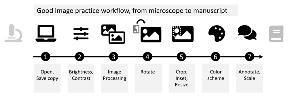
Duplicate the raw image to retain the original, untouched image as raw data and only process the duplicate. Load image-duplicate into Fiji and make sure metadata (see Table 1: Glossary), such as the scale, are correct. When possible use the Bio-Formats plugin for import, as this reads key image metadata (e.g. scale) automatically along with the image22.
When processing is complete, several options exist (see glossary): saving images in TIFF format preserves the entire information. TIFF files however can rarely be properly used in programs for figure assembly (e.g. Inkscape, PowerPoint). For image presentation (figures, slides, online), save images in PNG format, which irreversibly merges the image with annotations, permanently applies brightness/contrast settings, and saves multiple channels as 24-bit RGB image. Another common image presentation file format is JPEG, which should be rarely used due to its lossy compression19. Beware of incorrect or unintentional bit depth conversions23.
Images with a large gray value range may appear black when opening them in FIJI12. To properly display such data for the purpose of presentation/communication24, adjust the brightness and contrast. For comparisons of intensities across images, it is recommended to use the same fixed intensity values (‘set’). For adjustments, avoid auto-buttons as, depending on the software packages, the underlying code may differ, resulting in display differences. Linear intensity adjustment is acceptable, as long as key features are not obscured and minimal background signal is still visible to provide audiences with a sense for signal specificity. Entirely eliminating the background signal, or completely ‘clipping’ high intensities, is misleading (see also9,19,25). Some saturated pixels in the image are acceptable, if this helps the visualization. To identify problems with intensity sampling, or seeing if the image has been processed, the image histogram can be used to show its gray value distribution (Figure 3). Briefly, good unprocessed images should have some offset in the low intensity range (Figure 3: Histogram A). The distribution should not be cut off in the high range (Figure 3: Histogram B) and the range should be continuous (Figure 3: Histogram C).
Non-linear adjustments of brightness and contrast, for example histogram equalizations or gamma correction must be explained in both figure legend and method section19,26,27. Miura and Nørrelykke nicely describe why intensity adjustments (linear and non-linear) must be applied with special caution when images have already been pre-processed, e.g. cropped21. Once images have been adjusted, ‘apply’ and ‘save as PNG’ irreversibly change the intensity range, which makes images unsuitable for intensity measurements.
Depending on your specific scientific question and goal, further image processing may be necessary for image visualization. For instance, advanced systems such as lightsheet microscopy require extensive image processing workflows to obtain a reconstructed volume of the biological specimen for visualization28–32. Large 3D volumes of data are also hard to visualize in two dimensional figures and require the use of projection or rendering33. Finally, microscopy systems add artefacts (noise, blur), which image processing using linear filters13 and deconvolution34,35 can help to reduce. Any processing for representing the image data needs to be carefully applied where necessary and is no replacement for an optimized imaging setup12–18. The processing needs to be clearly stated in the methods section, advanced or non-linear adjustments also in the figure legends13,19.
Image rotations are sometimes necessary to compare image content properly. For instance, when comparing specimens, it helps to align them in the same anatomical orientation. Image rotations however result in a redistribution of the intensity values within the fixed image pixel grid: for rotations by less than 90 degrees, new intensity values are computed by interpolation, and thus information is lost (Figure 3). For rotations in multiples of 90-degree steps, pixels can be reordered rather than interpolated, however this depends on the specific implementation of the rotation algorithm (Figure 3). Loss of information by image rotation may be acceptable for image visualizations, however all image quantifications should be done beforehand19,26.
Often larger fields-of-view are captured on the microscope than are required in the figure. Cropping is then not only permissible, it is necessary to focus the reader on the relevant result. In contrast, it is not ethical to crop out data that would change the interpretation of the experiment, or to “cherry-pick” data9,19,26. We discourage adjusting the intensity of individual crops especially for comparisons21. When a larger field of view and a magnification of detail (‘inset’) need to be shown side-by-side, indicate inset position in the original image. Adjust the size of the image in the figure preparation software, not during image processing: Image size adjustments by upsampling or downsampling an image, requires interpolation and thus may degrade image quality.
In fluorescence microscopy, cameras usually capture each wavelength (channel) with a separate grayscale image. Here, no signal is shown as black, and intensities of the fluorescent signal are displayed in steps of grey values with saturated pixels shown in white. When only one fluorophore/wavelength/channel is shown in a figure, grayscale, which has the best contrast, is favorable. Consider also inverting the grayscale images as human brightness perception is logarithmic and can best differentiate bright areas27. Inverted grayscale images are also printer-friendly and have better visibility on a white page/slide. To visualize several channels of a specimen (e.g. colocalization studies), encode channels with different colors. A look-up table (LUT) determines how gray values are translated into a color value. Additionally, we see at times the use of false color LUTs for visualizing image data; when used improperly, false color LUTs can be highly misleading27 and therefore should be explicitly mentioned in methods and figure legends.
Images represent physical dimensions and can depict different scales ranging from nanometer to millimeter, which is often not obvious36. Adding scale information, ideally a scale bar with dimension, onto or next to the image, therefore is essential for self-explanatory figures. Also annotate what each color and symbol represents in an image, again best in the image itself or next to it. The aim is to provide sufficient information to the reader to understand the presented result at a glance. Ensure that scale bar, dimensions and annotations are legible in the final figure to be published; it may be more time efficient to adjust scale bar and add dimensions/annotations in the figure preparation software (e.g. as described here37).
We tested the workflow on fluorescently-stained microscope images of Drosophila egg chambers (RRID:BDSC_5905;38) and the HeLa (RRID:CVCL_0030) ImageJ sample image39. For generating a “poor” image example, we processed the raw microscope images minimally, only converting the bit depth from 16-bit to 8-bit and retained default color schemes. We did not add annotations, performed no image cropping, rotation, or specific brightness contrast adjustments as these often lack in poorly visualized images5. We thus simulated images as they are typically “processed” in the majority of current publications5. To perform a qualitative assessment, we tested image visibility to color blind (deuteranopia) audiences using the color blindness simulator (RRID: SCR_018400;40).
Using our example microscope images, we qualitatively compared the readability of images processed with or without the workflow described (schematic: Figure 2A). Images for which the steps of the workflow were implemented contained the key information, were cropped to maximize focus, and sufficiently annotated (color channels, scale, organism), while images processed minimally without following the workflow have a “poor” readability (Figure 2B). As further example of readability, we also demonstrated that images processed according to our workflow are accessible to color blind readers (Figure 2B).
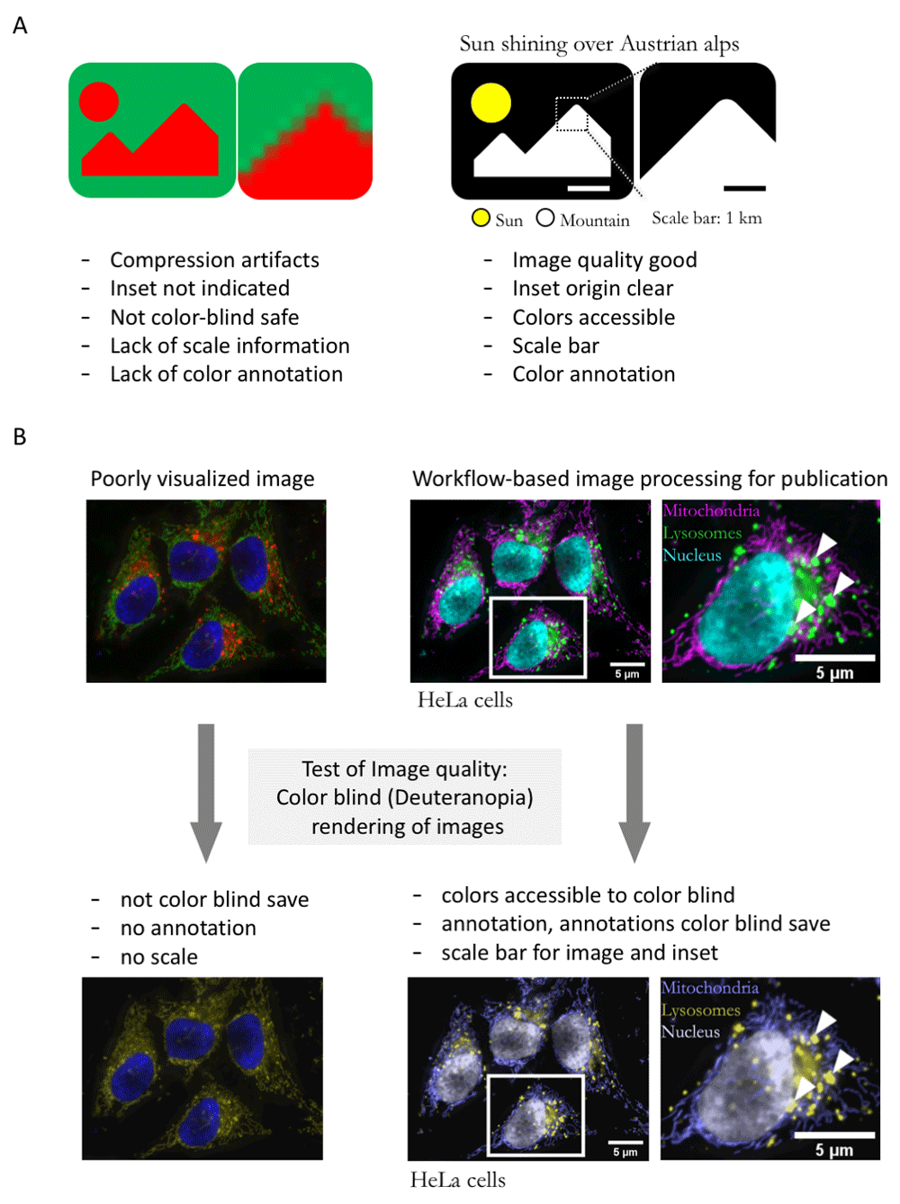
A. Schematic of typical errors in published bioimages and improved version of exemplary image without compression artifacts, and with accessible color-code, annotation, and scale. B. Poorly visualized example image, image after processing with the workflow presented here, and test of image accessibility to color blind readers.
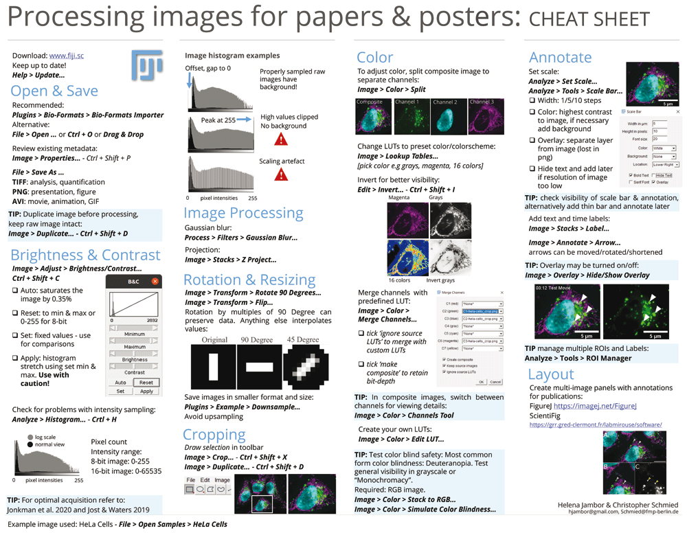
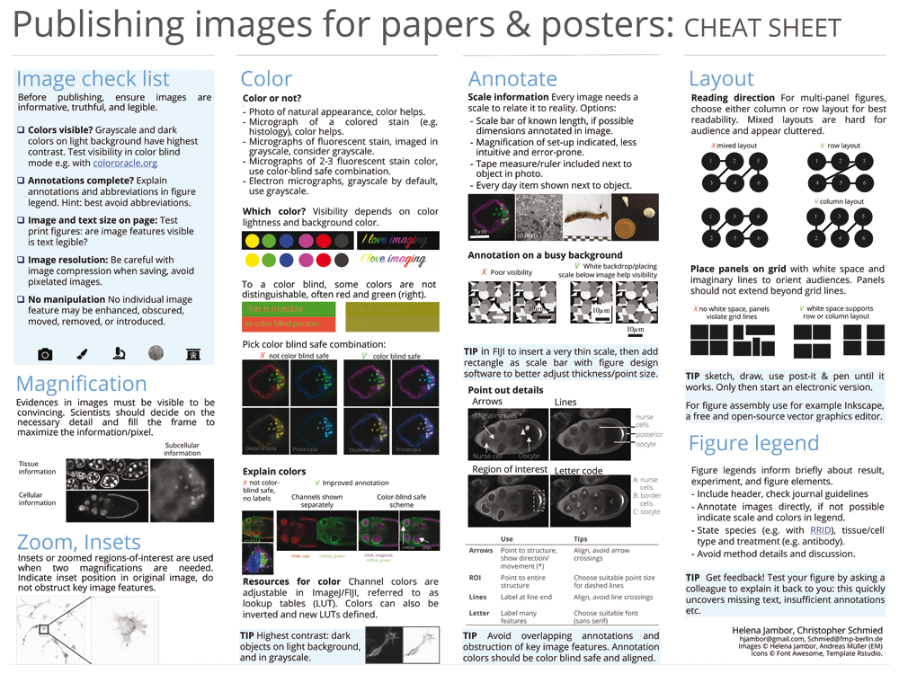
The workflow steps and accompanying suggestions for image presentation are available as accessible “cheat sheets” (Figure 3 and Figure 4) for wide distribution and adoption to more specific needs. Our workflow is based on the open source software Fiji (Figure 3), but its principles (Figure 4) are applicable to other software.
After completing the workflow, images may be assembled for publication and legends added41. Layouting images on a page can be done with design software such as the free and open source Inkscape (https://inkscape.org) or the proprietary Adobe Illustrator. Several options also exist to prepare publication-ready figures directly in ImageJ/FIJI, for example ScientiFig and FigureJ42,43. Figure resolution is usually referred to as dots per inch (DPI). For an ‘unpixelated’ display of microscopy images in an electronic publication, publishers require 300 DPI images in RGB color mode. (Note that the dots-per-inch do not correspond to the physical dimension of the microscopy object and scale bar but solely refer to image size in print or on the screen). This workflow is iterative and feedback from colleagues helps to identify possible hurdles.
If followed, the workflow helps avoiding common problems of published 2D images, but principles are also applicable to 3D stacks and movies. Indeed, lack of truthful scientific communication and reproducibility are among the biggest problems faced by science today44 and considering that an estimated 500 publications with images are published daily, improving image quality could have a profound impact in tackling this issue.
HeLa cell test images are available at: https://imagej.nih.gov/ij/images/hela-cells.zip. D.melanogaster egg chamber cells images are available on Open Science Framework.
Open Science Framework: Effective image visualization for publications – a workflow using open access tools and concepts. https://doi.org/10.17605/OSF.IO/DF3MQ45.
Open Science Framework: Effective image visualization for publications – a workflow using open access tools and concepts. https://doi.org/10.17605/OSF.IO/DF3MQ45.
This project contains the following extended data:
- Processing_images_cheatsheet_SchmiedJambor.png (printable image of cheat sheet 1)
- SchmiedJambor_Figures3_Cheatsheet1.eps (modifiable version of cheat sheet 1)
- Publishing_ images_cheatsheet_SchmiedJambor.png (printable image of cheat sheet 2)
- SchmiedJambor_Figures4_Cheatsheet2.eps (modifiable version of cheat sheet 2)
Data are available under the terms of the Creative Commons Zero “No rights reserved” data waiver (CC0 1.0 Public domain dedication).
| Views | Downloads | |
|---|---|---|
| F1000Research | - | - |
|
PubMed Central
Data from PMC are received and updated monthly.
|
- | - |
Provide sufficient details of any financial or non-financial competing interests to enable users to assess whether your comments might lead a reasonable person to question your impartiality. Consider the following examples, but note that this is not an exhaustive list:
Sign up for content alerts and receive a weekly or monthly email with all newly published articles
Already registered? Sign in
The email address should be the one you originally registered with F1000.
You registered with F1000 via Google, so we cannot reset your password.
To sign in, please click here.
If you still need help with your Google account password, please click here.
You registered with F1000 via Facebook, so we cannot reset your password.
To sign in, please click here.
If you still need help with your Facebook account password, please click here.
If your email address is registered with us, we will email you instructions to reset your password.
If you think you should have received this email but it has not arrived, please check your spam filters and/or contact for further assistance.
After reading the article carefully, I fully agree with most of the authors' points. However, I have noticed some aspects on which I would like to make comments and hopefully provide constructive criticism. Some points are certainly seen individually different by different people. However, I would recommend to edit images for scientific illustrations rather "conservatively" and thus minimally. This comment should be taken as a suggestion for improvements.
As a Fiji power user, I am of course also pleased to see Fiji presented as the tool of choice for publication figures. However, I would not unreservedly recommend Fiji or ImageJ allone for all steps of image creation.
Here are my comments:
Conclusion: I think that this publication is a very important contribution to improve the quality of scientific illustrations and was definitely necessary and long overdue. I thought long about publishing something similar in the past, but never managed to condense all necessary information into digestible chunks. Therefore, I very much appreciate that the authors started such a process. I would also be pleased if a few of the points criticized here might be included in a potential revised future version of this manuscript. Please do not hesitate to contact me (https://www.biovoxxel.de) if you have any questions and please do not take any of this as a criticism of your effort.